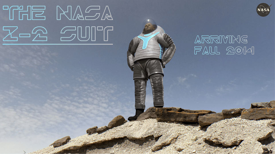
Striking a Buzz Lightyear-like pose above is the winning design for NASA’s Z-2 spacesuit prototype. The version, called “technology”, was by far the popular vote in an online contest the agency held to choose between three prototypes, garnering 62% of 233,431 votes.
While this will never be used in space, NASA said the next-generation prototype will be useful in helping design future spacesuits. And this prototype will go through a “test campaign” that includes vacuum tests, pool tests in NASA’s Neutral Buoyancy Laboratory and in an area at the Johnson Space Center that simulates the surface of Mars.
“With the agency laser focused on a path to Mars, work to develop the technologies astronauts one day will use to live and work on Mars has already begun. Each iteration of the Z-series will advance new technologies that one day will be used in a suit worn by the first humans to step foot on the Red Planet,” NASA stated.
To learn more about the suit and the differences from its predecessor, the Z-1, check out this recent Universe Today article.


I wonder why the Technology suit was so popular. A runaway winner like that usually means it was being promoted somehow. Personally I went for the Biomimicry one, although it’s odd that Biomimicry was the design least equipped with light-emitting areas, given that light-emission is very much a biomimicral idea.
Nothing says “serious scientific exploration” quite like space shorts. The Martians are going to think that they are being invaded by Dennis the Menace.
I thought biomimicry was the least bad, but the primary asthetic problem is the shape. The shuttle EMU suits have these shorts things too, but somehow blend in better. And the hunchback thing is not cool! It’s kind of necessary for suit-ports to work, but maybe some tweaking is in order to reduce the merged head shoulders look by the time we head for Mars! Or maybe they’re ahead of the curve, and in 2040 we’ll all be wearing this evolution of power shoulder pads and shorts over trousers!
They definitely need to hire a designer.
It is the most unsexiest design I have ever seen, even the colours are very badly chosen.
Maybe those are the best colors for space?