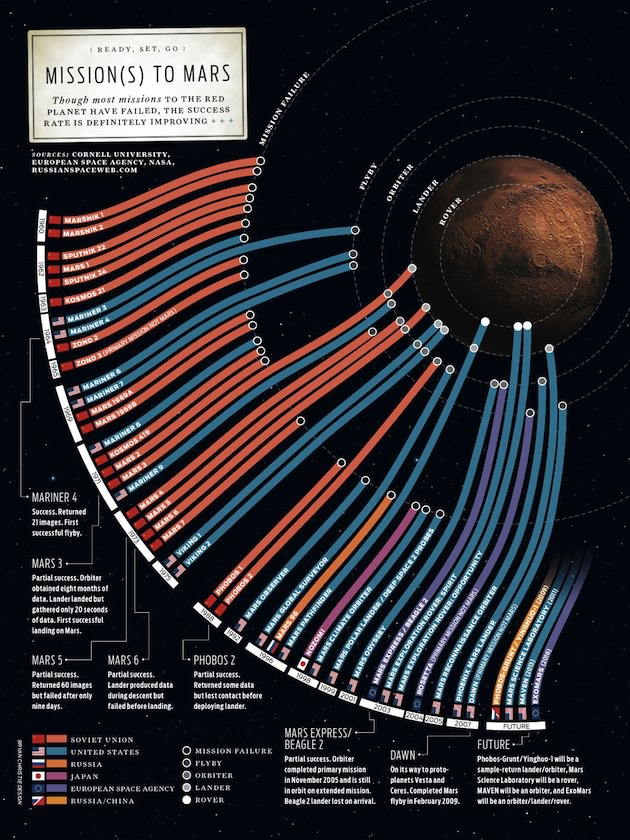
If you enjoyed the zoomable poster of 50 year of space exploration, you’ll probably also like this new poster of Mars missions. It’s basically a bar graph, with missions to Mars as listed chronologically, and the mission result is coded by how close the corresponding bar reaches to Mars. The poster also lists a few of the upcoming missions as well. Cool!
Via Fast Company


Two things stand out from that poster.
1) I didn’t know about all those Soviet Mars mission failures in the 60s.
2) We’ve had a remarkable run of success in recent years — long may it continue!
A link to a blog to another blog that links to the actual poster… sheesh!
Anyways, this is a cool picture. It shows in stark relief how many missions to Mars resulted in failure in the early years (aka almost all of them).
It’s interesting that USA failed in 1998/99.
Russia and China want to bring a piece of Mars back in 2009!?
I like how EU haven’t failed.
very user friendly chart. nicely done.
@ HAU:
I believe it’s a Phobos sample return.
Oh, and IIRC the Beagle lander failed, so the chart is misdirecting there.
Torbjorn, yeah, I wondered about ESA’s 2003 Beagle 2 Mars mission. Details here: http://en.wikipedia.org/wiki/Beagle_2 .
The poster I see explicitly lists Beagle 2 as “lost on arrival”. Was the poster changed since the above 2 comments?
Wasn’t. I just took it as a success, as a whole. That violet strip needs 2 circles.
Nope. It would have two circles if the Beagle had accomplished its mission. It would be like the Vikings: a lander and an orbiter. Since the Beagle failed, it has only one circle for the (very) successful orbiter.
The chart lists partial failures in writing. It may not be immediately clear (many people won’t read the captions), but I guess it’s the best possible way to do it, baceuse it’s the only way to convey what part of the mission succeeded and what part of it failed.