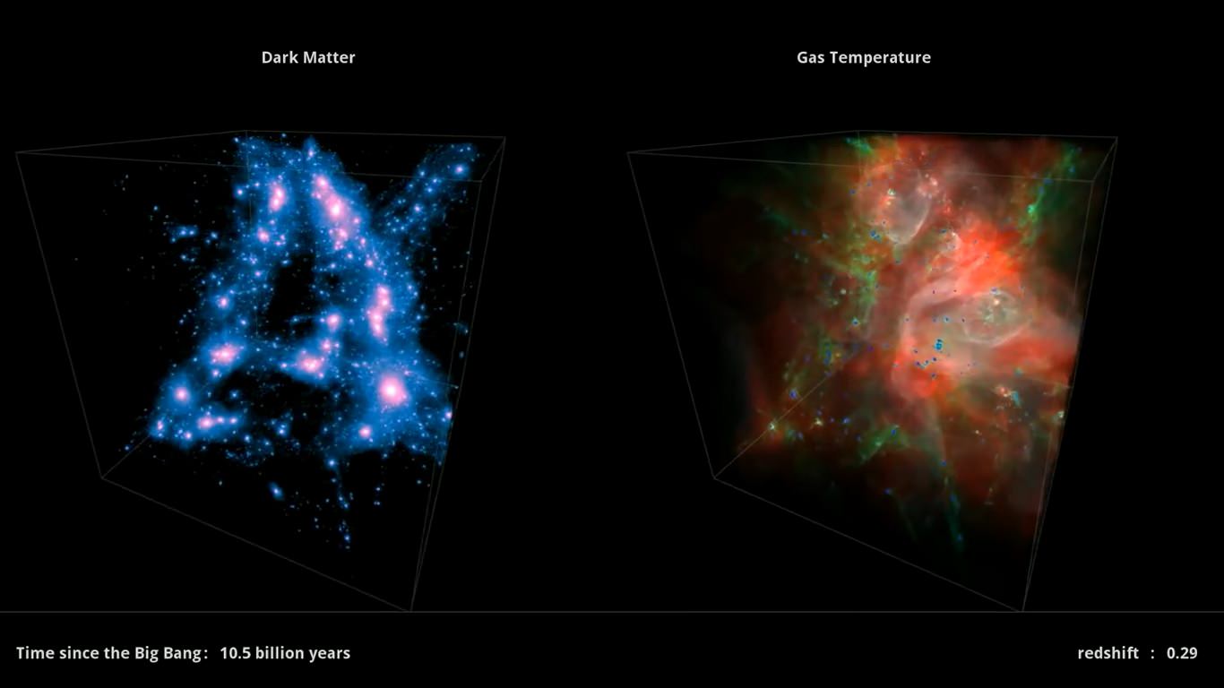
How do you show off 13 billion years of cosmic growth? One way that astronomers can figure that out is through visualizations — such as this one from the Harvard-Smithsonian Center for Astrophysics, called Illustris.
Billed as the most detailed computer simulation ever of the universe (done on a fast supercomputer), you can slowly see how galaxies come alight and the structure of the universe grows. While the pictures are pretty to look at, the Kavli Foundation also argues this is good for science.
In a recent roundtable discussion, the foundation polled experts to talk about the simulation (and in particular how the gas evolves), and how watching these interaction play out before their eyes helps them come to new understandings. But like any dataset, part of the understanding comes from knowing what to focus on and why.
“I think we should look at visualization like mapmakers look at map making. A good mapmaker will be deliberate in what gets included in the map, but also in what gets left out,” said Stuart Levy, a research programmer at the National Center for Supercomputing Applications’ advanced visualization lab, in a statement.
“Visualizers think about their audience … and the specific story they want to tell. And so even with the same audience in mind, you might set up the visualization very differently to tell different stories. For example, for one story you might want to show only what it’s possible for the human eye to see, and in others you might want to show the presence of something that wouldn’t be visible in any sort of radiation at all. That can help to get a point across.”
You can read the whole discussion at this webpage.


Wow, this is utterly amazing!
What are the tremendous galactic-cluster-scale “explosions”? I’ve looked at Illustris site and can’t seem to find info.
Thanks for fantastic article!