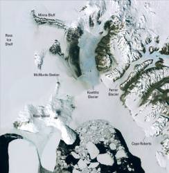
Satellites have revolutionized climate science and geology. The better your instruments, the better you can track what’s actually going on around the world. This week US and British science agencies unveiled the output of some of these instruments: a detailed map of Antarctica.
The new map of Antarctica is a mosaic of images captured by NASA satellites over years of observations. Scientists from the National Science Foundation, the U.S. Geological Survey and NASA worked with the British Antarctic Survey to hand-select the best individual images. The completed mosaic offers a cloudless view of the frozen continent’s surface at a resolution 10 times better than anything seen before.
The full mosaic contains more than 1,100 separate images stitched together from three years of Landsat observations. NASA has made the full images and data available to the public from a free web portal, and has 8 different versions of the full mosaic available for download. The homepage has a cool way to drag the map around, like Google Maps (although, I couldn’t get it to work).
The researchers are hoping this will give scientists a detailed snapshot of the current state of Antarctica, including its various ice sheets which contain 60% of the Earth’s fresh water.
Original Source: NSF News Release

