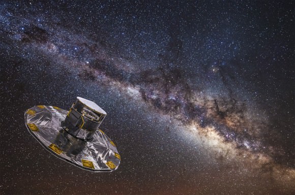
In December of 2013, the European Space Agency (ESA) launched the Gaia mission, a space observatory designed to measure the positions of movements of celestial bodies. Over the course of its five-year mission, this observatory has been studying a total of 1 billion objects – including distant stars, planets, comets, asteroids, quasars, etc. – for the sake of creating the largest and most precise 3D space catalog ever made.
With the second release of Gaia data, which took place on April 25th, 2018, astronomers have made some profound discoveries about our Galaxy. The most recent is a 3D map of the Milky Way that focuses on OB stars, the hottest, brightest and most massive stars in our Galaxy. With this latest 3D map, Gaia has provided astronomers with yet another tool for exploring the distribution and composition of our Galaxy, as well as its past and future evolution.
To put it simply, it is very challenging to map the structure of the Milky Way – which has a flattened disc-shape that is characterized by spiral arms – or reconstruct the distribution of stars in its disc. This is due to the fact that the Solar System, as with most stars in our Galaxy, is embedded in the Galactic Disc itself. As a result, astronomers have had to rely on observations of other galaxies to get a better understanding of what our own looks like.

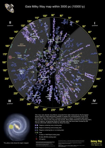
This is where the 3D positions and the 2D motions of the over 1 billion objects observed by Gaia comes into play. Using data on 40,000 OB stars located within a distance of 10,000 light years from the Sun, Kevin Jardine – a software developer and amateur astronomer who specializes in using astronomical data to map the Milky Way – was able to create this comprehensive map.
Because OB stars have relatively short lives – up to a few tens of million years – they are mostly found close to their formation sites in the Galactic Disc. During their lifetime, these stars emit a considerable amount of ultraviolet radiation, which rapidly ionizes the surrounding interstellar gas. As such, they can be used to trace the overall distribution of young stars, star formation sites, and the Galaxy’s spiral arms with a strong degree of accuracy.
As Jardine explained on his blog at Galaxy Map:
“I developed this map with help from scientists with the European Space Agency’s Gaia mission and researchers at Leiden and Heidelberg universities. It includes star density isosurfaces mapping the major concentrations of the hotter O, B and A class stars in the Gaia DR2 release, about 5000 extremely hot ionizing stars, dust clouds and HII regions. Even better, it is available both in a face-on form viewed from above the Milky Way and in a true 3D version in the latest version of Gaia Sky.”
In this way, Jardine was able to create a map that is centered on the Sun and shows the Galactic Disc as it would appear from outside the Galaxy. To deal with the massive number of stars in the Gaia catalog, Kevin employed a technique that is often used in CT scans to visualize the tissue of organs and bones. This technique is known as density isosurfaces, where a smooth surface represents points of constant value within a 3D volume of space.

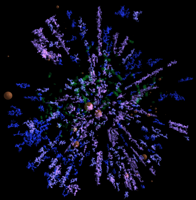
This allows for regions of different densities to be visualized; in this case, different regions of the Galactic Disc were represented by difference colors depending on the density of ionizing stars. The regions with the highest density are represented in pinkish-purple shades, intermediate density regions are represented by violet/blue, and low-density regions are dark blue.
Jadrine also consulted data from other astronomical surveys to map concentrations of interstellar dust (green) and known clouds of ionized gas (red spheres). As you can see, the map has an unusual appearance, where star concentrations appear to be arranged in spokes extending from the core, rather than in spiral arms. This is due to a combination of dust clouds obscuring the view of the stars behind them and the distribution of stars along specific lines of sight.
On his blog, Jardine expressed considerable pride for the map he created and thanked all those who helped make it possible. “Sometimes dreams do come true,” he wrote. “Today I can announce a detailed map of the Milky Way out to 3000 parsecs or about 10 thousand light years from the Sun… I’ve been running this site for almost 14 years now but today feels like a new beginning.”
This map, which is the latest breakthrough to come from the second release of Gaia data, will help astronomers to learn more about the kinds of stars that make up our Galaxy, its overall structure, and how the Milky Way is likely to evolve in the future. The third release of Gaia data is scheduled to take place in late 2020, with the final catalog being published in the 2020s.
Meanwhile, an extension has already been approved for the Gaia mission, which will now remain in operation until the end of 2020. An interactive version of this map is also available as part of Gaia Sky, a real-time, 3D astronomy visualization software that was developed for the Gaia mission at the University of Heidelberg’s Astronomisches Rechen-Institut.
And be sure to check out this trailer of the Gaia 3D map, courtesy of Kevin Jardine:
Further Reading: ESA, ESA (2), Galaxy Map


Love the video. Fantastic.
Why are the stars arranged along lines. That does not seem physically correct. Is it due to how the observations were done, or do to sampling, or a graphical artifact.
It’s explained in the article. The “spoked appearance” is due to gas clouds obscuring stars behind it and lines of sight used by Gaia.
Look out for a revised version of the map that fills in some of the gaps between the “spokes” in the next few months. Some Gaia scientists are working on some “dust-busting” algorithms to account for dust reddening and retrieve a more accurate list of the hot stars in the Gaia catalog. The next version should also include the locations of more than 1200 star clusters based on a new catalog of Gaia cluster data that should be published in the next few days.