Now that the US Space Force’s new uniforms have been eviscerated on social media (that was so last week) it’s up to their new logo to keep the uproar going. The newest branch of the US Armed Forces hasn’t disappointed: their logo looks like the Star Fleet logo from Star Trek, inviting all kinds of rancorous comparisons on the internet.
The comparison is pretty clear, and the two logos share many of the same elements. There’s the delta shape, the starry background, and the swoosh. So how did the Space Force logo designer arrive at this? Why did they make it so similar to Star Fleet’s logo? Are they planning to unite humanity and go on a bold mission where nobody’s gone before? Did they think nobody would notice?

Well, hold your keyboard criticisms. It turns out there’s something larger in play here.
So it’s not an unwitting copy worthy of derision. It’s an homage?
Then there’s this:

So it looks like the new Space Force logo is a mashup of the old Air Force Space Command’s logo and NASA’s logo. (Air Force Space Command was the pre-cursor to the Space Force.) That’s pretty cool. But will it calm down an upset internet? Maybe.
“… for the past 50 years, Star Trek has influenced scientists, engineers, and even astronauts to reach beyond their potential.”
From the NASA article ” 50 Years of NASA and Star Trek Connections”
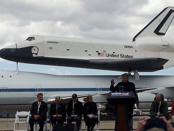
NASA and Star Trek have a history together. You can read all about it in this 2019 NASA article titled “50 Years of NASA and Star Trek Connections.” It shouldn’t be a surprise that people at NASA are fans of Star Trek. NASA has even hosted cast members at various events, and handed out plaques, too.

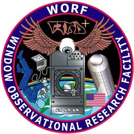
Then there’s the logo, and name, for WORF, the Window Observational Research Facility on the ISS. The name is taken from Commander Worf, the Klingon Chief of Security on the Enterprise. The logo contains Klingon writing under the WORF at the top.

So NASA and Star Trek have a long history together. It’s easy to see why. Star Trek inspired a large number of people to pursue space science. In the NASA article it says, “… for the past 50 years, Star Trek has influenced scientists, engineers, and even astronauts to reach beyond their potential.”

Rather than being a blunder worthy of your derision, the new logo is actually a purposeful homage to a ground-breaking TV show that reached further than anyone thought it would. Star Trek inspired a great many people with its vision of humanity getting over its old squabbles and working together. In the 1960s when it came out, there was a lot of racial and societal turbulence. Race riots, Vietnam protests, the civil rights movement. Even though it was just a TV show, and kind of a cheesy one in retrospect, it struck a chord. It still does today.
The current uproar over everything to do with Space Force may have a more modern cause: today’s political situation in the US.
The current President of the US is surrounded by controversy, allegations of corruption, and ill-will. Right now, the Senate is deciding whether to boot him out of office or not, after he was impeached by the House of Representatives. And for better or for worse, the President is associated with the implementation of Space Force.
It’s possible that since he was the one who announced the Space Force, everything to do with it is tainted with enmity. But let’s be reasonable. It’s not like the POTUSA himself designed the logo. Presidents have nothing to do with that.

