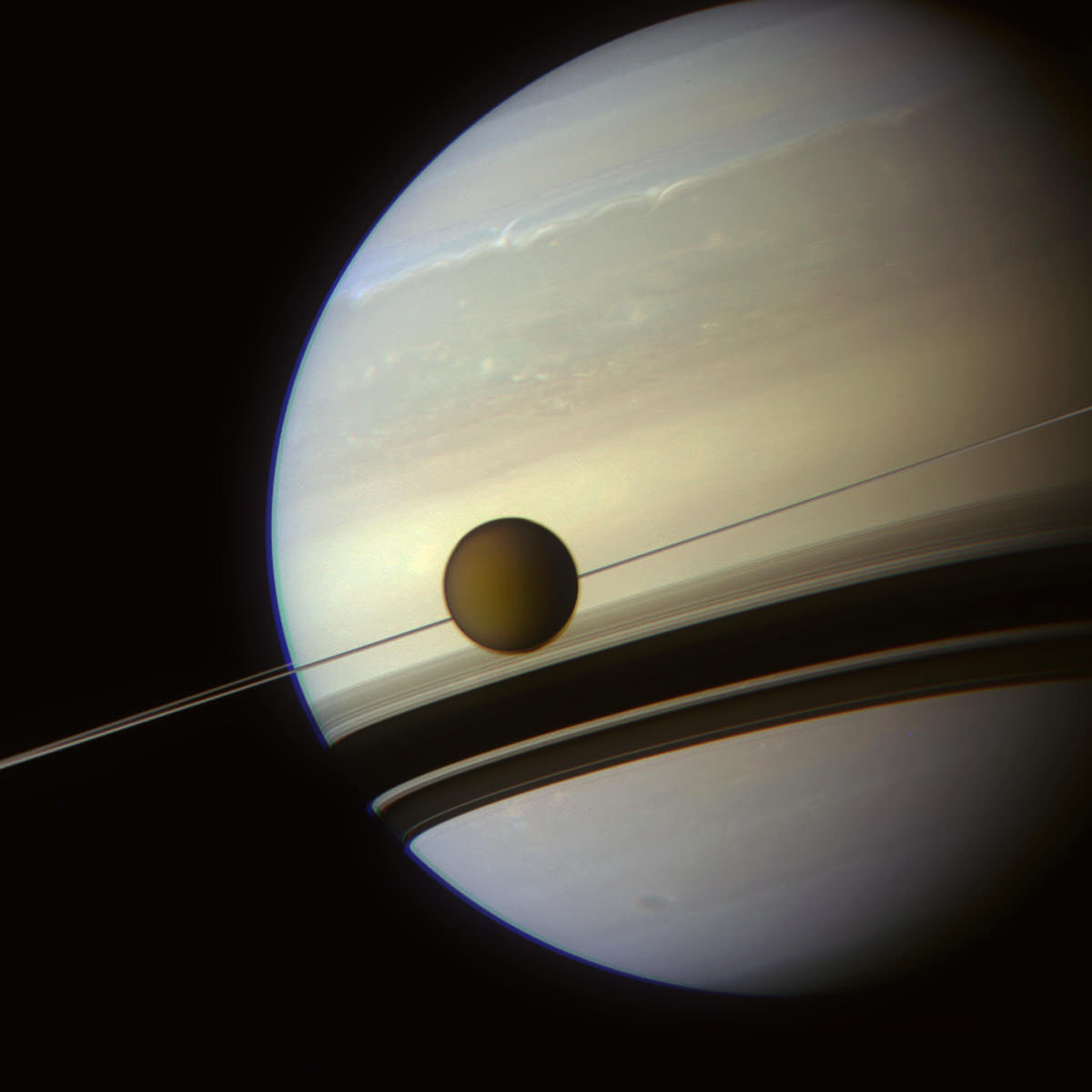
Here’s a great shot of Titan and Saturn acquired by Cassini on May 6, 2012 just after a pass by the haze-covered moon. It’s a color-composite made from images taken in Cassini’s red, green and blue color channels, and the resulting image was color adjusted a bit to appear more “Saturny”.
UPDATE 7/2/12: The image above is featured in today’s Astronomy Picture of the Day (APOD)… check it out here.
Cassini also made some closer passes of Titan on May 6, taking images within about 710,000 km. After recent passes of Encealdus and Dione, Cassini buzzed past Titan in preparation of a targeted flyby on May 22, after which it will head up and out out of the “moonplane” in order to get a better view of Saturn’s rings and upper latitudes.
After that, Cassini won’t be playing amongst the moons again for three years, so images like this will be a rarity for a while.
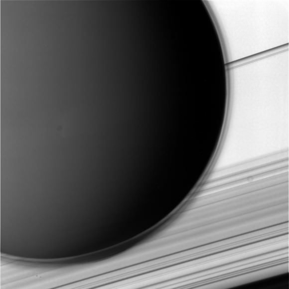
Another image of Titan, closer-in and set against Saturn’s rings and clouds, shows the fine, transparent structure of the moon’s upper atmospheric haze layers:
Created by the breakdown of methane in Titan’s opaque atmosphere by UV radiation, the haze is composed of complex hydrocarbons that extend outwards up to ten times the thickness of Earth’s atmosphere!
(The RGB layers weren’t available for this particular view, so there’s no color version of it.)
Check out previous images from Cassini’s flyby of Dione and Enceladus, and follow along with the Cassini mission on the JPL site here.
Top image: Color-composite image of Titan and Saturn (NASA/JPL/SSI/J. Major) Bottom image: Titan in blue wavelength against Saturn (NASA/JPL/SSI)


boy, wouldn’t i just love some photos that haven’t been ‘color adjusted’… anyone else feelin me on this one? folks in the photo lab have too much time on their hands? whats the deal? Imagine if they were adjusting earth to make it appear more marsy? ridiculous i do so think
It’s all about selling – drab doesn’t sell.
Nothing to do with selling or drab. The original color composite was actually over saturated in the blue 475 nm wavelengths, and so was toned down to look more like what your eye would see at Saturn…more like “true” color. This is what photographers and digital artists do, pretty much everywhere you see a published image of anything. Open up a National Geographic – you’ll see beautiful photos on nearly every page. Every one of them has been retouched somehow. It’s not ridiculous, it’s part of the process. In photography, that’s the deal.
yes, the real colors please
Is Saturny even a word?
I guess it is now!
Well, I guess you wouldn’t get true “true color” photo even _without_ adjustments …
It’s a combination of three filters anyway .
So at least they try to make it beautiful ..
This is a great picture.
As for “true colors,” the human eye does not capture what might be called true colors. The retina has greater sensitivity to some parts of the optical spectrum over others. Using the electromagnetic irradiance of optical spectra through color filters one can digitally recreate colors. There are of course other elements, such as a CCD and its associated software integrate this irradiance with time, whereas the human eye continually refreshes its perception. This is why nebula and other objects look far more pale than captured images.
These images might be the best we get. I doubt that humans are going to be visiting Saturn in the flesh, at least not any time soon. Even if that happens a very few human eyes will see the “true colors” as defined by the behavior of the human eye. However, if you look back at images decades ago from telescopes looking through the hazy atmosphere, these Cassini images are very remarkable by comparison.
LC
Agreed. The images are lovely. The many wonders of creation.
I think it’s reasonable to use the phrase “true colors” to mean “exactly as it would appear to a human eye if it were positioned where the camera is”
That said, I have no issue with these images being adjusted… they often bring out detail that our eyes wouldn’t pick out
More pics of the North Polar Hexagon!
The blue layer of Saturn’s atmosphere looks unnaturally thick, it’s > 1000 km on the picture.
I suspect this is due to the oversaturated blue-light (475nm) image used in the color composite, as Jason mentions below.
That’s due to a slight misalignment of the blue channel. To avoid such color-fringing in Titan, I chose to let Saturn’s limb exhibit some bleed-over.
if by “color adjusted” they mean; adjusting the photonic input within each spectral receiver onboard in order to replicate what the human eye would see thats great! If by color adjusted they mean “photoshopped to look more cool” then, come on man/woman, let us get a piece of reality.
love the new pics