[/caption]
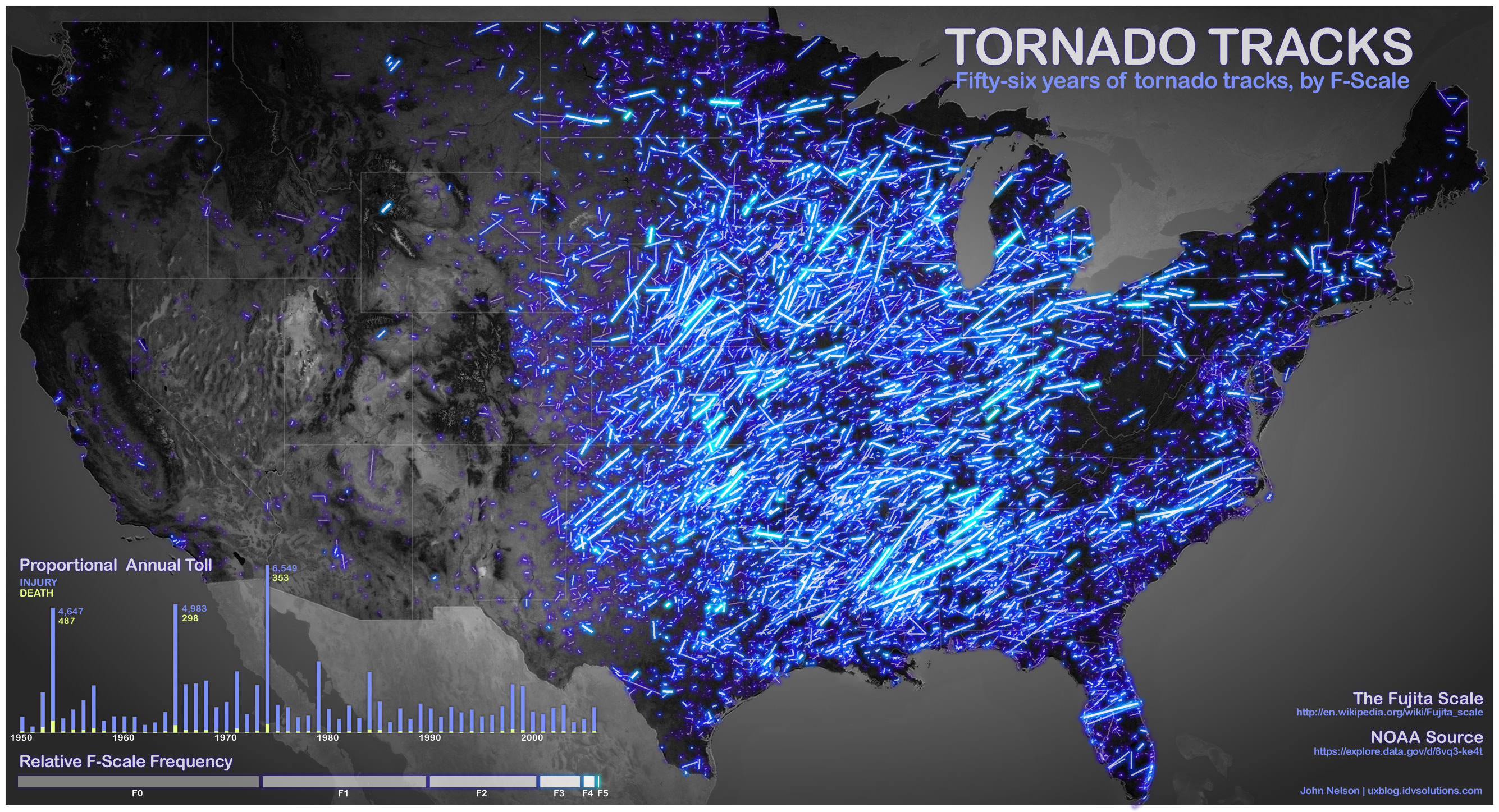
It’s a wonder of nature, baby. Using information from data.gov, tech blogger John Nelson has created this spectacular image of tornado paths in the US over a 56 year period. The graphic categorizes the storms by F-scale with the brighter neon lines representing more violent storms.
Makes you want to hang on to something solid.
Nelson also provided some stats on all the storms in the different categories:
The numbers represent total deaths, total injuries, average miles the storms traveled
F0: 7, 267, 2
F1: 111, 3270, 6.58
F2: 363, 10373, 11.4
F3: 958, 18160, 17.80
F4: 1912, 28427, 28.62
F5: 1013, 11038, 38.87
This provides a new appreciation for the term “suck zone” used in the movie “Twister.”
While tornadoes don’t travel in straight lines, Nelson explains that based on the data, the vectors were created using touchdown points and liftoff points.
Nelson said he got the data from this Data.gov page doing a “tornado tracks” search.


Not much of a Tornado Alley when visualized this way.
Alas, the first things I think of when looking at this image is ‘where is the time lapse version?’ and ‘gosh, those tornados all sure went straight.’ I assume that straight lines were used because for some of the tornados precise path information isn’t available?
Still, that is a neat idea.
As it says in the article, (in case you missed it) : “While tornadoes don’t travel in straight lines, Nelson explains that based on the data, the vectors were created using touchdown points and liftoff points.”