Could The U.S. Government Shutdown Hammer Earth and Mars Missions?

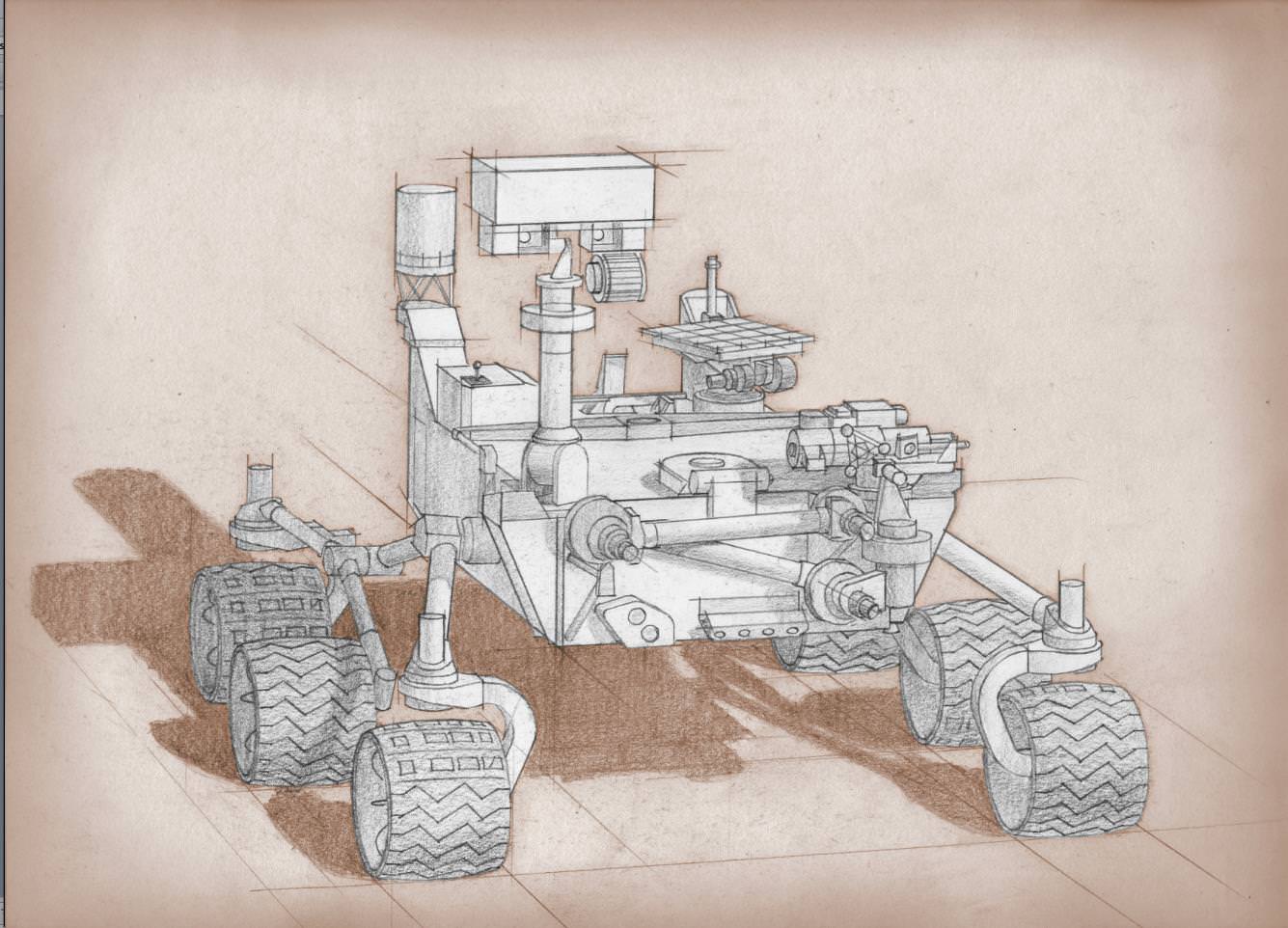
Artist's conception of the Mars 2020 rover. Credit: NASA

As Day 2 of the United States government shutdown continues, some short-term effects are already in evidence when it comes to Earth and space.

Most of the NASA and National Oceanic and Atmospheric Administration (NOAA) websites are offline. Social media updates are silent. At NASA, 97% of agency employees are off work and media reports indicate that 55% of NOAA’s employees are furloughed.

If the shutdown lasts for very long, however, long-term programs could feel the pain. This includes a couple of Mars missions NASA is developing, as well as Earth-based climate research and satellite observation from NOAA.

Mars 2020

A twin rover to Mars Curiosity, called Mars 2020 for now, is expected to leave for the Red Planet in 2020 and do investigations into past life and habitability. Planning is still in the early stages, but an announcement of opportunity for science investigators was supposed to happen on Oct. 8. Notices of intent were due Oct. 15.

“The preproposal conference, scheduled for 10/8, may be rescheduled and the due date for NOIs (currently 10/15) could be delayed, if the government is still shut down closer to those dates,” NASA officials wrote in an update before the shutdown on Monday.

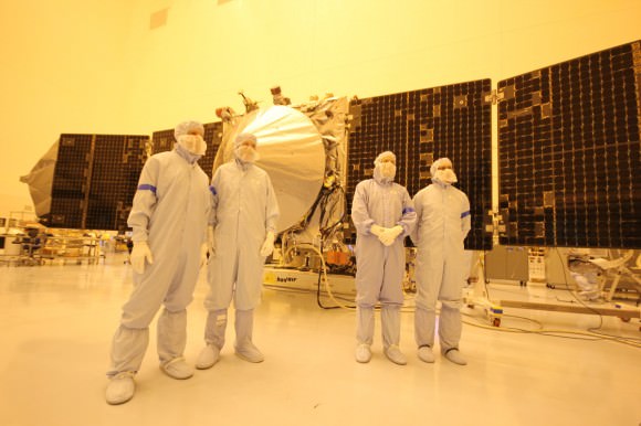
MAVEN team members, including chief scientist Bruce Jakosky (2nd from left)  pose with spacecraft inside the cleanroom at the Kennedy Space Center on Sept. 27, 2013. Credit: Ken Kremer/kenkremer.com
MAVEN team members, including chief scientist Bruce Jakosky (2nd from left) pose with spacecraft inside the cleanroom at the Kennedy Space Center on Sept. 27, 2013. Credit: Ken Kremer/kenkremer.com

MAVEN

As widely reported yesterday, the next Mars orbiter from NASA is expected to lift off from Earth on Nov. 18. Now, however, preparatory work has ceased and there is some concern from team members that it will miss the launch window, which extends into December. At worst, this means MAVEN’s launch could be delayed until 2016, when the next opportunity opens.

“The hardware is being safed, meaning that it will be put into a known, stable, and safe state,” Bruce Jakosky, MAVEN’s principal investigator, told Universe Today‘s Ken Kremer yesterday. “We’ll turn back on when told that we can. We have some margin days built into our schedule.”

NOAA

As with NASA, NOAA is keeping up with mission-critical activities — which in their case, includes weather forecasting. Long-term climate research, however, is reportedly being shelved.

“For example, Harold Brooks, a top tornado researcher who works at the National Severe Storms Laboratory in Norman, Okla., reported his furlough notice on Facebook on Tuesday,” Climate Central wrote on Oct. 1. “Much of the staff at NOAA’s Earth Systems Research Lab and the Geophysical Fluid Dynamics Laboratory, except for positions related to maintaining computing resources, have also been furloughed. Those two labs are heavily involved in NOAA’s climate research programs.”

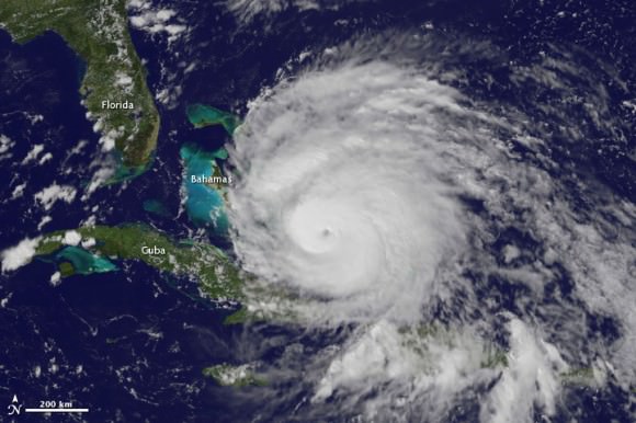
A view of Hurricane Irene taken by the GOES satellite at 2:55 p.m. Eastern Daylight Time on August 24, 2011. Credit: NASA

Observers are also worried that a lengthy shutdown could push back the time when new weather satellites become available. There have been multiple reports about a “weather satellite gap” coming in the United States as many of NOAA’s geostationary and polar-orbiting satellites are nearing the end of their expected lives. The Subcommittees on Oversight and Environment held hearings into this issue in September.

What’s still online?

These are some of the programs that are still happening at NASA and NOAA:

NASA’s Curiosity rover reaches out in ‘handshake’ like gesture with dramatic scenery of Mount Sharp in the background. This mosaic of images was snapped by Curiosity on Sol 262 (May 2, 2013) and shows her flexing the robotic arm. Two drill holes are visible on the surface bedrock below the robotic arm’s turret. Credit: NASA/JPL-Caltech/Ken Kremer-(kenkremer.com)/Marco Di Lorenzo

NASA:

  • Bare-bones management on programs such as the International Space Station and several robotic missions that are already in operation (such as the Lunar Atmosphere and Dust Environment Explorer (LADEE).
  • Certain missions are in critical phases that could be hurt if work stops, such as the James Webb Space Telescope, which is undergoing cryogenic testing on some of its instruments.
  • Several missions run out of the Jet Propulsion Laboratory and Applied Physics Laboratory are still running as usual, according to the Planetary Society, as these receive contract money from NASA; this means Mars Curiosity is still working, for example.
  • The Mars Reconnaissance Orbiter’s HiRISE camera is still snapping pictures, its Twitter account reported, which is positive given that it was intended to snap shots of Comet ISON during its closest approach to Mars yesterday.
  • The decades-long Landsat Earth observation program is still operating, according to The Atlantic, with data being sent back to Earth as usual. The difference is this information won’t be packaged as usual until government operations restart.

NOAA (all information according to this Department of Commerce document):

  • The Office of Oceanic and Atmospheric Research will keep 73 employees on board “to ensure continuity of crucial long-term historical climate records, and real-time regular research to support ongoing weather and air quality prediction services,” NOAA said.
  • 184 employees will stay with the Environmental Satellite and Data Information Service for command and control of several satellites for NOAA and the Department of Defense.
  • 474 employees will remain with the National Marine Fisheries Service. 174 are funded in another form besides appropriations. The others are a mix of law enforcement, fisheries management and property protection officials.
  • 490 employees are with the Office of Marine and Aviation Operations for observational data collection related to weather forecasting.
  • 173 employees are with the National Ocean Service. 17 are funded outside of appropriations, while the 156 remaining “are required to protect against imminent and significant threats to life and property by supporting safe maritime commerce in U.S. waters, including real-time water level data for ships entering U.S. ports, critical nautical chart updates, and accurate position information,” NOAA stated. Some are also monitoring marine health aspects such as algal blooms.
  • There are 19 IT-related employees and 20 employees providing support services.
  • The large bulk of employees still at work, 3,935 people, are with the National Weather Service to keep up weather forecasting.

There’s no word yet on when government employees could go back to work. Congress representatives are jousting over the implementation of a spending bill to keep the money flowing to government departments. One big issue: whether to include the Affordable Care Act, sometimes dubbed Obamacare, in the bill.

Another deadline is looming, too. Treasury Secretary Jack Lew has warned repeatedly that on Oct. 17, if the debt ceiling is not raised, the United States government may default on some financial obligations.

New U.S. Climate Map Shows Temperature Changes In HD. How To Prepare?

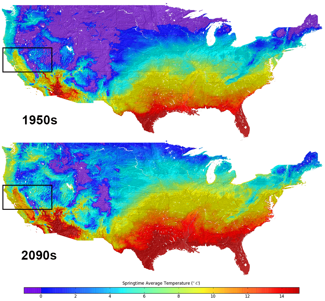
Average temperatures in the United States. Top, what they were in the 1950s. Bottom, the predictions for the 2090s. Credit: NASA

If you’re interested to see how warm your neighborhood will look like at 2090, here’s a chance. There’s new data available that has monthly climate projections for the continental United States at the size of a neighborhood, or about a  half-mile (800 meters).

Readers who have moderate to advanced knowledge of how to manipulate datasets can see instructions for how to get the raw information here. As for everyone else, NASA briefly summarized how the information could be used for community planners to deal with the effects of climate change.

The map charts how rain and temperatures in the United States will be affected based on greenhouse gases. Because, of course, this is a projection, the researchers ran four different scenarios for the period between 1950 and 2099. Climate projections came from global climate models from the upcoming Inter-Governmental Panel on Climate Change 5th Assessment Report and historical surface observations.

The projections “may make it easier for resource managers to quantify anticipated climate change impacts on a wide range of conditions and resources important to local communities,” NASA stated.

The agency then provided a long list of research areas that would benefit, including “water supplies and winter snow packs, public health and the spread of insect-borne diseases, flood risk and potential impacts to critical urban infrastructure, wildfire frequency and severity, agricultural production, and wildlife and biodiversity.”

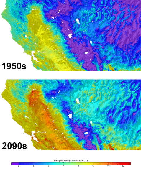
On this map of Nevada - northern California are superimposed graphics representing the average temperatures in the 1950s (top) and projected temperatures for the 2090s. Credit: NASA
On this map of Nevada – northern California are superimposed graphics representing the average temperatures in the 1950s (top) and projected temperatures for the 2090s. Credit: NASA

As you can see from the climate map above, Nevada and California are highly affected by the projections, and officials in the region are paying attention, according to NASA.

“We are using the 800-meter downscaled datasets for conservation planning and resource management in the San Francisco Bay Area,” stated Stuart Weiss, a researcher at the Terrestrial Biodiversity Climate Change Collaborative in the San Francisco Bay Area.

“They provide an indispensable, if necessarily hazy, crystal ball into hydrological and ecological responses through the 21st century.  It will be a very useful tool for climate change planning and adaptation that will be exported to the remainder of California and eventually the western United States.”

The data was crunched using supercomputers at NASA’s Ames Research Center, allowing the team to “produce the downscaled, high resolution climate dataset for the U.S. within months of release of the final global climate scenarios prepared for the next IPCC assessment report,” NASA added.

Source: NASA

Podcast: Climate Change

When it comes to carbon dioxide, just a little goes a long way to warming the planet. Unfortunately, we’ve been dumping vast amounts into the atmosphere, recently passing 400 parts per million. Let’s look at the science of the greenhouse effect, and how it’s impacting our global climate.

Click here to download the episode.

Or subscribe to: astronomycast.com/podcast.xml with your podcatching software.

“Climate Change” on the Astronomy Cast website, with shownotes and transcript.

And the podcast is also available as a video, as Fraser and Pamela now record Astronomy Cast as part of a Google+ Hangout (usually recorded every Monday at 3 pm Eastern Time):


Happy (or is it Merry?) Aphelion This Friday

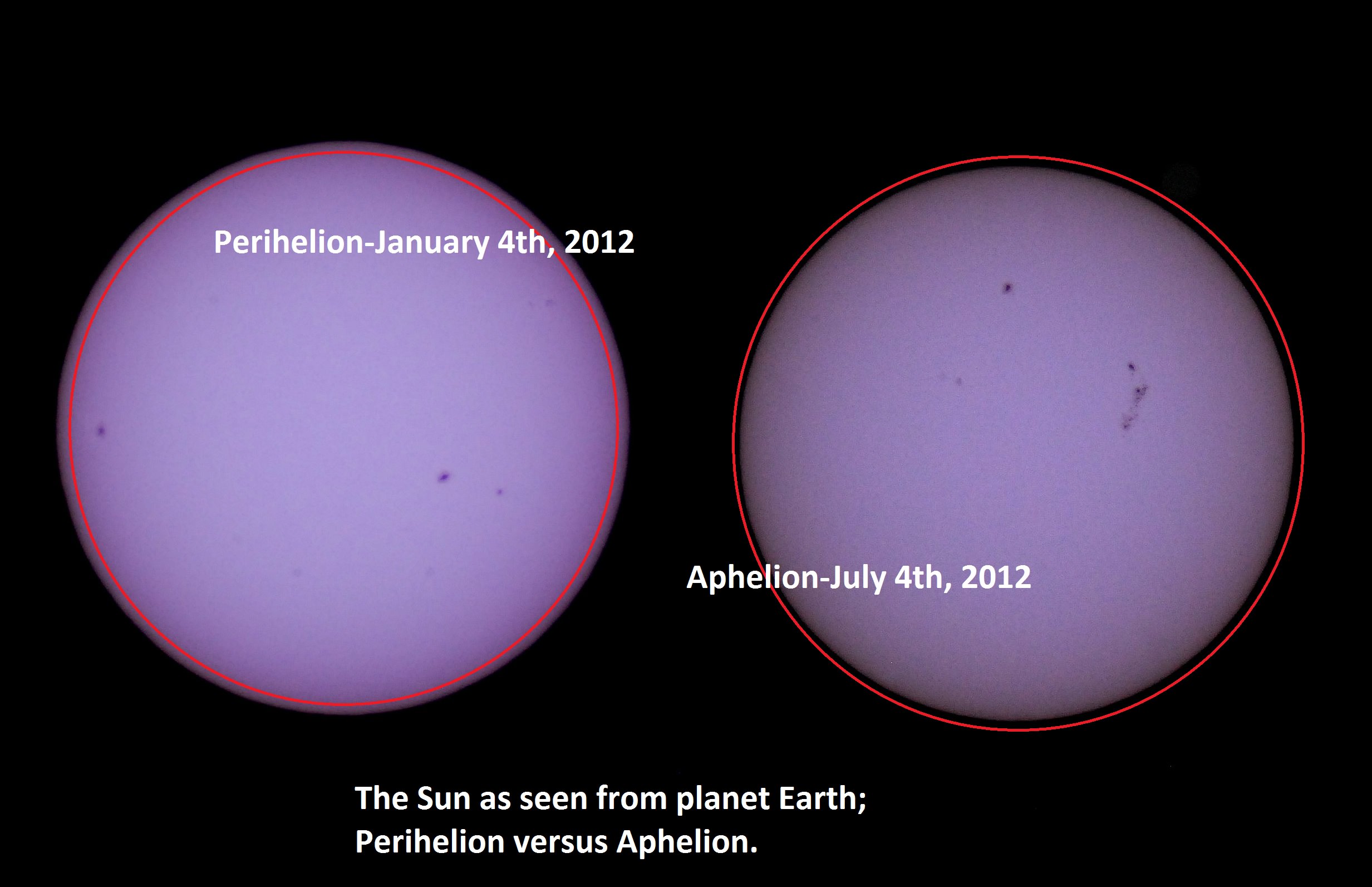
Solar apparent size- perihelion versus aphelion 2012.

This 4th of July weekend brings us one more reason to celebrate. On July 5th at approximately 11:00 AM EDT/15:00 UT, our fair planet Earth reaches aphelion, or its farthest point from the Sun at 1.0167 Astronomical Units (A.U.s) or 152,096,000 kilometres distant.

Though it may not seem it to northern hemisphere residents sizzling in the summer heat, we’re currently 3.3% farther from the Sun than our 147,098,290 kilometre (0.9833 A.U.) approach made in early January.

We thought it would be a fun project to capture this change. A common cry heard from denier circles as to scientific facts is “yeah, but have you ever SEEN it?” and in the case of the variation in distance between the Sun and the Earth from aphelion to perihelion, we can report that we have!

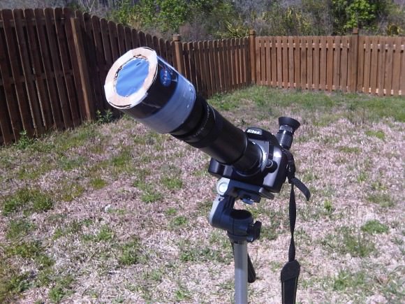
We typically observe the Sun in white light and hydrogen alpha using a standard rig and a Coronado Personal Solar Telescope  on every clear day. We have two filtered rigs for white light- a glass Orion filter for our 8-inch Schmidt-Cassegrain, and a homemade Baader solar filter for our DSLR. We prefer the DSLR rig for ease of deployment. We’ve described in a previous post how to make a safe and effective solar observing rig using Baader solar film.

Our solar imaging rig.
Our primary solar imaging rig. A Nikon D60 DSLR with a 400mm lens + a 2x teleconverter and Baader solar filter. Very easy to employ!

We’ve been imaging the Sun daily for a few years as part of our effort to make a home-brewed “solar rotation and activity movie” of the entire solar cycle.  We recently realized that we’ve imaged Sol very near aphelion and perihelion on previous years with this same fixed rig, and decided to check and see if we caught the apparent size variation of our nearest star. And sure enough, comparing the sizes of the two disks revealed a tiny but consistent variation.

It’s a common misconception that the seasons are due to our distance from the Sun. The insolation due to the 23.4° tilt of the rotational axis of the Earth is the dominant driving factor behind the seasons. (Don’t they still teach this in grade school? You’d be surprised at the things I’ve heard!) In the current epoch, a January perihelion and a July aphelion results in milder climatic summers in the northern hemisphere and more severe summers in the southern. The current difference in solar isolation between hemispheres due to eccentricity of Earth’s orbit is 6.8%.

The orbit of the Earth also currently has one of the lowest eccentricities (how far it deviates for circular) of the planets at 0.0167, or 1.67%. Only Neptune (1%) and Venus (0.68%) are “more circular.”

The orbital eccentricity of the Earth also oscillates over a 413,000 year period between 5.8% (about the same as Saturn) down to 0.5%. We’re currently at the low end of the scale, just below the mean value of 2.8%.

Variation in eccentricity is also coupled with other factors, such as the change in axial obliquity the precession of the line of apsides and the equinoxes to result in what are known as Milankovitch cycles. These variations in extremes play a role in the riddle of climate over hundreds of thousands of years.  Climate change deniers like to point out that there are large natural cycles in the records, and they’re right – but in the wrong direction. Note that looking solely at variations in the climate due to Milankovitch cycles, we should be in a cooling trend right now.  Against this backdrop, the signal of anthropogenic climate forcing and global dimming of albedo (which also masks warming via cloud cover and reflectivity) becomes even more ominous.

Aphelion can presently fall between July 2nd at 20:00 UT (as it did last in 1960) and July 7th at 00:00 UT as it last did on 2007.  The seemingly random variation is due to the position of the Earth with respect to the barycenter of the Earth-Moon system near the time of aphelion. The once every four year reset of the leap year (with the exception of the year 2000!) also plays a lesser role.

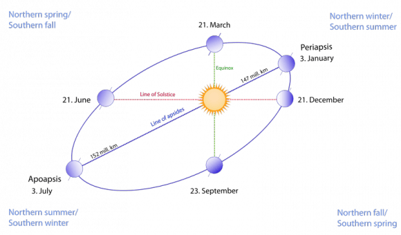
Perihelion and aphelion vs the solstices and equinoxes, an exagarated view.
Perihelion and aphelion vs the solstices and equinoxes, an exaggerated view. (Wikimedia Commons image under a 3.0 Unported Attribution-Share Alike license. Author Gothika/Doudoudou).

I love observing the Sun any time of year, as its face is constantly changing from day-to-day. There’s also no worrying about light pollution in the solar observing world, though we’ve noticed turbulence aloft (in the form of bad seeing) is an issue later in the day, especially in the summertime.  The rotational axis of the Sun is also tipped by about 7.25° relative to the ecliptic, and will present its north pole at maximum tilt towards us on September 8th. And yes, it does seem strange to think in terms of “the north pole of the Sun…”

We’re also approaching the solar maximum through the 2013-2014 time frame, another reason to break out those solar scopes.  This current Solar Cycle #24 has been off to a sputtering start, with the Sun active one week, and quiet the next. The last 2009 minimum was the quietest in a century, and there’s speculation that Cycle #25 may be missing all together.

And yes, the Moon also varies in its apparent size throughout its orbit as well, as hyped during last month’s perigee or Super Moon. Keep those posts handy- we’ve got one more Super Moon to endure this month on July 22nd. The New Moon on July 8th at 7:15UT/3:15 AM EDT will occur just 30 hours after apogee, and will hence be the “smallest New Moon” of 2013, with a lot less fanfare. Observers worldwide also have a shot at catching the slender crescent Moon on the evening of July 9th. This lunation and the sighting of the crescent Moon also marks the start of the month of Ramadan on the Muslim calendar.

Be sure to observe the aphelion Sun (with proper protection of course!) It would be uber-cool to see a stitched together animation of the Sun “growing & shrinking” from aphelion to perihelion and back. We could also use a hip Internet-ready meme for the perihelion & aphelion Sun- perhaps a “MiniSol?” A recent pun from Dr Marco Langbroek laid claim to the moniker of “#SuperSun;” in time for next January’s perihelion;

Marco quote

Could a new trend be afoot?

An Early Start for Noctilucent Clouds

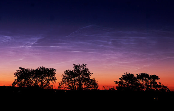
Noctilucent clouds photographed over Killygordon, Ireland on the morning of June 10. (© Brendan Alexander/Donegal Skies. All rights reserved.)

The season for noctilucent “night-shining” clouds is arriving in the northern hemisphere, when wispy, glowing tendrils of high-altitude ice crystals may be seen around the upper latitudes, shining long after the Sun has set. Found about 83 km (51 miles) up, noctilucent clouds (also called polar mesospheric clouds) are the highest cloud formations in the atmosphere. They’ve been associated with rocket launches and space shuttle re-entries and are now thought to also be associated with meteor activity… and for some reason, this year they showed up a week early.


Noctilucent clouds (NLCs) form between 76 to 85 kilometers (47 to 53 miles) above Earth’s surface when there is just enough water vapor to freeze into ice crystals. The icy clouds are illuminated by the Sun when it is just below the horizon, after darkness has fallen, giving them their night-shining properties. This year NASA’s AIM spacecraft, which is orbiting Earth on a mission to study high-altitude ice, started seeing noctilucent clouds on May 13th.

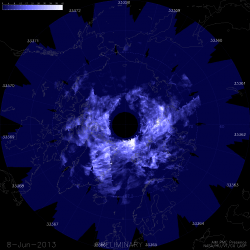
AIM map of noctilucent clouds over the north pole on June 8 (Credit: LASP/University of Colorado)
AIM map of noctilucent clouds over the north pole on June 8
(Credit: LASP/University of Colorado)

“The 2013 season is remarkable because it started in the northern hemisphere a week earlier than any other season that AIM has observed,” reports Cora Randall of the Laboratory for Atmospheric and Space Physics at the University of Colorado. “This is quite possibly earlier than ever before.”

The early start is extra-puzzling because of the solar cycle. Researchers have long known that NLCs tend to peak during solar minimum and bottom-out during solar maximum — a fairly strong anti-correlation. “If anything, we would have expected a later start this year because the solar cycle is near its maximum,” Randall says. “So much for expectations.”

Read more on the NASA AIM page here, and watch the Science@NASA video below for the full story. (Also, check out some very nice NLC photos taken last week in the UK by Stuart Atkinson at Cumbrian Sky.)

Source: NASA

What Does Antarctica Look Like Under the Ice?

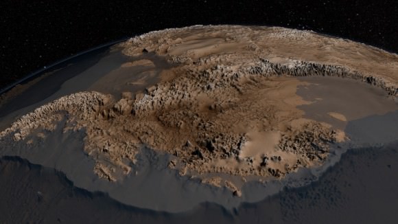
New topography map of Antarctica by the British Antarctic Survey's Bedmap2 (NASA/GSFC)

Although it sits isolated at the “bottom of the world” Antarctica is one of the most influential continents on Earth, affecting weather, climate, and ocean current patterns over the entire planet. But Antarctica is also one of the most enigmatic landmasses too, incredibly remote, extremely harsh, and covered by a layer of ice over 2 km thick. And as Earth’s global temperature continues to climb steadily higher, the future of ice in Antarctica — a continent half again as large as the contiguous United States — is a big concern for scientists… but in order to know exactly how its ice will behave to changing conditions, they need to know what’s under it.

This is where the British Antarctic Survey — using data gathered by NASA’s ICESat and Operation IceBridge missions — comes in, giving us a better view of what lies beneath the southern continent’s frozen veil.

A new dataset called Bedmap2 gives a clearer picture of Antarctica from the ice surface down to the bedrock below. Bedmap2 is a significant improvement on the previous collection of Antarctic data — known as Bedmap — that was produced more than 10 years ago. The product was a result of work led by the British Antarctic Survey, where researchers compiled decades worth of geophysical measurements, such as surface elevation measurements from NASA’s Ice, Cloud and Land Elevation Satellite (ICESat) and ice thickness data collected by Operation IceBridge.

Bedmap2, like the original Bedmap, is a collection of three datasets—surface elevation, ice thickness and bedrock topography. Both Bedmap and Bedmap2 are laid out as grids covering the entire continent, but with a tighter grid spacing Bedmap2 includes many surface and sub-ice features too small to be seen in the previous dataset. Additionally, the extensive use of GPS data in more recent surveys improves the precision of the new dataset.

Improvements in resolution, coverage and precision will lead to more accurate calculations of ice volume and potential contribution to sea level rise.

Ice sheet researchers use computer models to simulate how ice sheets will respond to changes in ocean and air temperatures. An advantage of these simulations is that they allow testing of many different climate scenarios, but the models are limited by how accurate the data on ice volume and sub-ice terrain are.

Only the tips of many of Antarctica's mountains are visible above thousands of feet of ice. (Oct. 2012 IceBridge photo. Credit: NASA / Christy Hansen)
Only the tips of many of Antarctica’s mountains are visible above thousands of feet of ice. (Oct. 2012 IceBridge photo. Credit: NASA / Christy Hansen)

“In order to accurately simulate the dynamic response of ice sheets to changing environmental conditions, such as temperature and snow accumulation, we need to know the shape and structure of the bedrock below the ice sheets in great detail,” said Michael Studinger, IceBridge project scientist at NASA Goddard.

Knowing what the bedrock looks like is important for ice sheet modeling because features in the bed control the ice’s shape and affect how it moves. Ice will flow faster on a downhill slope, while an uphill slope or bumpy terrain can slow an ice sheet down or even hold it in place temporarily. “The shape of the bed is the most important unknown, and affect how ice can flow,” said Nowicki. “You can influence how honey spreads on your plate, by simply varying how you hold your plate.” The vastly improved bedrock data included in Bedmap2 should provide the level of detail needed for models to be realistic.

Bedmap2 data of Antarctica's bedrock. Verical elevation has been exaggerated by 17x. (NASA/GSFC)
Bedmap2 data of Antarctica’s bedrock. Verical elevation has been exaggerated by 17x. (NASA/GSFC)

“It will be an important resource for the next generation of ice sheet modelers, physical oceanographers and structural geologists,” said Peter Fretwell, BAS scientist and lead author.

The BAS’ work was published recently in the journal The Cryosphere. Read more on the original release by George Hale here.

Source: NASA Earth

Carbon Impacts Planetary Atmospheric Formation

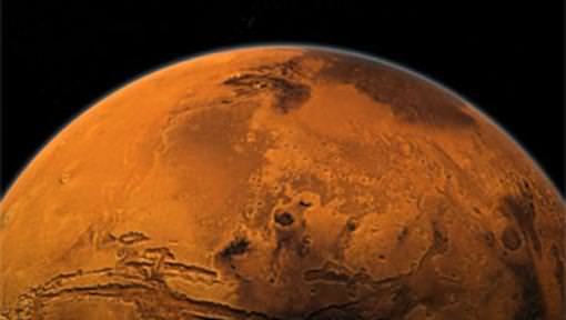
Early on, Mars had giant active volcanoes, which would have released significant methane. Because of methane’s high greenhouse potential, even a thin atmosphere might have supported liquid water. Credit: NASA

It might be common, but carbon could have a huge impact in the formation and evolution of a planet’s atmosphere. As it moves from the interior to the surface, carbon’s role is important. According to a new study in Proceedings of the National Academy of Sciences, if Mars let go of its majority of carbon supply as methane, it probably would have been temperate enough to caused liquid water to form. Just how captive carbon escapes via iron-rich magma is offering us vital clues as to the role it plays in “early atmospheric evolution on Mars and other terrestrial bodies”.

While the atmosphere of a planet is its outer layer, it has its beginnings far below. During the formation of a planet, the mantle – a layer between a planet’s core and upper crust – latches on to subsurface carbon when it melts to create magma. When the viscous magma rises upwards to the surface, the pressure lessens and the captive carbon is released as gas. As an example, Earth’s captive carbon is encapsulated in magma as carbonate and its released gas is carbon dioxide. As we are aware, carbon dioxide is a “greenhouse gas” which enables our planet to absorb heat from the Sun. However, the release process for captive carbon on other planets – and its subsequent greenhouse effects – isn’t well understood..

“We know carbon goes from the solid mantle to the liquid magma, from liquid to gas and then out,” said Alberto Saal, professor of geological sciences at Brown and one of the study’s authors. “We want to understand how the different carbon species that are formed in the conditions that are relevant to the planet affect the transfer.”

Thanks to the new study, which also included researchers from Northwestern University and the Carnegie Institution of Washington, we’re able to take a closer look at the release processes for other terrestrial mantles, such as those found on the Moon, Mars and similar bodies. Here the captive carbon in the magma is formed as iron carbonyl – then escapes as methane and carbon monoxide. Like carbon dioxide, both of these gases have a huge potential as greenhouse.

The team, along with Malcolm Rutherford from Brown, Steven Jacobsen from Northwestern and Erik Hauri from the Carnegie Institution, came to some significant conclusions about the early volcanic history of Mars. If it followed the captive carbon theory, it might have very well released enough methane gas to have kept the Red Planet warm and cozy. However, it didn’t happen in an “Earth-like” manner. Here our mantel supports a condition known as “oxygen fugacity” – the volume of free oxygen available to react with other elements. While we have a high rate, bodies like early Mars and the Moon are poor in comparison.

Now the real science part comes into play. In order to discover how a lower oxygen fugacity impacts “carbon transfer”, the researchers experimented with volcanic basalt which closely match those located on both Mars and the Moon. Through various pressures, temperatures and oxygen fugacities, the volcanic rock was melted and studied with a spectrometer. This allowed the scientists to determine just how much carbon was absorbed and what form it took. Their findings? At low oxygen fugacities, captive carbon took the form of iron carbonyl and at low pressure the iron carbonyl released as carbon monoxide and methane.

“We found that you can dissolve in the magma more carbon at low oxygen fugacity than what was previously thought,” said Diane Wetzel, a Brown graduate student and the study’s lead author. “That plays a big role in the degassing of planetary interiors and in how that will then affect the evolution of atmospheres in different planetary bodies.”

As we know, Mars has a history of volcanism and studies such as this mean that large quantities of methane must have once been released via carbon transfer. Could this have triggered a greenhouse effect? It’s entirely possible. After all, methane in a early atmosphere may very well have supported conditions warm enough to have allowed liquid water to form on the surface.

Maybe even enough to pool…

Original Story Source: Brown University News Release.

Global Temperatures Continue to Rise

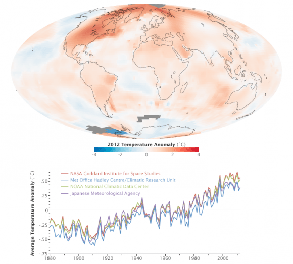
This map represents global temperature anomalies averaged from 2008 through 2012. Credit: NASA Goddard Institute for Space Studies/NASA Goddard's Scientific Visualization Studio.

This week, scientists at NASA released their global climate analysis for 2012 which revealed that Earth continues to experience warmer temperatures than several decades ago. The past year was the ninth warmest year on record since 1880, continuing what appears to be a long-term global trend of rising temperatures. The ten warmest years in the 132-year record have all occurred since 1998, and the last year that was cooler than average was 1976. The hottest years on record were 2010 and 2005.

The analysis was done by NASA’s Goddard Institute for Space Studies (GISS) which monitors global surface temperatures on an ongoing basis, comparing temperatures around the globe to the average global temperature from the mid-20th century.

In 2012, the average temperature was about 14.6 degrees Celsius (58.3 degrees Fahrenheit). This is .55 degrees C (1.0 degree F) warmer than the mid-20th century baseline, with the global average temperature having risen about 0.8 degrees C (1.4 degrees F) since 1880. The majority of that change has occurred in the past forty years.

Additionally, last week the US National Climatic Data Center (NCDC) released their latest climate report from 2012 and found that it was the warmest year ever recorded in the contiguous United States. The average temperature for the contiguous United States for 2012 was 13 degrees C (55.3 degrees F) which was 3.2°F above the 20th century average.

The map depicts temperature anomalies, or changes, by region in 2012; while the line plot above shows yearly temperature anomalies from 1880 to 2011 as recorded by NASA GISS, the National Oceanic and Atmospheric Administration (NOAA) National Climatic Data Center, the Japanese Meteorological Agency, and the Met Office Hadley Centre in the United Kingdom. NASA Goddard Institute for Space Studies.

The data was gathered by NASA GISS, the National Oceanic and Atmospheric Administration (NOAA) National Climatic Data Center, the Japanese Meteorological Agency, and the Met Office Hadley Centre in the United Kingdom. All four institutions tally temperature data from stations around the world and make independent judgments about whether the year was warm or cool compared to other years. Though there are minor variations from year to year, all four records show peaks and valleys in sync with each other. All show rapid warming in the past few decades, and all show the last decade as the warmest.

Scientists emphasize that weather patterns cause fluctuations in average temperatures from year to year, but the continued increase in greenhouse gas levels in the atmosphere assures that there will be a long-term rise in global temperatures. Each individual year will not necessarily be warmer than the previous year, but scientists expect each decade to be warmer than the previous decade.

“One more year of numbers isn’t in itself significant,” GISS climatologist Gavin Schmidt said. “What matters is this decade is warmer than the last decade, and that decade was warmer than the decade before. The planet is warming. The reason it’s warming is because we are pumping increasing amounts of carbon dioxide into the atmosphere.”

See an interactive global temperature map from New Scientist.

Carbon dioxide traps heat and largely controls Earth’s climate. It occurs naturally but is also released by the burning of fossil fuels for energy. The level of carbon dioxide in Earth’s atmosphere has been rising consistently for decades, largely driven by increasing man-made emissions. The carbon dioxide level in the atmosphere was about 285 parts per million in 1880, the first year of the GISS temperature record. By 1960, the atmospheric carbon dioxide concentration, measured at NOAA’s Mauna Loa Observatory, was about 315 parts per million. Today, that measurement exceeds 390 parts per million.

The continental U.S. endured its warmest year on record by far, according to NOAA, the official keeper of U.S. weather records. NOAA also announced that global temperatures were 10th warmest on record by their analysis methods.

“The U.S. temperatures in the summer of 2012 are an example of a new trend of outlying seasonal extremes that are warmer than the hottest seasonal temperatures of the mid-20th century,” NASA GISS director James E. Hansen said. “The climate dice are now loaded. Some seasons still will be cooler than the long-term average, but the perceptive person should notice that the frequency of unusually warm extremes is increasing. It is the extremes that have the most impact on people and other life on the planet.”

For more explanation of how the analysis works, read World of Change: Global Temperatures (pdf).

Sources: NASA, NASA’s Earth Observatory

Hurricane Sandy Barreling to Eastern Seaboard Menacing Millions

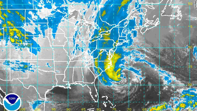
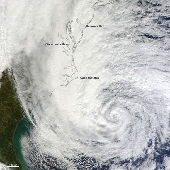
Image Caption: NOAA Satellite image of Hurricane Sandy threatening millions of people living along US Eastern Seaboard. See NASA satellite imagery below. Credit: NOAA

Hurricane Sandy, a powerfully monstrous and unprecedented late season storm, is barreling mightily towards the US Eastern Seaboard, menacing tens of millions of residents living in the path of her sustained destructive winds, rains and life threatening storm surges.

Mandatory mass evacuations involving hundreds of thousands of people are already in progress in anticipation of a devastating storm strike on Monday (Oct 29).

First effects from Sandy are expected on Sunday night (Oct 28) in the New York/ New Jersey/Connecticut/Pennsylvania metropolitan area. Wind gusts are already exceeding 40 MPH as of Sunday afternoon, here in New Jersey – and steadily worsening.

Coastal Wave heights of 6 to 11 feet are predicted – possibly breaking records.

Public transit systems in New York City/New York, New Jersey, Philadelphia, Pennsylvania, Connecticut and Washington, D.C. have been ordered to shut down later today – Sunday – by the Governors’ of the affected states. Most schools and government offices will also be closed on Monday.

Amtrak has just announced it will shutdown trains in the Northeast Corridor.

Image Caption: Hurricane Sandy off the southeastern United States was imaged at noon Eastern Daylight Time (16:00 UT) on October 28, 2012, acquired by the Moderate Resolution Imaging Spectroradiometer (MODIS) on NASA’s Terra satellite. Credit: NASA Terra satellite

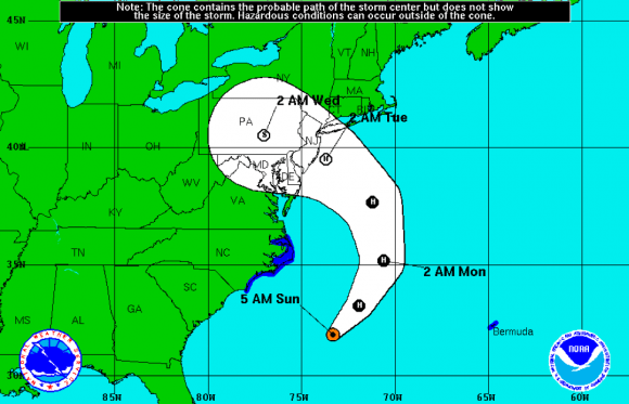
As of Sunday afternoon (Oct. 28) Sandy is predicted to make a dramatic, sharp left hook on Monday morning and most likely will make a violent direct hit slamming somewhere along the Jersey shore which borders from Maryland to New York City and beyond – sending high waves surging into coastal towns and cities overwhelming protective barriers.

Image Caption: Predicted path of Hurricane Sandy. Credit: NOAA

Inland areas will also suffer widespread destruction and power losses as Sandy slowly moves onshore and lingers over an extraordinarily wide path spanning several hundred miles in diameter.

Heavy rains and hurricane force wind gusts will soak the ground, taking down trees and power lines. Leaves may block storm drains.

Hurricane Sandy is currently classified as a Category 1 Hurricane. Its effects could be catastrophic and should not be taken lightly.

Making matters even worse, Sandy will hit during a full moon and the astronomical highest tides.

The National Hurricane Service warns that major flooding effecting millions of homes and businesses is expected along the US East Coast stretching from North Carolina to New England.

Millions and millions of people have more than a 50% chance of losing power.

Local power companies learned hard lessons from the devastating effects of Hurricane Irene just 1 year ago, which caused widespread and serious misery, flooding and deaths throughout the Northeast. Some people went without power for more than 2 weeks in the aftermath of Hurricane Irene in 2011. This author lost power for several days and now we are in for another direct hit.

Additional Power crews have been called in from across the country and prepositioned as a precautionary measure. NEVER touch any downed power lines.

States of Emergency have been declared in 9 eastern States from North Carolina to Maine as well as the District of Columbia.

Mandatory evacuations of low lying coastal areas have been ordered by the Governors’ of New Jersey, New York and Connecticut. State Shelters are being opened now.

Ocean wave heights of 20 to 50 feet have already been reported near the Hurricane’s eye.

Even the US Presidential election is being affected by Hurricane Sandy. Campaign events by both candidates Obama and Romney have been cancelled in several key battleground states. It is possible that polling stations may lose power – and the consequences are unknown on the closely contested election that could hinge on a handful of votes !

Stay tuned to NOAA, NASA and local and national news for continuing Hurricane updates.

Ken Kremer

Manhattan-Sized Ice Island Heads Out to Sea

An “ice island” that calved from the Petermann Glacier in July is seen by NASA satellite (MODIS/Terra)

Remember that enormous slab of ice that broke off Greenland’s Petermann Glacier back in July? It’s now on its way out to sea, a little bit smaller than it was a couple of months ago — but not much. At around 10 miles long and 4.6 miles across (16.25 x 7.5 km) this ice island is actually a bit shorter than Manhattan, but is fully twice as wide.

The image above was acquired on September 14 by the Moderate Resolution Imaging Spectroradiometer (MODIS) aboard NASA’s Terra satellite.

Although the calving of this particular ice island isn’t thought to be a direct result of increasing global temperatures, climate change is thought to be a major factor in this year’s drop in Arctic sea ice extent, which is now below 4.00 million square kilometers (1.54 million square miles). Compared to September conditions in the 1980s and 1990s, this represents a 45% reduction in the area of the Arctic covered by sea ice.

Arctic sea ice extent data for June-July 2012 (NSIDC)

This year sea ice in the Arctic Ocean dropped below the previous all-time record, set in 2007. 2012 also marks the first time that there has been less than 4 million square kilometers (1.54 million square miles) of sea ice since satellite observations began in 1979.

The animation below, released today by the NOAA, shows the 2012 time-series of ice extent using data from the DMSP SSMI/S satellite sensor:

Read more here.