GOCE Data Close Up: Around the World in Lumpy, Geoidy 3-D

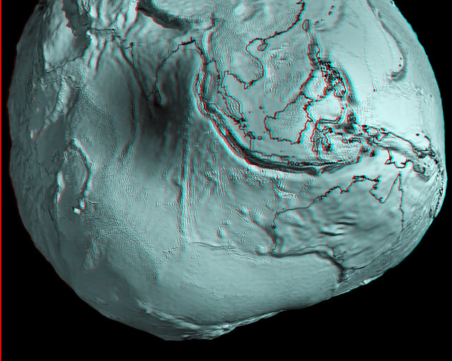
Australia and Asia region of Earth's geoid. Credits: ESA/HPF/DLR, anaglyph by Nathanial Burton-Bradford.

[/caption]

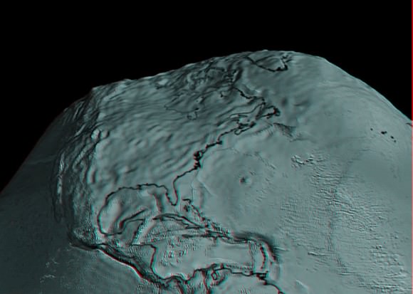
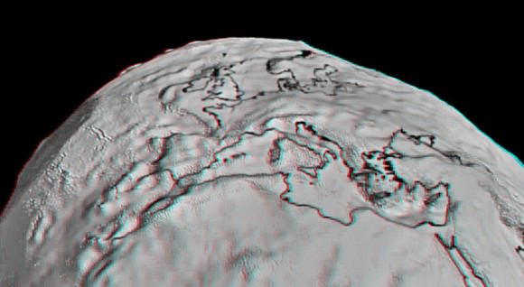
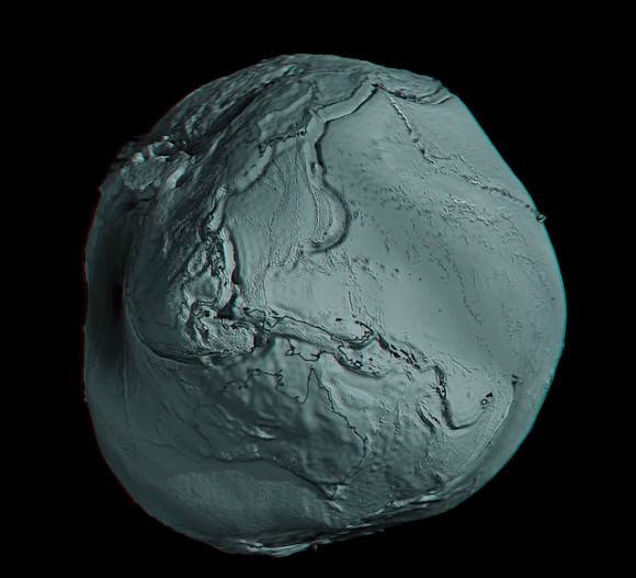
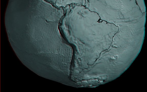
Grab your red/cyan 3-D glasses and take a look at these marvelous new anaglyphs created by Nathanial Burton-Bradford from the latest data from GOCE satellite, showing Earth’s gravity field – or geoid. The geoid is essentially a map of the shape our world would be its surface were covered by water and if gravity were the only thing shaping this global ocean’s surface. These exaggerated views (the surface in the images of the geoid is amplified by a factor 7,000) show the most accurate model of how gravity varies across the planet. Nathanial was able to obtain high-resolution video from Dr. Rune Floberghagen of the GOCE team from which he extracted appropriate frames in order to construct hi-res anaglyph images of numerous longitudes across the globe.

In our previous article about GOCE (Gravity Field and Steady-State Ocean Circulation Explorer), we showed the entire globe and how it looks like a spinning potato. Nathanial’s anaglyphs show close-ups of various parts of the globe. Above is Australia and Asia. Take a trip around the GOCE geoid 3-D world below. Remember, use the red/cyan 3-D glasses to get the full effect!


GOCE view of South America. Credits: ESA/HPF/DLR, anaglyph by Nathanial Burton-Bradford.

GOCE view of the US and Mexico. Credits: ESA/HPF/DLR, anaglyph by Nathanial Burton-Bradford.
GOCE view of Europe. Credits: ESA/HPF/DLR, anaglyph by Nathanial Burton-Bradford.
GOCE view of Africa.. Credits: ESA/HPF/DLR, anaglyph by Nathanial Burton-Bradford.
GOCE global view, 145 East Longitude. Credits: ESA/HPF/DLR, anaglyph by Nathanial Burton-Bradford.
GOCE global view, 140 West Longitude. Credits: ESA/HPF/DLR, anaglyph by Nathanial Burton-Bradford.

Thanks to Nathanial Burton-Bradford for sharing his images. See more at his Flickr page.

Arctic Ozone Levels Reach All-Time Low

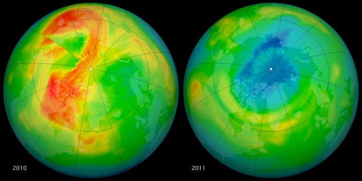
This set of images by the Ozone Monitoring Instrument (OMI) on NASA’s Aura satellite shows March 19, 2010 on the left, and the right shows the same date in 2011. March 2010 had relatively high ozone, while March 2011 has low levels. NASA image by Rob Simmon, with data courtesy of Ozone Hole Watch.

In the past, massive ozone loss over Antarctica has grabbed the headlines. But this year, measurements by several different sources show record levels of stratospheric ozone loss over the Arctic. Scientists say the main reason for the record ozone loss this year is that unusually cold stratospheric temperatures, which have endured later into the season than usual. Scientists say the unusual loss is not catastrophic, but something that needs to be monitored.

The World Meteorological Organization cautioned that people who live in northerly latitudes could get sunburned easier, noting that ozone-depleted air masses extended from the north pole to southern Scandinavia.

The record low temperatures were caused by unusually strong winds, known as the polar vortex, which isolated the atmospheric mass over the North Pole and prevented it from mixing with air in the mid-latitudes.

This has allowed for the formation of polar stratospheric clouds, and the catalytic chemical destruction of ozone molecules occurs on the surface of these clouds which form at 18-25 kilometers height when temperatures drop below -78 C.

[/caption]

This created conditions similar to those that occur every southern hemisphere winter over the Antarctic.
Measurements by ESA’s Envisat satellite, the Ozone Monitoring Instrument (OMI) on NASA’s Aura satellite, and France’s MetOp satellite, as well as observations made since January from the ground and from balloons show all show that 40% of ozone molecules have been destroyed over the Arctic.

Ozone is a protective atmospheric layer found at around 25 km altitude that acts as a sunlight filter shielding life on Earth from harmful ultraviolet rays, which can increase the risk of skin cancer and cataracts in humans and harm marine life.

Stratospheric temperatures in the Arctic usually do vary widely from winter to winter. Last year, temperatures and ozone above the Arctic were very high. The last unusually low stratospheric temperatures over the North Pole were recorded in 1997.

See this link from ESA that shows a animation comparison between 2010 and 2011.

“This depletion is not necessarily a big surprise,” said Paul Newman, an atmospheric scientist and ozone expert at NASA’s Goddard Space Flight Center. “The ozone layer remains vulnerable to large depletions because total stratospheric chlorine levels are still high, in spite of the regulation of ozone-depleting substances by the Montreal Protocol. Chlorine levels are declining slowly because ozone-depleting substances have extremely long lifetimes.”

Ozone “holes” do not form consistently over the North Pole like they do in Antarctica. “Last winter, we had very high lower stratospheric temperatures and ozone levels were very high; this year is just the opposite,” Newman said. “The real question is: Why is this year so dynamically quiet and cold in the stratosphere? That’s a big question with no good answer.”

Scientists will be watching in coming months for possible increases in the intensity of ultraviolet radiation (UV) in the Arctic and mid-latitudes, since ozone is Earth’s natural sunscreen. “We need to wait and see if this will actually happen,” Newman said. “It’s something to look at but it is not catastrophic.”

Scientists are also investigating why the 2011 and 1997 Arctic winters were so cold and whether these random events are statistically linked to global climate change. “In a changing climate, it is expected that on average stratospheric temperatures cool, which means more chemical ozone depletion will occur,” said Mark Weber from the University of Bremen.

Experts say that on a global scale, the ozone layer is still on a long-term course for recovery. But for decades to come, there remains a risk of major ozone losses on yearly or regional scales.

Sources: Nature, ESA, NASA, The Independant Science Daily Earth/Sky Blog

New Results from GOCE: Earth is a Rotating Potato

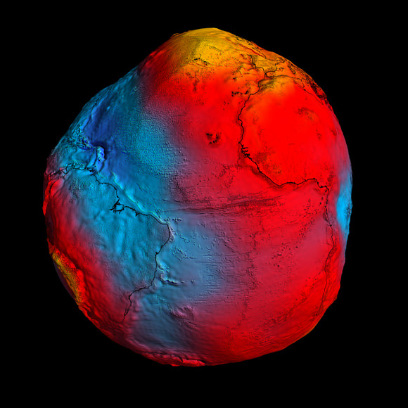
In this GOCE image, gravity is strongest in yellow areas; it is weakest in blue ones. Credit: ESA

Although they aren’t particularly fond of the comparison, scientists from the GOCE satellite team had to admit that new data showing Earth’s gravity field – or geoid — makes our planet look like a rotating potato. After just two years in orbit, ESA’s sleek and sexy GOCE satellite (Gravity Field and Steady-State Ocean Circulation Explorer) has gathered sufficient data to map Earth’s gravity with unrivalled precision. While our world certainly doesn’t look like a spinning tuber, this exaggerated view shows the most accurate model of how gravity varies across the planet.

The geoid is nothing more than how the oceans would vary if there were no other forces besides gravity acting on our planet.

“If we had an homogeneous sphere, it would be a boring sphere,” said GOCE scientist Roland Pail from Technical University in Munich, speaking at the press briefing today. “But due to rotation, you get a flattening of the Earth, and we have topography such as mountains, and irregular mass distribution in Earth’s interior. What we are showing you here, in principle, is the gravity field by any deviations due to inhomogeneous mass distributions on the Earth and the Earth’s interior.”

[/caption]

While a previous gravity satellite, the Gravity Recovery And Climate Experiment (GRACE) operated for 8 years, most of the new data from GOCE was gathered in about 14 months, and provides data where there was none before.

GOCE is able to sense tiny variations in the pull of gravity over Earth, and the data is used to construct an idealized surface, which traces gravity lumps and bumps, and is the shape the oceans would take without winds, currents, Earth’s rotation and other forces.

By comparing sea level and geoid data, GOCE is revealing data on ocean currents and circulation, sea-level change, ice dynamics, said Rory Bingham, from the University of Newcastle, which helps understand heat transport and the changing climate.

But also of interest is how GOCE data reveals shifting tectonic plates in earthquakes and magma movements under volcanoes. Following the earthquakes in Japan, scientists are looking closely, as the data should reveal a three-dimensional view of what was going on inside the Earth. Even though the motion cannot be observed directly from space, earthquakes create signatures in gravity data, which could be used to understand the processes leading to these natural disasters and ultimately help to predict them.

“Even though these quakes resulted from big movements in the Earth, at the altitude of the satellite the signals are very small. But we should still seem them in the data,” said Dr. Johannes Bouman from the German Geodetic Research Institute.

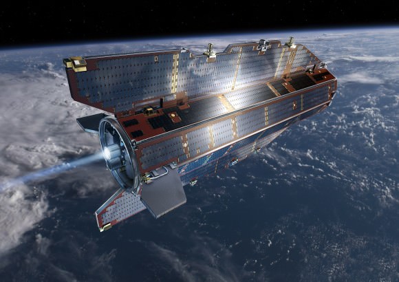
GOCE in orbit. Credit: ESA

“GOCE will give us dynamic topography and circulation patterns of the oceans with unprecedented quality and resolution,” said professor Reiner Rummel, former Head of the Institute for Astronomical and Physical Geodesy at the Technische Universität München. “I am confident that these results will help improve our understanding of the dynamics of world oceans.”

“You could say that, at its early conception, GOCE was more like science fiction,” said Volker Liebig, Director of ESA’s Earth Observation Program. “GOCE has now clearly demonstrated that it is a state-of-the-art mission.”

Sources: GOCE press briefing, ESA press release

From the Earth and Moon (and Russia) With Love

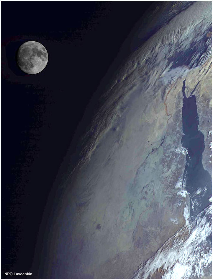
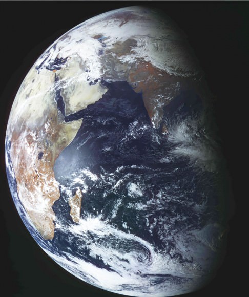
Russia's Elektro-L spacecraft captured this view of the Moon over the Red Sea region of the Earth. Credit: NPO Lavochkin

[/caption]

This stunning picture of the Moon and Earth was taken by Russia’s new Elektro-L spacecraft, a weather-forecasting satellite that launched in January 2011. This is the first major spacecraft developed in post-Soviet Russia, and it is designed to give Russian meteorologists the ability to watch the entire disk of the planet, thanks to the satellite’s position in the geostationary orbit 36,000 kilometers above the equator. The clarity of the images is fantastic, as you can see in another image of just the Earth, below. The Elektro-L is designed to last at least a decade, and will enable local and global weather forecasting, analysis of oceanic conditions, as well as space weather monitoring, such as measurements of solar radiation, properties of Earth’s ionosphere and magnetic field.

On Feb. 26, 2011, at 14:30 Moscow Time, the Elektro-L satellite produced its first breathtaking image of the home planet. Credit: NPO Lavochkin

Learn more about the Elektro-L mission at their website.

h/t: SDO Facebook page.

Scientists Predict Arctic Could Be Ice-Free Within Decades

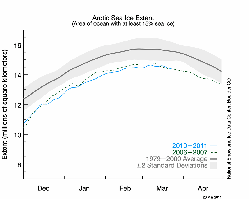
Sea ice data through mid- March 2011. Credit: National Snow and Ice Data Center

[/caption]

Bad news for what is now the beginning of the “melt season” in the Arctic. Right now, the sea ice extent maximum appears to be tied for the lowest ever measured by satellites as the spring begins, according to scientists at the University of Colorado Boulder’s National Snow and Ice Data Center. And because of the trend of how the amount of Arctic sea ice has been spiraling downward in the last decade, some scientists are predicting the Arctic Ocean may be ice free in the summers within the next several decades.

“I’m not surprised by the new data because we’ve seen a downward trend in winter sea ice extent for some time now,” said Walt Meier, a research scienitist with the NSIDC.

The seven lowest maximum Arctic sea ice extents measured by satellites all have occurred in the last seven years, and the from the latest data, the NSIDC research team believes the lowest annual maximum ice extent of 5,650,000 square miles occurred on March 7 of this year.

The maximum ice extent was 463,000 square miles below the 1979-2000 average, an area slightly larger than the states of Texas and California combined. The 2011 measurements were tied with those from 2006 as the lowest maximum sea ice extents measured since satellite record keeping began in 1979.

Virtually all climate scientists believe shrinking Arctic sea ice is tied to warming temperatures in the region caused by an increase in human-produced greenhouse gases being pumped into Earth’s atmosphere.

Meier said the Arctic sea ice functions like an air conditioner for the global climate system by naturally cooling air and water masses, playing a key role in ocean circulation and reflecting solar radiation back into space. In the Arctic summer months, sunlight is absorbed by the growing amounts of open water, raising surface temperatures and causing more ice to melt.

“I think one of the reasons the Arctic sea ice maximum extent is declining is that the autumn ice growth is delayed by warmer temperatures and the ice extent is not able to ‘catch up’ through the winter,” said Meier. “In addition, the clock runs out on the annual ice growth season as temperatures start to rise along with the sun during the spring months.”

Since satellite record keeping began in 1979, the maximum Arctic sea ice extent has occurred as early as Feb. 18 and as late as March 31, with an average date of March 6. Since the researchers determine the maximum sea ice extent using a five-day running average, there is small chance the data could change.

As of March 22, ice extent declined for five straight days. But February and March tend to be quite variable, so there is still a chance that the ice extent could expand again. Ice near the edge is thin and is highly sensitive to weather, scientists say, moving or melting quickly in response to changing winds and temperatures, and it often oscillates near the maximum extent for several days or weeks, as it has done this year.

In early April the NSIDC will issue a formal announcement on the 2011 maximum sea ice extent with a full analysis of the winter ice growth season, including graphics comparing 2011 to the long-term record.

Source: NSIDC, University of Colorado-Boulder

NASA: Happy St. Paddy’s Day!

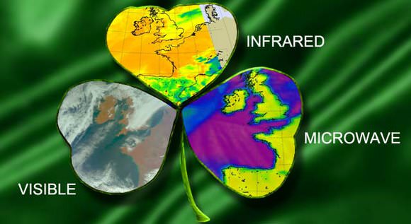
Collection of Ireland images, captured from the AIRS instrument onboard NASA's Aqua satellite on March 3. Credit: NASA JPL, Ed Olsen/ Henry Kline

[/caption]

With the luck o’ the Irish, NASA’s Aqua satellite was fortunate to capture mostly clear views of the Emerald Isle in these near-infrared/visible, infrared and microwave light views acquired by Aqua’s Atmospheric Infrared Sounder (AIRS) instrument. And with holiday flair, the agency has arranged the images into a clover and released them as a St. Paddy’s Day treat.

From the press release:

Ireland, located in the Atlantic Ocean, is the third-largest island in Europe, and originated the St. Patrick’s Day holiday. Located west of Great Britain and separated from it by the Irish Sea, it is surrounded by hundreds of islands and islets. In March, Ireland’s average daytime high temperature is near 9.4 degrees Celsius (49 degrees Fahrenheit) and its average nighttime low temperature is near 3.3 degrees Celsius (38 degrees Fahrenheit).

The AIRS instrument measures temperatures of land, sea and air to provide a better understanding of what is happening in those environments. The March 3 images reveal temperatures near the surface that were near normal for this time of year.

NASA’s Aqua satellite circles Earth pole-to-pole 15 times a day in a sun-synchronous orbit to provide data and images to researchers in Earth, ocean and atmospheric sciences. When Aqua passed over Ireland on March 3, it captured visible, infrared and microwave images: a clover of images from one instrument.

The false-color near-infrared/visible image revealed a mostly cloud-free country, except for the northernmost area, as a cold front approached from the west. Also visible were some of the navigable rivers that extend inland.

The visible image also showed areas over the North Sea, Spain and the French-Italian border region where the clouds were heavy enough to confine AIRS infrared data to the higher regions of the atmosphere above the cloud tops. Over the Pyrenees at the Spanish-French border and the Alps at the French-Italian border, the clouds were heavy enough (and contained some precipitation) so that the surface is not visible even using the microwave wavelength.

The infrared image showed that the clouds approaching Ireland from the west were low clouds associated with the cold front moving east. There were no areas of high, cold clouds that would indicate convection and the possibility of thunderstorms. “The brightness temperature of the island is approximately 283 Kelvin, which amounts to 10 degrees Celsius or 50 degrees Fahrenheit,” said Ed Olsen of NASA’s Jet Propulsion Laboratory in Pasadena, Calif. Olsen provides images for the AIRS instrument. “This brightness temperature is a combination of the temperature of the near-surface air temperature and the (land) surface temperature. This is close to the ambient temperature that the population there experienced outdoors.”

The microwave brightness temperature is a bit colder than the infrared temperature data, approximately 273 Kelvin, which is just at the freezing point for water (0 degrees Celsius/32 degrees Fahrenheit). Olsen noted, “The major component of the 89 gigahertz radiances is due to emissions from the surface to about a centimeter below the surface.” He said the temperature of the ground just below the (land surface) that is warmed by the sun is colder–after all, it is still winter in Ireland.

AIRS infrared data can measure cold, high cloud tops in thunderstorms and tropical cyclones, warm or cold ocean waters and land surfaces. Cloud top temperatures, for example, provide clues to scientists about the power of the thunderstorms. The colder the clouds are, the higher they are, and the more powerful the thunderstorms. When AIRS measures cloud temperatures as cold as or colder than minus 52 degrees Celsius (minus 63 degrees Fahrenheit), that indicates high cloud tops, strong convection and the likelihood of powerful thunderstorms.

Data from the Advanced Microwave Sounding Unit (AMSU), another of the AIRS suite of instruments on Aqua, are used to create microwave images. Cold areas in AMSU images can indicate where there is precipitation or ice in cloud tops.

Every day, NASA’s Aqua satellite looks at conditions around the globe, just like looking over a clover (in this case, a three-leafed or imaged one) that it looked at before.

Source: NASA release, via Eurekalert
Satellite Photos Before and After of Japan’s Earthquake, Tsunami

Sendai, Japan after the disaster. Satellite image courtesy of GeoEye.

[/caption]

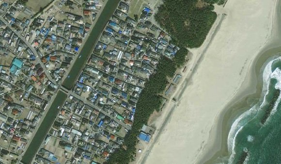
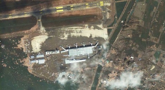
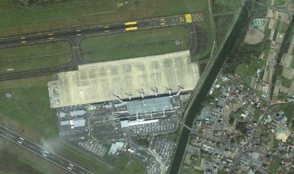
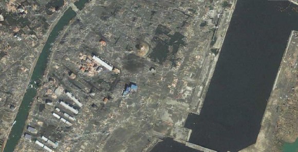
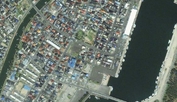
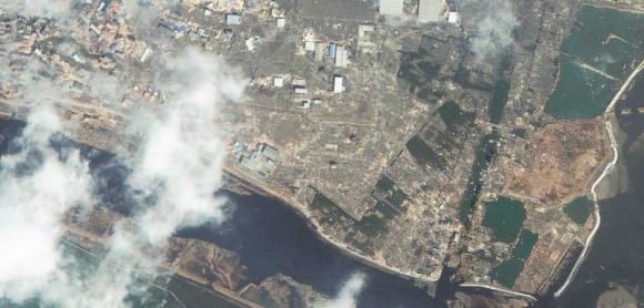
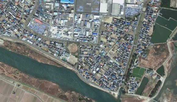
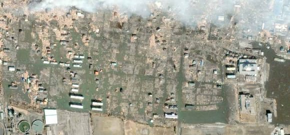
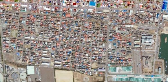
Photos from the GeoEye satellite imaging company from before and after the March 11 earthquake and tsunami in Japan show sobering views from above of the disaster. Above is the town of Sendai, Japan after the quake, below is how it looked before catastrophe struck.

Arahama, Japan before the disaster. Satellite image courtesy of GeoEye.

See more below.

The Sendai Airport after the disaster. Satellite image courtesy of GeoEye.
The Sendai Airport in August of 2010. Satellite image courtesy of GeoEye.
Yuriage, Japan on March 12, 2011. Satellite image courtesy of GeoEye.
Yuriage, Japan on April 4, 2010. Satellite image courtesy of GeoEye.
Sendai, Japan on March 12, 2011. Satellite image courtesy of GeoEye.
Sendai, Japan on April 4, 2010. Satellite image courtesy of GeoEye.
Ishinomaki, Japan on March 12, 2011. Satellite image courtesy of GeoEye.
Ishinomaki, Japan on April 4, 2010. Satellite image courtesy of GeoEye.

Below is an images from the MODIS Rapid Response System, which is producing twice-daily images of Japan in response to the disaster.

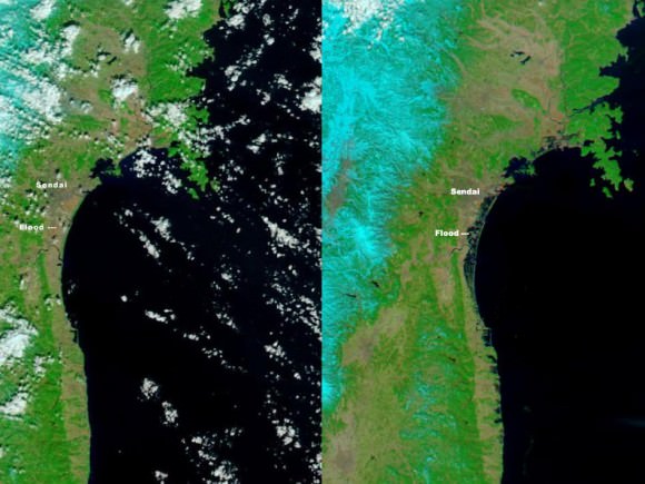
The Moderate Resolution Imaging Spectroradiometer (MODIS) on NASA’s Aqua satellite took the right image on Mar. 13, 2011, while the MODIS sensor on NASA’s Terra satellite took the left image on Feb 26, 2011. NASA images courtesy the MODIS Rapid Response Team at NASA GSFC.

These two images, from the MODIS instrument on NASA’s Aqua satellite from Mar. 13, 2011 on the right, and the the MODIS sensor on NASA’s Terra satellite from Feb. 26, 2011 on the left before the earthquake and tsunami. Both images were made with infrared and visible light to highlight the presence of water on the ground. Plant-covered land is bright green, bare earth is tan-pink, and snow is blue. The city of Sendai is brown.

At this level of detail, the flooding along the coastline is the most obvious sign of the destructive earthquake and tsunami that struck Japan on March 11. A bright orange-red spot near the city of Sendai is the thermal signature from a fire, also likely caused by the earthquake. The photo-like true-color version of the image shows a plume of black smoke extending east over the ocean.

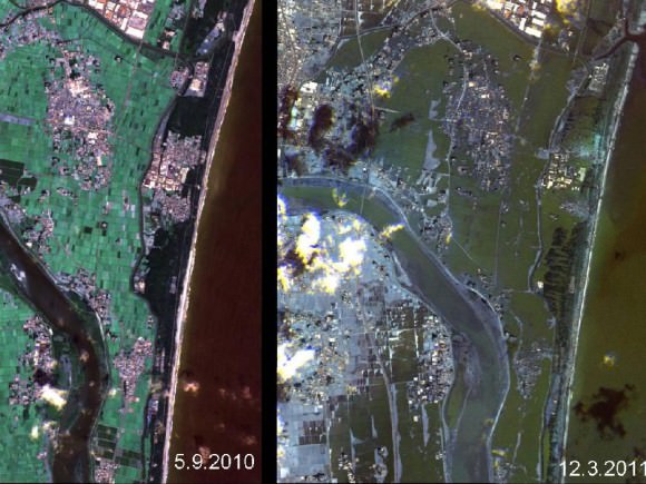
The German Aerospace Center (Deutsches Zentrum fur Luft- und Raumfahrt; DLR) is responding through its Center for Satellite Based Crisis Information (Zentrum fur Satellitengestutzte Kriseninformation; ZKI), based at its site in Oberpfaffenhofen, and provided the image below.

Japan's Coastline Before and After the Tsunami These images show the effects of the tsunami on Japan's coastline. The image on the left was taken on Sept. 5, 2010; the image on the right was taken on March 12, 2011, one day after an earthquake and resulting tsunami struck the island nation. Image Credit: German Aerospace Center (DLR)/Rapid Eye

Sources: GeoEye, New York Times, NASA, Space Daily

As Seen from Space: Ghostly, Ethereal Island

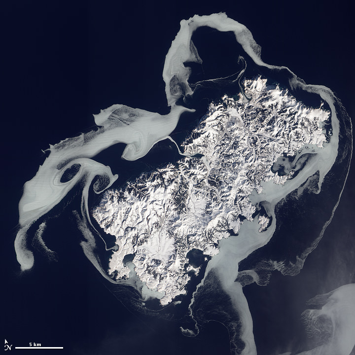
The volcanic island Ostrov Shikotan as seen by The Advanced Land Imager (ALI) on NASA’s Earth Observing-1 (EO-1) satellite.

[/caption]

Looking rather otherworldly, this haunting view of Shikotan-to island shows ghostly swirls of sea ice surrounding the snow-covered volcanic island. Also known as Ostrov Shikotan, this island is at the southern end of a volcanic archipelago called the Kuril Chain, which is part of the Pacific Ring of Fire. The chain stretches approximately 1,300 km (810 mi) northeast from Japan, off the coast of Russia. The Advanced Land Imager (ALI) on NASA’s Earth Observing-1 (EO-1) satellite captured this natural-color image of Shikotan on February 14, 2011.

When the ice around the island forms, it is shaped by the moving currents – giving it a swirly appearance. North of the western end of Shikotan, eddies have shaped the ice into rough circles.

The island’s rugged appearance comes from millions of years of volcanic and seismic activity, multiple tsunamis, and weathering from wind and rain. The total land area of Shikotan is 225 square km.

Although this island is a part of Russia, Japan maintains a claim to it as well. And although you wouldn’t guess it from this image, there are two different settlements of about 1,000 people each. The name of Shikotan derives from an ancient Japanese dialect and means “land with big communities.”

See a larger version of the image at NASA’s Earth Observatory website.

Mysterious Noctilucent Clouds As Seen from Space

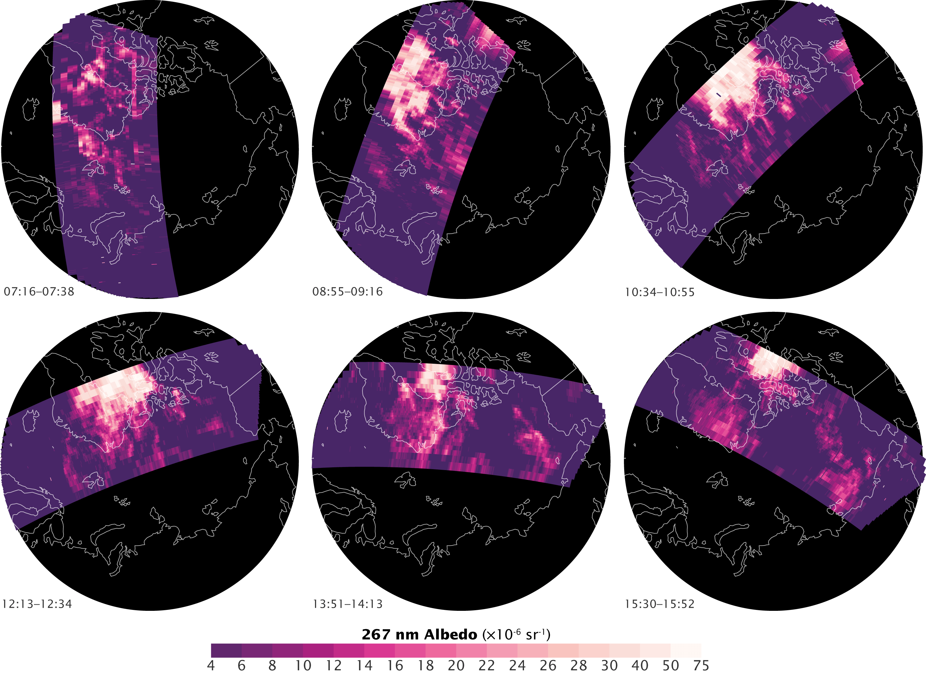
Polar mesospheric clouds (PMCs) observed by the Ozone Monitoring Instrument (OMI) on the Aura satellite. Maps by Robert Simmon. Credit: NAS

[/caption]

Mysterious “night shining” or noctilucent clouds are beautiful to behold, and are usually seen during the summertime, appearing at sunset. They are thin, wavy ice clouds that form at very high altitudes and reflect sunlight long after the Sun has dropped below the horizon. Scientists don’t know exactly why they form, but continue to observe them – both from Earth and from space. These images were taken by the Ozone Monitoring Instrument (OMI) on NASA’s Aura satellite.

Also called polar mesospheric clouds, they are puzzling scientists with their recent dramatic changes. They used to be considered rare, but now the clouds are growing brighter, are seen more frequently, are visible at lower and lower latitudes than ever before, and — as these satellite image reveal — they are now even appearing during the day.

Noctilucent clouds over Kendal Castle, England in June 2010. Credit: Stuart Atkinson

Noctilucent clouds form in an upper layer of the Earth‘s atmosphere called the mesosphere during the Northern Hemisphere’s summer – at an altitude of 80 km (50 miles). They can start forming as early as May, and extend through August. They can also be seen in high latitudes during the summer months in the Southern Hemisphere.

What could the observed changes mean? Some scientists believe they are a good gauge of even the tiniest changes in the atmosphere, as they are extremely sensitive to changes in atmospheric water vapor and temperature. The clouds form only when temperatures drop below -130 degrees Celsius (-200 Fahrenheit), when the scant amount of water high in the atmosphere freezes into ice clouds.

Scientist Matthew DeLand of Science Systems and Applications Inc. and NASA’s Goddard Space Flight Center has been monitoring polar mesospheric clouds with instruments that were actually designed to study ozone, including the OMI, which provides more detailed and frequent observations than previous instruments. This gives DeLand a way to refine his previous measurements of a long-term trend towards more and brighter noctilucent clouds linked to rising greenhouse gases.

These images at the top of this article show OMI measurements of polar mesospheric clouds on July 10, 2007. The clouds, detectable because they are the only things that reflect light in this part of the atmosphere, are shown in white and pink. The Aura satellite travels in a polar orbit, circling from south to north as the Earth turns beneath it. As a result, the satellite gets several opportunities to image the poles every day. This series of images shows the clouds over six consecutive orbits between 7:16 and 15:52 Universal Time. Throughout the day, a wide area of polar mesospheric clouds developed over northern Greenland and Canada, peaking around 10:30 UTC (the third orbit).

Another instrument observing these clouds is the Solar Backscatter Ultraviolet (SBUV) instruments, which have flown on seven different satellites over the past 32 years, and that wealth of data is showing how the clouds change throughout the day.

DeLand now has an index to help correct the SBUV measurement trends to account for the time of day. The correction allows him to develop a more accurate view of the long-term trend. Even with the corrections, the trend indicates that the atmosphere has been responding to increased greenhouse gases over the past 30 years.

The fact that polar mesospheric clouds are getting brighter suggests that the mesosphere is getting colder and more humid, says DeLand. Increasing greenhouse gases in the atmosphere could account for both phenomena.

Sources: NASA Earth Observatory, twice

Videos: Two Different Satellite Views of the Big Snowstorm of 2011

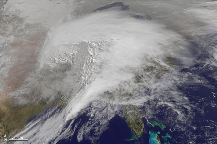
Here's an image from the top animation, the storm as seen on January 31, 2011

To speak in the vernacular of the peasantry, this storm was a whopper. Heavy snow, ice, freezing rain, and frigid wind battered about two thirds of the United States, making it “a winter storm of historic proportions,” said the National Weather Service. This animation—made with images from the NOAA-NASA GOES 13 satellite—shows the giant storm developing and moving across the country between January 31 and February 2. Below is another video view from GOES-East satellite, which includes infrared water vapor imagery from January 29 -February 1, 2011.

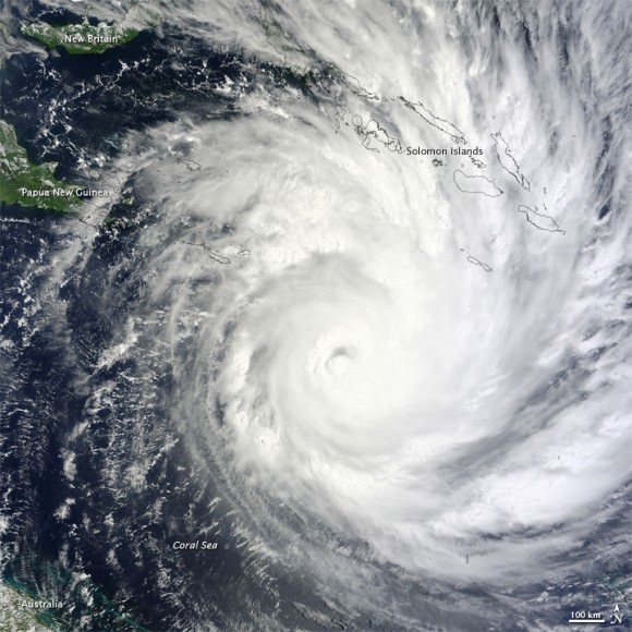
And there’s also an update on Cyclone Yasi.

[/caption]

Cyclone Yasi as seen on Feb. 1, 2011 from The Moderate Resolution Imaging Spectroradiometer (MODIS) on NASA’s Terra satellite

Yasi weakened after coming ashore early on Thursday morning but was still strong enough to produce high winds and tidal surges that sent waves crashing deep into seaside communities. Thankfully, so far no lives have been lost because of this storm. Officials said lives were saved because after days of dire warnings people heeded directions to flee to evacuation centers or bunker themselves at home. Track the storm on WeatherUnderground, and read more on the latest news from Yasi on The Guardian.

Sources: NASA Earth Observatory, SolarWatcher, The Guardian