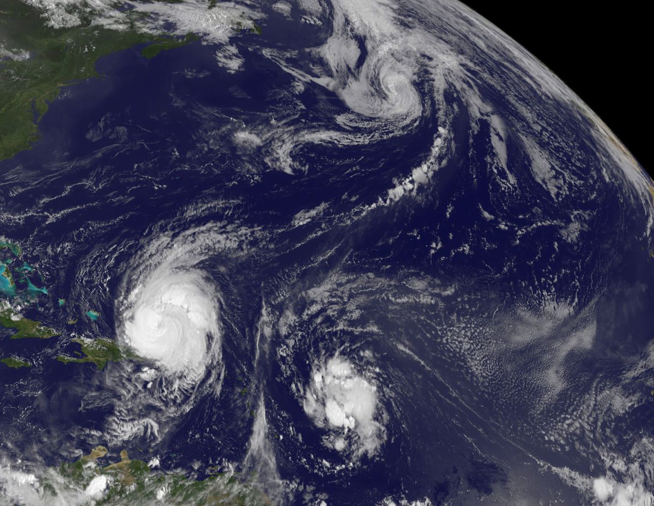
Satellite Captures Three Tropical Cyclones in One Image

Hurricane Earl (lower left), Tropical Storm Fiona located to Earl's east, and Tropical Storm Danielle far in the Northern Atlantic. Credit: NASA/GOES Project

[/caption]

My father had a favorite adage when life was hectic: “There’s lots of commotion in the ocean.” That saying was never more true than the current situation in the busy Atlantic Ocean. The GOES-13 satellite captured this image earlier today (Tuesday Aug. 31) and visible are three areas of tropical commotion. The large and powerful Hurricane Earl (lower left) is passing Puerto Rico, Tropical Storm Fiona located to Earl’s east, and Tropical Storm Danielle far in the Northern Atlantic. Below is footage taken by the International Space Station of the action.

Hurricane Earl is a storm that’s about 640 km (400 miles) in diameter and the hurricane force winds are about 225 km (140 miles) in diameter from side-to-side of the storm’s eye. Earl is still a Category Four hurricane on the Saffir-Simpson scale, one category stronger than Hurricane Katrina was when she made landfall in Mississippi in 2005.

A tropical storm warning is in effect for Turks and Caicos Islands and a tropical storm watch is in effect for the southeastern Bahamas. Meanwhile, residents from the Carolinas northward to New England in the US should be watchful of where Earl is heading. A hurricane watch could be required for portions of the mid-Atlantic coast later today.

Tropical Storm Fiona is moving through the same areas that Hurricane Earl battered a few days ago, but with less force. A tropical storm warning is in effect for St. Martin and St. Barthelemy. A tropical storm watch is in effect for, Antigua, Barbuda, Montserrat, St. Kitts, Nevis, and Anguilla and St. Maarten, Saba, and St. Eustatius. The National Hurricane Center noted in its forecast this morning, August 31, that Tropical storm conditions could spread over portions of the Northern Leeward Islands tonight or early Wednesday.

At 11 a.m. EDT, Tropical Storm Fiona had maximum sustained winds near 65 kph (40 mph) and some strengthening is possible. Fiona is moving west-northwest near 38 kph (24 mph) and is expected to slow down.

Tropical cyclones are warm-core systems, so when the core temperatures change, the dynamics of the system also changes. Today, Danielle transitioned into a cold-core low pressure area in the Northern Atlantic Ocean. Her sustained winds were near 112 kph (70 mph), but waning.

Danielle’s effects are being felt along the shores of Newfoundland with heavy surf and waves up to 3 meters (10 feet).

The Geostationary Operational Environmental Satellite project was developed by NASA for the National Oceanic and Atmospheric Administration (NOAA). The GOES satellites are funded by NOAA, while the Goddard Space Flight Center procures and manages the development and launch of the GOES satellites while NOAA manages the operational environmental satellite program and establishes requirements, provides all funding and distributes environmental satellite data for the United States.

Source: NASA

Time Lapse Video of Earth from Space

This time lapse footage was taken by astronaut Don Pettit — of Saturday Morning Science and the Zero-G coffee cup fame — during his time on the International Space Station. It shows Earth from day to night and back to day again. Pettit was on the ISS from November 23, 2002 to May 3, 2003, so he was in space when the Columbia accident happened. Pettit is one of the most interesting and quirkier astronauts and I hope he gets to return to the ISS. is scheduled to return to the ISS in 2011 (thanks to Ben H. for clarifying — see comments). This video provides some great views of Earth, especially at night, that can’t be captured with a regular video shot. Stunning.

via @wiredscience on Twitter

James Cameron and ‘Avatar’ Help Promote NASA’s Exploration

Can’t get enough of “Avatar?” Now, you can see James Cameron and scenes from the 3-D epic on NASA TV and elsewhere, promoting the many contributions of NASA’s Earth science program that helps enable exploration of our home planet, as well as making the public more environmentally aware. NASA has 14 science satellites in orbit making cutting-edge global observations of the entire global system including the atmosphere, oceans, land surface, snow and ice.

“When NASA ventures into space, it remembers to keep a steady eye on home,” Cameron said. “Its fleet of Earth-orbiting satellites constantly reveals our whole planet: its remotest places, its mysteries and the powerful influence of humans.”

The movie “Avatar,” depicts the fictional planet of Pandora and is coming back to theaters this week. The story centers on a beautiful planet threatened by forces that want to exploit its natural resources.

Satellite Data Show Plant Growth is Declining on Earth

Caption: A snapshot of Earth's plant productivity in 2003 shows regions of increased productivity (green) and decreased productivity (red). Credit: NASA Goddard Space Flight Center Scientific Visualization Studio

[/caption]

One idea about climate change suggested that higher temperatures would boost plant growth and food production. That may have been a trend for awhile, where plant growth flourished with a longer growing season, but the latest analysis of satellite data shows that rising global temperatures has reached a tipping point where instead of being beneficial, higher temperatures are causing drought, which is now decreasing plant growth on a planetary scale. This could impact food security, biofuels, and the global carbon cycle. “This is a pretty serious warning that warmer temperatures are not going to endlessly improve plant growth,” said Steven Running from the University of Montana.

During the 1980s and 1990s global terrestrial plant productivity increased as much as six percent. Scientists say that happened because during that time, temperature, solar radiation and water availability — influenced by climate change — were favorable for growth.

During the past ten years, the decline in global plant growth is slight – just one percent. But it may signify a trend.

Interannual shifts in plant productivity (green line) 
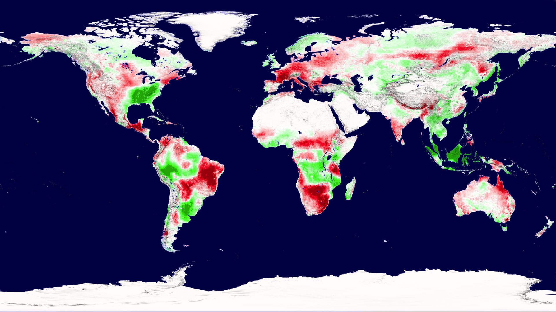
fluctuated in step with shifts in atmospheric carbon dioxide (red line) between 2000 through 2009. Credit: Maosheng Zhao and Steven Running

“These results are extraordinarily significant because they show that the global net effect of climatic warming on the productivity of terrestrial vegetation need not be positive — as was documented for the 1980’s and 1990’s,” said Diane Wickland, of NASA Headquarters and manager of NASA’s Terrestrial Ecology research program.

A 2003 paper in Science led by then University of Montana scientist Ramakrishna Nemani (now at NASA Ames Research Center, Moffett Field, Calif.) showed that land plant productivity was on the rise.
Running and co-author Maosheng Zhao originally set out to update Nemani’s analysis, expecing to see similar results as global average temperatures have continued to climb. Instead, they found that the impact of regional drought overwhelmed the positive influence of a longer growing season, driving down global plant productivity between 2000 and 2009.

The discovery comes from an analysis of plant productivity data from the Moderate Resolution Imaging Spectroradiometer (MODIS) on NASA’s Terra satellite, combined with growing season climate variables including temperature, solar radiation and water. The plant and climate data are factored into an algorithm that describes constraints on plant growth at different geographical locations.

For example, growth is generally limited in high latitudes by temperature and in deserts by water. But regional limitations can vary in their degree of impact on growth throughout the growing season.

Zhao and Running’s analysis showed that since 2000, high-latitude northern hemisphere ecosystems have continued to benefit from warmer temperatures and a longer growing season. But that effect was offset by warming-associated drought that limited growth in the southern hemisphere, resulting in a net global loss of land productivity.

“This past decade’s net decline in terrestrial productivity illustrates that a complex interplay between temperature, rainfall, cloudiness, and carbon dioxide, probably in combination with other factors such as nutrients and land management, will determine future patterns and trends in productivity,” Wickland said.
The researchers plan on maintaining a record of the trends into the future. For one reason, plants act as a carbon dioxide “sink,” and shifting plant productivity is linked to shifting levels of the greenhouse gas in the atmosphere. Also, stresses on plant growth could challenge food production.

“The potential that future warming would cause additional declines does not bode well for the ability of the biosphere to support multiple societal demands for agricultural production, fiber needs, and increasingly, biofuel production,” Zhao said.

“Even if the declining trend of the past decade does not continue, managing forests and croplands for multiple benefits to include food production, biofuel harvest, and carbon storage may become exceedingly challenging in light of the possible impacts of such decadal-scale changes,” Wickland said.

The team published their findings Aug. 20 in Science.

Source: NASA

MESSENGER Looks Back at the Earth and Moon

Earth and Moon from 114 Million Miles.Credit: NASA/Johns Hopkins University Applied Physics Laboratory/Carnegie Institution of Washington

[/caption]

A new image to add to the family photo album! The MESSENGER spacecraft is working its way to enter orbit around Mercury in March of 2011, and while wending its way, took this image of the Earth and Moon, visible in the lower left. When the image was taken in May 2010, MESSENGER was 183 million kilometers (114 million miles) away from Earth. For context, the average separation between the Earth and the Sun is about 150 million kilometers (93 million miles). It’s a thought provoking image (every one of us is in that image!), just like other Earth-Moon photos — Fraser put together a gallery of Earth-Moon images from other worlds, and this one will have to be added. But this image was taken not just for the aesthetics.

This image was taken as part of MESSENGER’s campaign to search for vulcanoids, small rocky objects hypothesized to exist in orbits between Mercury and the Sun. Though no vulcanoids have yet been detected, the MESSENGER spacecraft is in a unique position to look for smaller and fainter vulcanoids than has ever before been possible. MESSENGER’s vulcanoid searches occur near perihelion passages, when the spacecraft’s orbit brings it closest to the Sun. August 17, 2010 was another such perihelion, so if MESSENGER was successful in finding any tiny asteroids lurking close to the Sun, we may hear about it soon.

Source: MESSENGER

What is Causing Weather Extremes in 2010?

Wildfires in Russia as seen from space by ESA's Envisat satellite. Credit: ESA

[/caption]

Massive rains in Pakistan, China and Iowa in the US. Drought, heat and unprecedented fires in Russia and western Canada. 2010 is going down as the year of crazy, extreme weather. Is this just a wacky year or a trend of things to come? According to meteorologists, unusual holding patterns in the jet stream in the northern hemisphere are to blame for the extreme weather in Pakistan and Russia. But also, the World Meteorological Organization and other scientists say this type of weather fits patterns predicted by climate scientists, and could be the result of climate change.

“All these things are the kinds of things we would expect to happen as the planet warms up,” said Tom Wagner, a NASA scientist who studies the cryosphere, during an interview on CNN on August 11. “And we are seeing that the planet is warming about .35 degrees per decade. Places like Greenland are warming even faster, like 3.5 degrees per decade. And all these events from heat waves to stronger monsoons, to loss of ice are all consistent with that. Where it gets a little tricky is assigning any specific event to say, the cause of this event is definitely global warming, that is where we get to the edge of the research.”

“This weather is very unusual but there are always extremes every year,” said Andrew Watson from the University of East Anglia’s Environmental Studies. “We can never say that weather in a single year is unequivocal evidence of climate change, if you get many years of extreme weather then that can point to climate change.”

The Intergovernmental Panel on Climate Change (IPCC) has long predicted that rising global temperatures would produce more frequent and intense heat waves, and more severe rainfalls. In its 2007 report, the panel said these trends have already been observed, with an increase in heat waves since 1950, for example.

NOAA measurements show that the combined global surface temperatures for June 2010 are the warmest on record, and Wagner said there are larger conclusions to be drawn from the definite global warming trend. “We are seeing things that haven’t really happened before on the planet, like warming at this specific rate. We think it is very well tied to increasing carbon dioxide in the atmosphere since the late 1800’s caused by humans.”

This graph, based on the comparison of atmospheric samples contained in ice cores and more recent direct measurements, provides evidence that atmospheric CO2 has increased since the Industrial Revolution. (Source: NOAA)

Graphs on NASA’s climate website show an undeniable rise in global temperatures, sea levels, and carbon dioxide levels. See more of these graphs here.

“Not just over 10 years, but we have satellites images, weather station records and other good records going back to the late 1800’s that tells us all about how the planet is warming up,” Wagner said. “Not only that but we have evidence from geologic records, ice cores, and sediment cores from ocean cores. All of this feeds together to show us how the planet is changing.”

Asked if the cycle can be reversed, Wagner replied, “That is the million dollar question. One thing we have to think about is that the planet is changing and we have to deal with that. Ice around Antarctica and Greenland is melting. Sea level is rising right now at 3 millimeters a year. If you just extrapolate that to 100 years, it will rise to at least a foot of sea level rise. But there is the possibility it could be more than that. These are the types of things we need to think about and come up with mitigation strategies to deal with them. We’re doing the research to try and nail down these questions a little more tightly to see how much sea level is going to rise, how much temperatures are going to rise and how are weather patterns going to change.”

Reducing emissions is one thing that everyone can do to help protect the planet and the climate, and climate experts have been saying for years that there needs to be sharp cutbacks in emissions of carbon dioxide and other heat-trapping gases that go into the atmosphere from automobiles, power plants, and other fossil fuel-burning industrial and residential sources.

In the news this week was the huge ice chunk coming loose from a Greenland glacier. Not only is this an indication of warming water, but other problems could develop, such as the large ice chunks getting in the way of shipping lanes or heading towards oil rigs. The high temperatures and fires in Russia are affecting big percentage of the world’s wheat production, and could have an effect on our food supply this coming year.

Not only that, but the wildfires have created a noxious soup of air pollution that is affecting life far beyond just the local regions, JPL reports. Among the pollutants created by wildfires is carbon monoxide, a gas that can pose a variety of health risks at ground level. Carbon monoxide is also an ingredient in the production of ground-level ozone, which causes numerous respiratory problems. As the carbon monoxide from these wildfires is lofted into the atmosphere, it becomes caught in the lower bounds of the mid-latitude jet stream, which swiftly transports it around the globe.

Two movies were created using continuously updated data from the “Eyes on the Earth 3-D” feature, also on NASA’s global climate change website. They show three-day running averages of daily measurements of carbon monoxide present at an altitude of 5.5 kilometers (18,000) feet, along with its global transport.

And in case you are wondering, the recent solar flares have nothing to do with the wildfires — as Ian O’Neill from Discovery space deftly points out.

Sources: CNN, AP, JPL , SkyNews

View From Space: Huge Piece of Glacier Breaks Off Greenland

Enormous chuck of ice breaks off the Petermann Glacier in Greenland. Credit: NASA.

[/caption]

A huge ice island four times the size of Manhattan– and half as thick as the Empire State Building is tall– has broken off from one of Greenland’s two main glaciers. On August 5, 2010, an enormous chunk of ice, roughly 97 square miles (251 square kilometers) in size, broke off the Petermann Glacier, along the northwestern coast of Greenland. Satellite images, like this one from NASA’s Aqua satellite show the glacier lost about one-quarter of its 70-kilometer (40-mile) long floating ice shelf. Located a thousand kilometers south of the North Pole, the now-separate ice island contains enough fresh water to keep public tap water in the United States flowing for 120 days, said scientists from the University of Delaware who have been monitoring the break.

While thousands of icebergs detach from Greenland’s glaciers every year, the last time one this large formed was in 1962. The flow of sea water beneath Greenland’s glaciers is a main cause of ice detaching from them.

This movie made from another satellite — Envisat from the European Space Agency – shows the giant iceberg breaking off.

Time-series animation based on Envisat Advanced Synthetic Aperture Radar (ASAR) 
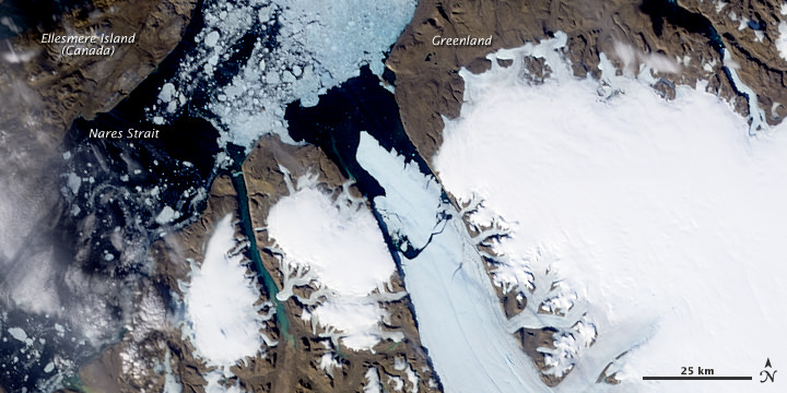
data from 31 July, 4 August, and 7 August 2010 showing the breaking of the Petermann glacier and the movement of the new iceberg towards Nares Strait. Credits: ESA

The animation above was created by combining three Advanced Synthetic Aperture Radar (ASAR) acquisitions (31 July, 4 August and 7 August 2010) taken over the same area. The breaking of the glacier tongue and the movement of the iceberg can be clearly seen in this sequence.

The Petermann glacier is one of the largest glaciers connecting the Greenland inland ice sheet with the Arctic Ocean. Upon reaching the sea, a number of these large outlet glaciers extend into the water with a floating ‘ice tongue’.
The ice tongue of the Petermann glacier was the largest in Greenland. This tide-water glacier regularly advances towards the ocean at about 1 km per year. During the previous months, satellite images revealed that several cracks had appeared on the glacier surface, suggesting to scientists that a break-up event was imminent.

Scientists say it’s hard to tell if global warming caused the event. Records on the glacier and sea water below have only been kept since 2003. The first six months of 2010 have been the hottest globally on record.

Sources: NASA, ESA

2010 Had Warmest Global June on Record

June Land Surface Temperature Anomalies in degrees Celsius. Credit: NOAA

[/caption]

Was last month warm where you live? If so, you weren’t alone. According measurements taken by the National Oceanic and Atmospheric Administration (NOAA) June 2010 was the hottest June on record worldwide. But this is not a new trend, at least for this year. March, April, and May 2010 were also the warmest on record. This was also the 304th consecutive month with a global temperature above the 20th century average. The last month with below-average temperature was February 1985.

Here are some of the numbers:

* The combined global land and ocean average surface temperature for June 2010 was the warmest on record at 16.2°C (61.1°F), which is 0.68°C (1.22°F) above the 20th century average of 15.5°C (59.9°F). The previous record for June was set in 2005.

* The June worldwide averaged land surface temperature was 1.07°C (1.93°F) above the 20th century average of 13.3°C (55.9°F)—the warmest on record.

* It was the warmest April–June (three-month period) on record for the global land and ocean temperature and the land-only temperature. The three-month period was the second warmest for the world’s oceans, behind 1998.

* It was the warmest June and April–June on record for the Northern Hemisphere as a whole and all land areas of the Northern Hemisphere.

* It was the warmest January–June on record for the global land and ocean temperature. The worldwide land on average had its second warmest January–June, behind 2007. The worldwide averaged ocean temperature was the second warmest January–June, behind 1998.

* Sea surface temperature (SST) anomalies in the central and eastern equatorial Pacific Ocean continued to decrease during June 2010. According to NOAA’s Climate Prediction Center, La Niña conditions are likely to develop during the Northern Hemisphere summer 2010.

Some regions on the planet, however, had cool temps for a northern hemisphere summer. Spain had its coolest June temperatures since 1997, and Guizhou in southern China had its coolest June since their records began in 1951.

Still, with those cool temperatures, the planet on the whole was warmer.

Arctic sea ice extent for June 2010 was 10.87 million square kilometers (4.20 million square miles). Credit: NSIDC

Other satellite data from the US National Snow and Ice Data Center in Colorado shows that the extent of sea ice in the Arctic was at its lowest for any June since satellite records started in 1979. The ice cover on Arctic Ocean grows each winter and shrinks in summer, reaching its annual low point in September. The monthly average for June 2010 was 10.87 km sq. The ice was declining an average of 88,000 sq km per day in June. This rate of decline is the fastest measured for June.

During June, ice extent was below average everywhere except in the East Greenland Sea, where it was near average.

Sources: NOAA, NSIDC

Earth’s Gravity Seen in HD

New map of Earth's gravity field from GOCE. Credit: ESA

[/caption]

The sleek and sexy-looking GOCE satellite has provided a new, finely detailed look at Earth’s gravity – in high definition. This is the first-ever global gravity model and is based on just two months of data from the low-flying GOCE. “GOCE is delivering where it promised: in the fine spatial scales,” GOCE Mission Manager Rune Floberghagen said. “We have already been able to identify significant improvements in the high-resolution ‘geoid’, and the gravity model will improve as more data become available.”

GOCE stands for Gravity field and steady-state Ocean Circulation Explorer.

The geoid is a measure of the lumps and bumps in Earth’s gravity, and shows how the surface would look if an ocean covered the earth, also known as surface of equal gravitational attraction and mean sea level.
Scientists say it is a crucial reference for accurately measuring ocean circulation, sea-level change and ice dynamics – all affected by climate change.

GOCE in orbit. Credit: ESA

The GOCE team presented their initial data at ESA’s Living Planet Symposium. ESA launched GOCE in March 2009, and the data is from November and December 2009.

“Over continents, and in particular in regions poorly mapped with terrestrial or airborne techniques, we can already conclude that GOCE is changing our understanding of the gravity field,” said Floberghagen. Over major parts of the oceans, the situation is even clearer, as the marine gravity field at high spatial resolution is for the first time independently determined by an instrument of such quality.”

This will greatly improve our knowledge and understanding of the Earth’s internal structure, and will be used as a much-improved reference for ocean and climate studies, including sea-level changes, oceanic circulation and ice caps dynamics survey. Numerous applications are expected in climatology, oceanography and geophysics.

“The computed global gravity field looks very promising. We can already see that important new information will be obtained for large areas of South America, Africa, Himalaya, South-East Asia and Antarctica,” said Prof. Reiner Rummel from Technische Universität München, Chairman of the GOCE Mission Advisory Group. “With each two-month cycle of data, the gravity model will become more detailed and accurate. I am convinced that the data will be of great interest to various disciplines of Earth sciences.”

The spacecraft can measure accelerations as small as 1 part in 10,000,000,000,000 of the gravity experienced on Earth.

GOCE flies in orbit at just 254.9 km (158 miles) mean altitude – the lowest orbit sustained over a long period by any Earth observation satellite, but the lower the altitude, the better the data.

Anaglyph images created from an ESA video animation of global gravity gradients. A more accurate global map will be generated by ESA's GOCE craft. Credit: ESA and Nathaniel Burton Bradford.

The residual air at this low altitude causes the orbit of a standard satellite to decay very rapidly. So, to counteract the drag, the satellite fires an ion thruster using xenon gas, maintaining its orbit. This ensures the gravity sensors are flying as though they are in pure freefall, so they pick up only gravity readings and not the disturbing effects from other forces.

To obtain clean gravity readings, there can be no disturbances from moving parts, so the entire satellite is a single extremely sensitive measuring device.

The new map is just from the first data, and more information will be forthcoming. In May, ESA made available the first set of gravity gradients and ‘high-low satellite-to-satellite tracking’ to scientific and non-commercial users – and much more will come in the following months.

Souces: ESA, BBC

Earth Moved Substantially in April 2010 Earthquake

Overview of the UAVSAR interferogram of the magnitude 7.2 Baja California earthquake of April 4, 2010, overlaid atop a Google Earth image of the region. Major fault systems are shown by red lines, while recent aftershocks are denoted by yellow, orange and red dots. Image credit: NASA/JPL/USGS/Google ›

[/caption]


From a JPL press release.

NASA has released the first-ever airborne radar images of the deformation in Earth’s surface caused by a major earth quake — the magnitude 7.2 temblor that rocked Mexico’s state of Baja California and parts of the American Southwest on April 4, 2010. The data reveal that in the area studied, the quake moved the Calexico, Calif., region in a downward and southerly direction up to 80 centimeters (31 inches).

A science team at NASA’s Jet Propulsion Laboratory, Pasadena, Calif., used the JPL-developed Uninhabited Aerial Vehicle Synthetic Aperture Radar (UAVSAR) to measure surface deformation from the quake. The radar flies at an altitude of 12.5 kilometers (41,000 feet) on a Gulfstream-III aircraft from NASA’s Dryden Flight Research Center, Edwards, Calif.

The team used a technique that detects minute changes in the distance between the aircraft and the ground over repeated, GPS-guided flights. The team combined data from flights on Oct. 21, 2009, and April 13, 2010. The resulting maps are called interferograms.

The April 4, 2010, El Mayor-Cucapah earthquake was centered 52 kilometers (32 miles) south-southeast of Calexico, Calif., in northern Baja California. It occurred along a geologically complex segment of the boundary between the North American and Pacific tectonic plates. The quake, the region’s largest in nearly 120 years, was also felt in southern California and parts of Nevada and Arizona. It killed two, injured hundreds and caused substantial damage. There have been thousands of aftershocks, extending from near the northern tip of the Gulf of California to a few miles northwest of the U.S. border. The area northwest of the main rupture, along the trend of California’s Elsinore fault, has been especially active, and was the site of a large, magnitude 5.7 aftershock on June 14.

UAVSAR has mapped California’s San Andreas and other faults along the plate boundary from north of San Francisco to the Mexican border every six months since spring 2009, looking for ground motion and increased strain along faults. “The goal of the ongoing study is to understand the relative hazard of the San Andreas and faults to its west like the Elsinore and San Jacinto faults, and capture ground displacements from larger quakes,” said JPL geophysicist Andrea Donnellan, principal investigator of the UAVSAR project to map and assess seismic hazard in Southern California.

Each UAVSAR flight serves as a baseline for subsequent quake activity. The team estimates displacement for each region, with the goal of determining how strain is partitioned between faults. When quakes do occur during the project, the team will observe their associated ground motions and assess how they may redistribute strain to other nearby faults, potentially priming them to break. Data from the Baja quake are being integrated into JPL’s QuakeSim advanced computer models to better understand the fault systems that ruptured and potential impacts to nearby faults, such as the San Andreas, Elsinore and San Jacinto faults.

One figure (Figure 1) shows a UAVSAR interferogram swath measuring 110 by 20 kilometers (69 by 12.5 miles) overlaid atop a Google Earth image. Each colored contour, or fringe, of the interferogram represents 11.9 centimeters (4.7 inches) of surface displacement. Major fault lines are marked in red, and recent aftershocks are denoted by yellow, orange and red dots.

The quake’s maximum ground displacements of up to 3 meters (10 feet) actually occurred well south of where the UAVSAR measurements stop at the Mexican border. However, these displacements were measured by JPL geophysicist Eric Fielding using synthetic aperture radar interferometry from European and Japanese satellites and other satellite imagery, and by mapping teams on the ground.

Scientists are still working to determine the exact northwest extent of the main fault rupture, but it is clear it came within 10 kilometers (6 miles) of the UAVSAR swath, close to the point where the interferogram fringes converge. “Continued measurements of the region should tell us whether the main fault rupture has moved north over time,” Donnellan said.

An enlargement of the interferogram is shown in another figure (Figure 2), focusing on the area where the largest deformation was measured. The enlargement, which covers an area measuring about 20 by 20 kilometers (12.5 by 12.5 miles), reveals many small “cuts,” or discontinuities, in the fringes. These are caused by ground motions ranging from a centimeter to tens of centimeters (a few inches) on small faults. “Geologists are finding the exquisite details of the many small fault ruptures extremely interesting and valuable for understanding the faults that ruptured in the April 4th quake,” said Fielding. Another figure, (Figure 3) shows a close-up of the region where the magnitude 5.7 aftershock struck.

“UAVSAR’s unprecedented resolution is allowing scientists to see fine details of the Baja earthquake’s fault system activated by the main quake and its aftershocks,” said UAVSAR Principal Investigator Scott Hensley of JPL. “Such details aren’t visible with other sensors.”

UAVSAR is part of NASA’s ongoing effort to apply space-based technologies, ground-based techniques and complex computer models to advance our understanding of quakes and quake processes. The radar flew over Hispaniola earlier this year to study geologic processes following January’s devastating Haiti quake. The data are giving scientists a baseline set of imagery in the event of future quakes. These images can then be combined with post-quake imagery to measure ground deformation, determine how slip on faults is distributed, and learn more about fault zone properties.

UAVSAR is also serving as a flying test bed to evaluate the tools and technologies for future space-based radars, such as those planned for a NASA mission currently in formulation called the Deformation, Ecosystem Structure and Dynamics of Ice, or DESDynI. That mission will study hazards such as earth quakes, volcanoes and landslides, as well as global environmental change.

See all the maps at this webpage.