[/caption]
As only a British tabloid (and Fox News) could, reports came out this week of the Loch Ness Monster being spotted on Google Earth. “This amazing image on Google Earth could be the elusive proof that the Loch Ness Monster exists,” The Sun reported. Well, for one thing, this doesn’t look *anything* like Nessie. Doesn’t he have a long black neck? And another thing about this: it looks surprisingly like a …. boat. Imagine that, a boat on a lake captured by Google Earth! Astounding! Look closely and you’ll see the squared off back end of the boat (the stern), the rounded stern bow in front, and the tentacle-looking things are just the boat’s wake. This looks very much like another image of a boat on Loch Ness on Bing (below). Click on the picture to get to the image on Bing and zoom out for the full effect.
Another boat on Loch Ness from Bing.
To see it on Google Earth, go to coordinates Latitude 57°12’52.13″N, Longitude 4°34’14.16″W. Take a tour of Loch Ness (it is pretty there!) and you’ll see lots of other suspicious looking white things in the lake that are (gasp!) more boats!
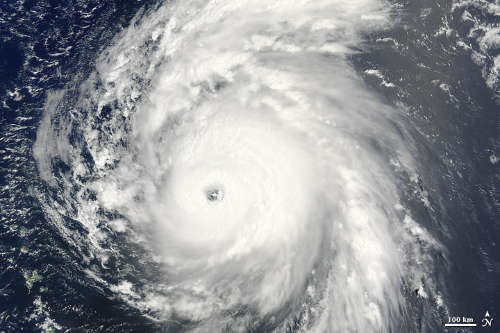
Hurricane Bill skirts the Eastern Coast of the US. NASA image by Jeff Schmaltz, MODIS Rapid Response Team, Goddard Space Flight Center.
[/caption]
Hurricane Bill kept its distance from the US mainland, seemingly skirting along the eastern seaboard and fitting perfectly within the coastline curves on this NASA satellite image. Thankfully, the storm largely missed the eastern states, with the center of the storm well off the coast. It appears Bill will keep its distance from the Canadian coast as well. It has now been downgraded to a tropical storm, and is expected to weaken over the next 24 hours. As of late Sunday night, the storm had maximum sustained winds near 120 kilometers (75 miles) per hour with higher gusts. This image was taken by the Moderate Resolution Imaging Spectroradiometer (MODIS) on NASA’s Aqua satellite, taken at 2:00 p.m. EDT (14:00 UTC) on August 23, 2009.
Source: NASA Earth Observation website
Hurricane Bill, August 19, 2009. Credit: MODIS/NASA/NOAA
This just in — the NASA/NOAA satellite GOES-14 has just released video taken on August 20 (that’s today!) of Hurricane Bill, the first hurricane of the season. This spectacular video is a collection of a few quick movies put together by the GOES-14 team and includes an impressive zoom-out, showing how big the hurricane is, relative to the hemisphere. Yes, Bill is large, with sustained winds of 217 kph (135 mph), making it a powerful Category 4 storm. The winds extend outward up to 80 miles from the center. Bill stretches more than 1,200 kilometers (746 miles) across, and the storm’s partially cloud-filled eye is nearly 50 kilometers (31 miles) wide.
See an image below of Bill from NASA’s MODIS satellite, taken on August 19, 2009.
[/caption]
As of August 20 at 5 pm EDT, Hurricane Bill was located 790 miles SSE of Bermuda, while continuing to move quickly off to the northwest. Bill should begin turning in a more northerly direction by later Friday.
Based on all available forecast data at this time, it appears that Bill will track east of the Eastern U.S. Coast over the next few days.
You can follow a tracker on Weather.com to find out where Hurricane Bill is currently located.
Ever wonder about all the different data that satellites are collecting as they orbit Earth? This video is a sample of Bella Gaia, a 45-minute movie is meant to be watched in an immersive theater, such as a fulldome planetarium. This clip is an audio visual “Living Atlas” journey of our world, showing the beauty and fragility of planet Earth as seen through satellite data. Created by director and violist Kenji Williams, the The movie is based on the stunning orbital imagery created by SCISS’ Uniview software and NASA, and shows data ranging from oil consumption and air traffic, over Earth’s magnetosphere and polar sub storms to time-lapse images of the Arctic ice melt. It’s a new way to look at Earth, and hopefully will instill some of the awe that the first “Earthrise” images brought. Look for the full version coming soon to an immersive theater near you. More info on Bella Gaia.
[/caption]
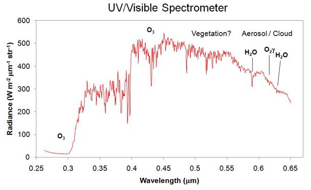
The LCROSS spacecraft took a look back at Earth, and guess what it saw? Evidence of intelligence? Not so much. But it did see evidence of life. On Aug. 1, 2009, the LCROSS spacecraft took a gander at Earth to help calibrate and test its science payload. During the Earth observations, the spacecraft’s spectrometers were able to detect the signatures of the Earth’s water, ozone, methane, oxygen, carbon dioxide and possibly vegetation.
Phil Plait explained on Bad Astronomy that this spectrum covers part of the ultraviolet and visible range of light, and this type of observation with better instruments in the future could help us find life on other planets. Phil wrote. “You can see that LCROSS clearly detected ozone (O3) and water, which you might see on any old planet. But it also saw a feature that is from free oxygen (O2), something you don’t see just anywhere .… The only reason we have a lot of it in our air (more than 20% of the Earth’s atmosphere is O2) is because we have life in the form of plants.” Check out Phil’s post here.
LCROSS images of Earth. Credit: NASA
The spacecraft also took these images of Earth, again, helping to refine camera exposure settings, check instrument pointing alignment, and check radiometric and wavelength calibrations.
LCROSS is in an elongated Earth orbit, and on course to impact the Moon’s south pole in October. From its current vantage point of 223,700 miles (360,000 km) from Earth, the LCROSS science team changed exposure and integration settings on the spacecraft’s infrared cameras and spectrometers and performed a crossing pattern, pushing the smaller fields of view of the spectrometers across the Earth’s disk. At this range, the Earth was approximately 2.2 degrees in diameter.
“The Earth-look was very successful,” said Tony Colaprete, LCROSS project scientist. “The instruments are all healthy and the science teams was able to collect additional data that will help refine our calibrations of the instruments.”
An additional Earth-look and a moon-look are scheduled for the remainder of the cruise phase of the mission.
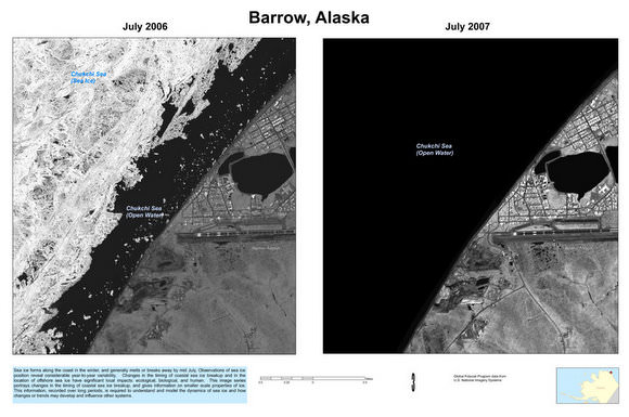
Ice loss in Barrow Alaska from 2006 to 2007. Credit: US Geological Survey
[/caption]
Last week the US government released more than a thousand intelligence images of Arctic ice that have been used to help scientists study the impact of climate change. The images were taken by spy satellites, as part of the Medea program, which lets scientists request spy pictures from environmentally sensitive locations around the world. After they were taken, the Bush Administration released the photographs to the scientists but deemed them “unsuitable for public release.” Earlier this month, the National Academy of Sciences recommended the Obama Administration declassify the photos, which they did within a few hours of the recommendation.
Various blogs are saying these dramatic images are faked, but since they are available through the US Geological Survey , that hardly seems likely. Over 700 images show changes of sea ice in various recent years from six sites around the Arctic Ocean, with an additional 500 images of 22 sites in the United States.
Ice loss in the Beaufort Sea. Credit: USGS
Scientists request ice pictures to be taken by intelligence satellites because the resolution is much greater, in some cases, than other available satellite images. According to Reuters, the newly declassified Arctic images have a resolution of about 1 yard (1 meter), a vast improvement on previously available pictures of sea ice which have a resolution between 15 and 30 meters. Ice loss at the Bering Glacier. Credit: USGS
Grand Canyon from space. Click for larger version. Credit: ESA
[/caption]
The Grand Canyon is an awesome sight on Earth — one of the seven natural wonders of the world – and it looks breathtaking from space, too. This image was taken by the Envisat satellite, showing canyon walls, rock structures, old lava flows, buttes, ravines, stair-step topography in hues of pink, violet and gray.
Also visible in the image are the Colorado Plateau (upper right corner), the Mogollon Plateau (dark area under Colorado Plateau), Lake Meade (Y-shaped water body left of the canyon), Las Vegas, Nevada (bright white and blue area left of Lake Meade) and the southern tip of Utah (upper left).
Although a number of processes combined to create the Grand Canyon, it was formed primarily by the eroding action of the Colorado River that began about six million years ago. Other contributing factors include volcanism, continental drift and the semiarid climate.
As water erosion sculpted this majestic showplace, it revealed layers and layers of exposed rocks that provide us with a profound record of geologic events. As some of Earth’s oldest rock lies at the bottom of the canyon, it is said to be 1800 meters and a billion years deep. It is about 443 km long and 8 to 29 km wide.
This image was acquired by Envisat’s Medium Resolution Imaging Spectrometer (MERIS) instrument on 10 May 2009, working in Full Resolution mode to provide a spatial resolution of 300 meters.
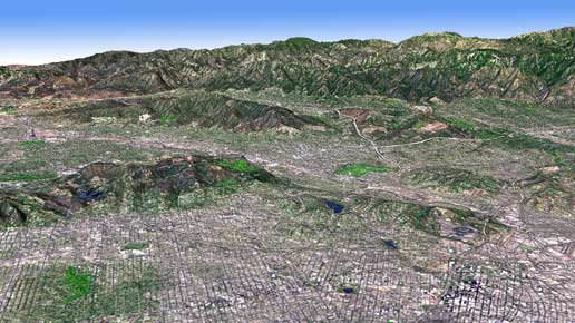
In this perspective view, the new topographic maps show the LA Basin. Credit: NASA, MET
[/caption]
Topographic maps are some of the most used and valuable maps for both government and the general public. Now, NASA and Japan have released a new digital topographic map of Earth Monday that covers more of our planet than ever before and was created from nearly 1.3 million individual stereo-pair images collected by the Japanese Advanced Spaceborne Thermal Emission and Reflection Radiometer, or ASTER, on board NASA’s Terra spacecraft. It is available online to users everywhere at no cost.
“This is the most complete, consistent global digital elevation data yet made available to the world,” said Woody Turner, ASTER program scientist at NASA Headquarters in Washington. “This unique global set of data will serve users and researchers from a wide array of disciplines that need elevation and terrain information.”
ASTER is one of five Earth-observing instruments launched on Terra in December 1999. ASTER acquires images from the visible to the thermal infrared wavelength region, with spatial resolutions ranging from about 50 to 300 feet.
According to Mike Abrams, ASTER science team leader at JPL the new topographic information will be of value throughout the Earth sciences and has many practical applications. “ASTER’s accurate topographic data will be used for engineering, energy exploration, conserving natural resources, environmental management, public works design, firefighting, recreation, geology and city planning, to name just a few areas,” Abrams said.
Click here to download the ASTER global digital elevation model.
NASA and Japan’s Ministry of Economy, Trade and Industry, known as METI, developed the data set. Global map from ASTER. Credit: NASA, METI
Previously, the most complete topographic set of data publicly available was from NASA’s Shuttle Radar Topography Mission. That mission mapped 80 percent of Earth’s landmass, between 60 degrees north latitude and 57 degrees south. The new ASTER data expands coverage to 99 percent, from 83 degrees north latitude and 83 degrees south. Each elevation measurement point in the new data is 98 feet apart.
The ASTER data fill in many of the voids in the shuttle mission’s data, such as in very steep terrains and in some deserts,” said Michael Kobrick, Shuttle Radar Topography Mission project scientist at the Jet Propulsion Laboratory. “NASA is working to combine the ASTER data with that of the Shuttle Radar Topography Mission and other sources to produce an even better global topographic map.”
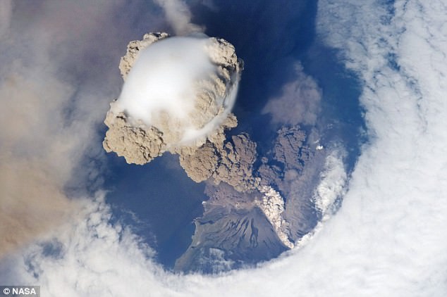
Sarychev Volcano as seen from the ISS. Credit: NASA
[/caption]
These images of Sarychev Volcano were popping up everywhere in the internet yesterday, but unfortunately I was out of intertube contact most of the day. But these images are too awesome not to share! Astronauts on board the International Space Station took these striking views of Sarychev Volcano (Kuril Islands, northeast of Japan) on June 12, 2009. Notice the shock wave around the edge of the volcano’s plume and the “hole” the clouds that the eruption caused. Sarychev Peak is one of the most active volcanoes in the Kuril Island chain, and it is located on the northwestern end of Matua Island. Here are few more images taken in sequence as the ISS flew 354 km (220 miles) overhead:
Second image of Sarychev Volcano. Credit: NASA
Volcanologists say these images are exciting because they capture several phenomena that occur during the earliest stages of an explosive volcanic eruption. The main column is one of a series of plumes that rose above Matua Island on June 12. The plume appears to be a combination of brown ash and white steam. The vigorously rising plume gives the steam a bubble-like appearance. The eruption cleared a circle in the cloud deck. The clearing may result from the shockwave from the eruption or from sinking air around the eruption plume: as the plume rises, air flows down around the sides like water flowing off the back of a surfacing dolphin. As air sinks, it tends to warm and expand; clouds in the air evaporate.
Also visible is material from the eruption falling down the slopes of the volcano.
Third image of the volcano. Credit: NASA
These images were taken by the Expedition 20 crew on the ISS, using a Nikon D2XS digital camera fitted with a 400 mm lens, and is provided by the ISS Crew Earth Observations experiment and Image Science & Analysis Laboratory, Johnson Space Center.
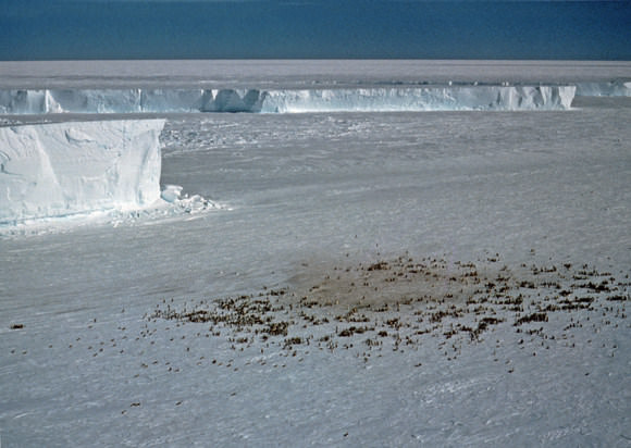
An emporer penguin colony at Halley Bay. Credit: British Antarctic Survey
This just in from the ‘things kids can giggle about’ department: British scientists are using satellite images to find colonies of emperor penguins in Antarctica. While their natural camouflage makes them blend into the shadows of the sea ice where they breed, their droppings, or guano, show up perfectly from space. “We can’t see actual penguins on the satellite maps because the resolution isn’t good enough,” said mapping expert Peter Fretwell. “But during the breeding season the birds stay at a colony for eight months. The ice gets pretty dirty and it’s the guano stains that we can see.”
Stains on the ice visible on this satellite image. Credit: British Antarctic Survey
Emperor penguins spend a large part of their lives at sea. During the Antarctic winter when temperatures drop to -50°C they return to their colonies to breed on sea-ice, but this is a time when it is most difficult for scientists to monitor them. Knowing their location provides a baseline for monitoring their response to environmental change.
Reddish brown patches of guano on the ice, visible in satellite images, provide a reliable indication of their location.
British Antarctic Survey Penguin ecologist Dr Phil Trathan says: “This is a very exciting development. Now we know exactly where the penguins are, the next step will be to count each colony so we can get a much better picture of population size. Using satellite images combined with counts of penguin numbers puts us in a much better position to monitor future population changes over time.”
The method helped scientists identify 38 penguin colonies — of those, 10 were new. Of previously known colonies, six had re-located and six were not found. Estimates put the total number of penguins at between 200,000 and 400,000 breeding pairs.

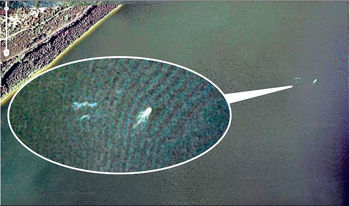
 Look closely and you’ll see the squared off back end of the boat (the stern), the rounded