[/caption]
With the help of an orbiting satellite, researchers have conducted the first global analysis of the health and productivity of ocean plants. Using the Moderate Resolution Imaging Spectroradiometer (MODIS) on NASA’s Aqua satellite, scientists have for the first time measured remotely the amount of fluorescent red light emitted by ocean phytoplankton and assess how efficiently the microscopic plants are turning sunlight and nutrients into food through photosynthesis. Now that they have their first data, this method should allow scientists to effectively keep an eye on the health of our oceans. So what did they find out so far?
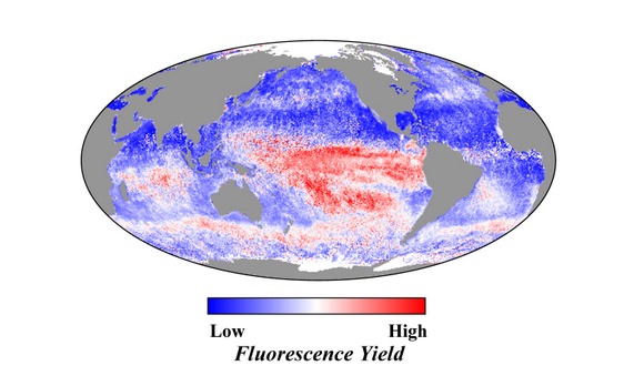
Over the past two decades, scientists have employed various satellite sensors to measure the amount and distribution of the green pigment chlorophyll, an indicator of the amount of plant life in the ocean. But with MODIS, “red-light fluorescence” has been observed over the open ocean.
“Chlorophyll gives us a picture of how much phytoplankton is present,” said Scott Doney, a marine chemist from the Woods Hole Oceanographic Institution and a co-author of the paper. “Fluorescence provides insight into how well they are functioning in the ecosystem.”

Red-light fluorescence reveals insights about the physiology of marine plants and the efficiency of photosynthesis, as different parts of the plant’s energy-harnessing machinery are activated based on the amount of light and nutrients available. For instance, the amount of fluorescence increases when phytoplankton are under stress from a lack of iron, a critical nutrient in seawater. When the water is iron-poor, phytoplankton emit more solar energy as fluorescence than when iron is sufficient.
The fluorescence data from MODIS gives scientists a tool that enables research to reveal where waters are iron-enriched or iron-limited, and to observe how changes in iron influence plankton. The iron needed for plant growth reaches the sea surface on winds blowing dust from deserts and other arid areas, and from upwelling currents near river plumes and islands.
The new analysis of MODIS data has allowed the research team to detect new regions of the ocean affected by iron deposition and depletion. The Indian Ocean was a particular surprise, as large portions of the ocean were seen to “light up” seasonally with changes in monsoon winds. In the summer, fall, and winter – particularly summer – significant southwesterly winds stir up ocean currents and bring more nutrients up from the depths for the phytoplankton. At the same time, the amount of iron-rich dust delivered by winds is reduced.

“On time-scales of weeks to months, we can use this data to track plankton responses to iron inputs from dust storms and the transport of iron-rich water from islands and continents,” said Doney. “Over years to decades, we can also detect long-term trends in climate change and other human perturbations to the ocean.”
Climate change could mean stronger winds pick up more dust and blow it to sea, or less intense winds leaving waters dust-free. Some regions will become drier and others wetter, changing the regions where dusty soils accumulate and get swept up into the air. Phytoplankton will reflect and react to these global changes.
Single-celled phytoplankton fuel nearly all ocean ecosystems, serving as the most basic food source for marine animals from zooplankton to fish to shellfish. In fact, phytoplankton account for half of all photosynthetic activity on Earth. The health of these marine plants affects commercial fisheries, the amount of carbon dioxide the ocean can absorb, and how the ocean responds to climate change.
“This is the first direct measurement of the health of the phytoplankton in the ocean,” said Michael Behrenfeld, a biologist who specializes in marine plants at the Oregon State University in Corvallis, Ore. “We have an important new tool for observing changes in phytoplankton every week, all over the planet.”
Source: NASA


 interferogram. Credits: INGV")


 side of crater, and in this view, fumaroles are rising from near the ice/wall-rock contact. Image Creator: Payne, Allison")
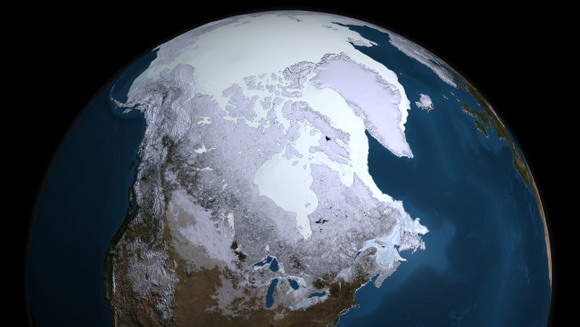

. The solid gray line indicates average extent from 1979 to 2000. This year’s maximum winter ice extent occurred on February 28, 2009. Credit: National Snow and Ice Data Center")