[/caption]
From a Harvard Smithsonian Center for Astrophysics press release:
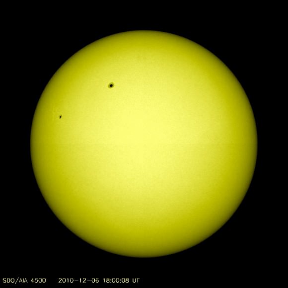
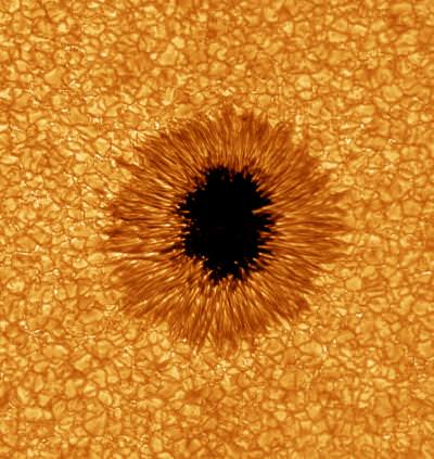
Our Sun can be a menace when it sends out powerful solar blasts of radiation towards the Earth. Astronomers keenly watch the Sun to learn more about what powers these solar eruptions, in hopes of being able to predict them. New research shows that one-third of the Sun’s blasts are “sneak attacks” that may occur without warning.
“If space weather forecasters rely on some of the traditional danger signs, they’ll miss a significant fraction of solar eruptions,” said Suli Ma of the Harvard-Smithsonian Center for Astrophysics (CfA).
To reach their conclusion, Ma and her colleagues studied 34 solar eruptions over 8 months using the STEREO spacecraft. STEREO allows us to study the Sun from two different angles simultaneously. It consists of two spacecraft, one ahead of Earth in its orbit and the other trailing behind. The researchers used it to ensure that the events leaving the Sun were definitely on the side facing the Earth.
STEREO is ideal for studying coronal mass ejections, or CMEs. A CME is a huge eruption from the Sun that blasts a billion tons of highly charged particles into space at speeds greater than a million miles per hour. When those charged particles reach Earth, they interact with our planet’s magnetic field, potentially creating a geomagnetic storm. Such a storm can interfere with satellite communications, disrupt power grids, or even short out orbiting satellites.
Previous to STEREO, astronomers thought that all Earth-facing CMEs were accompanied by warning signals like flares (smaller explosions accompanied by high-energy radiation), coronal dimmings (darkening of the corona caused by discharge of matter in the CME) or filament eruptions (long ribbons of plasma arching violently out from the solar surface). Therefore, by watching for those signals, we could potentially predict an impending eruption.
This new research found that 11 of the 34 CMEs observed by STEREO were “stealthy,” showing none of the usual signals. As a result, any system designed to watch for such warning signs could miss one-third of all solar blasts.
“Meteorologists can give days of warning for a hurricane, but only minutes for a tornado,” explained Smithsonian astronomer Leon Golub. “Currently, space weather forecasting is more like tornado warnings. We might know an eruption is imminent, but we can’t say exactly when it will happen. And sometimes, they catch us by surprise.”
The team plans to continue looking for subtle clues that might allow us to predict an impending “stealth” CME. They caution that their study occurred during a prolonged minimum of solar activity; conditions may change as solar activity increases over the next few years.
“The Sun is entering its stormy season, ramping up toward its next period of maximum activity in 2013 and 2014,” said Ma. “The more we learn and understand about it now, the better.”
The paper discussing their findings appeared in the Oct. 10, 2010 issue of The Astrophysical Journal. It was authored by Suli Ma, G. Attrill, and Leon Golub (CfA); and J. Lin (Chinese Academy of Sciences).


