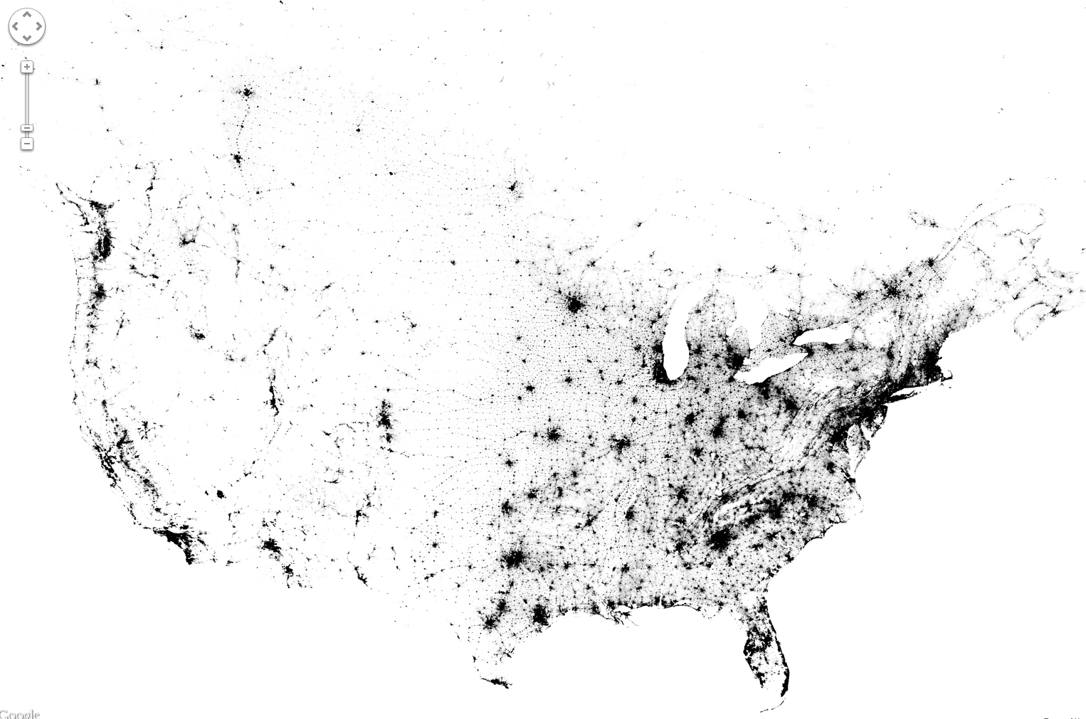
Zoomable map of the US and Canada pinpoints everyone with a dot. (Credit: Brandon Martin-Anderson/Census Dotmap)
Now this is something different: an interactive and zoomable map of the United States and Canada, made not from political boundaries or geographic landforms but rather of tiny dots — 341,817, 095 of them, to be exact — each one representing an individual person counted in the 2010 (US) and 2011 (Canada) censuses. There’s no other feature on this map except those dots, each randomly placed within the regional blocks used by the census, yet we still end up with a very recognizable structure.
So if you were listed in either of these censuses, you helped to make this map!
The Census Dotmap is a project by Brandon Martin-Anderson, who wanted an image of human settlement patterns that didn’t use political boundaries. He wrote a script that organized all the census data into points that got drawn into the block-level counts… well, you can see more about how he made it here.
(Just how accurate are population counts? According to the US Census Bureau, the 2010 count was “exemplary”… although renters and certain minority groups are traditionally undercounted.)

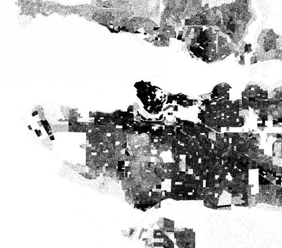
Dotmap of the Vancouver, BC area
The bottom line is that this is really interesting to explore… if you live in a somewhat remote area, and you see a dot there, most likely that’s you! (It’s a little harder to determine who’s who in the more populated areas… the dots don’t pinpoint specific street addresses.)
And yes, Alaska and Hawaii are on there too… they just didn’t fit in the screenshot above. In fact all of northern Canada is there too, the dots are just very few and widely spaced out. But it’s not blank.
Check it out… you can even buy a print of the entire map, or a particular region or city. Now that’s leaving your mark on the world!
Credit: Brandon Martin-Anderson. Tip of the hat to Inkwell Communications.


