MESSENGER Looks Back at the Earth and Moon

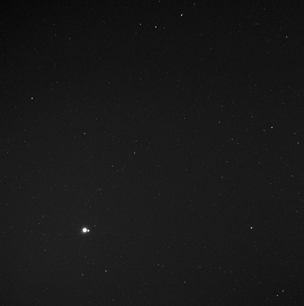
Earth and Moon from 114 Million Miles.Credit: NASA/Johns Hopkins University Applied Physics Laboratory/Carnegie Institution of Washington

[/caption]

A new image to add to the family photo album! The MESSENGER spacecraft is working its way to enter orbit around Mercury in March of 2011, and while wending its way, took this image of the Earth and Moon, visible in the lower left. When the image was taken in May 2010, MESSENGER was 183 million kilometers (114 million miles) away from Earth. For context, the average separation between the Earth and the Sun is about 150 million kilometers (93 million miles). It’s a thought provoking image (every one of us is in that image!), just like other Earth-Moon photos — Fraser put together a gallery of Earth-Moon images from other worlds, and this one will have to be added. But this image was taken not just for the aesthetics.

This image was taken as part of MESSENGER’s campaign to search for vulcanoids, small rocky objects hypothesized to exist in orbits between Mercury and the Sun. Though no vulcanoids have yet been detected, the MESSENGER spacecraft is in a unique position to look for smaller and fainter vulcanoids than has ever before been possible. MESSENGER’s vulcanoid searches occur near perihelion passages, when the spacecraft’s orbit brings it closest to the Sun. August 17, 2010 was another such perihelion, so if MESSENGER was successful in finding any tiny asteroids lurking close to the Sun, we may hear about it soon.

Source: MESSENGER

What is Causing Weather Extremes in 2010?

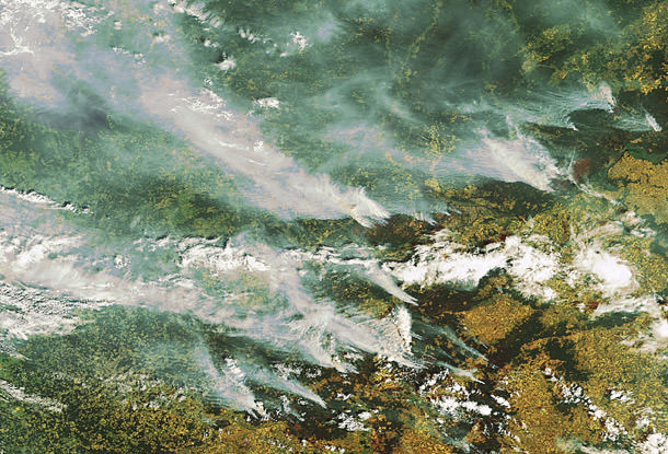
Wildfires in Russia as seen from space by ESA's Envisat satellite. Credit: ESA

[/caption]

Massive rains in Pakistan, China and Iowa in the US. Drought, heat and unprecedented fires in Russia and western Canada. 2010 is going down as the year of crazy, extreme weather. Is this just a wacky year or a trend of things to come? According to meteorologists, unusual holding patterns in the jet stream in the northern hemisphere are to blame for the extreme weather in Pakistan and Russia. But also, the World Meteorological Organization and other scientists say this type of weather fits patterns predicted by climate scientists, and could be the result of climate change.

“All these things are the kinds of things we would expect to happen as the planet warms up,” said Tom Wagner, a NASA scientist who studies the cryosphere, during an interview on CNN on August 11. “And we are seeing that the planet is warming about .35 degrees per decade. Places like Greenland are warming even faster, like 3.5 degrees per decade. And all these events from heat waves to stronger monsoons, to loss of ice are all consistent with that. Where it gets a little tricky is assigning any specific event to say, the cause of this event is definitely global warming, that is where we get to the edge of the research.”

“This weather is very unusual but there are always extremes every year,” said Andrew Watson from the University of East Anglia’s Environmental Studies. “We can never say that weather in a single year is unequivocal evidence of climate change, if you get many years of extreme weather then that can point to climate change.”

The Intergovernmental Panel on Climate Change (IPCC) has long predicted that rising global temperatures would produce more frequent and intense heat waves, and more severe rainfalls. In its 2007 report, the panel said these trends have already been observed, with an increase in heat waves since 1950, for example.

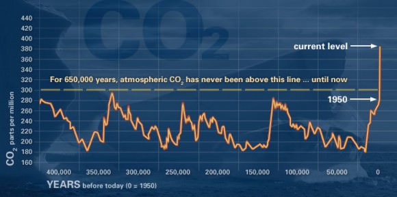
NOAA measurements show that the combined global surface temperatures for June 2010 are the warmest on record, and Wagner said there are larger conclusions to be drawn from the definite global warming trend. “We are seeing things that haven’t really happened before on the planet, like warming at this specific rate. We think it is very well tied to increasing carbon dioxide in the atmosphere since the late 1800’s caused by humans.”

This graph, based on the comparison of atmospheric samples contained in ice cores and more recent direct measurements, provides evidence that atmospheric CO2 has increased since the Industrial Revolution. (Source: NOAA)

Graphs on NASA’s climate website show an undeniable rise in global temperatures, sea levels, and carbon dioxide levels. See more of these graphs here.

“Not just over 10 years, but we have satellites images, weather station records and other good records going back to the late 1800’s that tells us all about how the planet is warming up,” Wagner said. “Not only that but we have evidence from geologic records, ice cores, and sediment cores from ocean cores. All of this feeds together to show us how the planet is changing.”

Asked if the cycle can be reversed, Wagner replied, “That is the million dollar question. One thing we have to think about is that the planet is changing and we have to deal with that. Ice around Antarctica and Greenland is melting. Sea level is rising right now at 3 millimeters a year. If you just extrapolate that to 100 years, it will rise to at least a foot of sea level rise. But there is the possibility it could be more than that. These are the types of things we need to think about and come up with mitigation strategies to deal with them. We’re doing the research to try and nail down these questions a little more tightly to see how much sea level is going to rise, how much temperatures are going to rise and how are weather patterns going to change.”

Reducing emissions is one thing that everyone can do to help protect the planet and the climate, and climate experts have been saying for years that there needs to be sharp cutbacks in emissions of carbon dioxide and other heat-trapping gases that go into the atmosphere from automobiles, power plants, and other fossil fuel-burning industrial and residential sources.

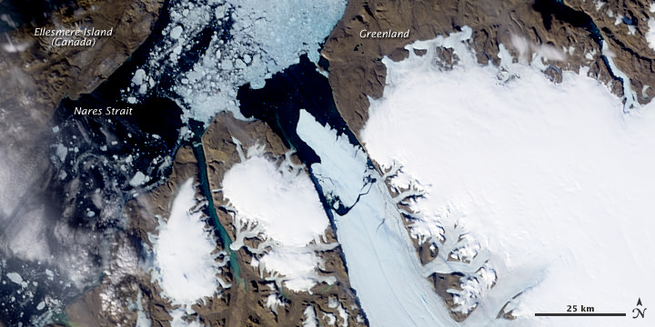
In the news this week was the huge ice chunk coming loose from a Greenland glacier. Not only is this an indication of warming water, but other problems could develop, such as the large ice chunks getting in the way of shipping lanes or heading towards oil rigs. The high temperatures and fires in Russia are affecting big percentage of the world’s wheat production, and could have an effect on our food supply this coming year.

Not only that, but the wildfires have created a noxious soup of air pollution that is affecting life far beyond just the local regions, JPL reports. Among the pollutants created by wildfires is carbon monoxide, a gas that can pose a variety of health risks at ground level. Carbon monoxide is also an ingredient in the production of ground-level ozone, which causes numerous respiratory problems. As the carbon monoxide from these wildfires is lofted into the atmosphere, it becomes caught in the lower bounds of the mid-latitude jet stream, which swiftly transports it around the globe.

Two movies were created using continuously updated data from the “Eyes on the Earth 3-D” feature, also on NASA’s global climate change website. They show three-day running averages of daily measurements of carbon monoxide present at an altitude of 5.5 kilometers (18,000) feet, along with its global transport.

And in case you are wondering, the recent solar flares have nothing to do with the wildfires — as Ian O’Neill from Discovery space deftly points out.

Sources: CNN, AP, JPL , SkyNews

View From Space: Huge Piece of Glacier Breaks Off Greenland

Enormous chuck of ice breaks off the Petermann Glacier in Greenland. Credit: NASA.

[/caption]

A huge ice island four times the size of Manhattan– and half as thick as the Empire State Building is tall– has broken off from one of Greenland’s two main glaciers. On August 5, 2010, an enormous chunk of ice, roughly 97 square miles (251 square kilometers) in size, broke off the Petermann Glacier, along the northwestern coast of Greenland. Satellite images, like this one from NASA’s Aqua satellite show the glacier lost about one-quarter of its 70-kilometer (40-mile) long floating ice shelf. Located a thousand kilometers south of the North Pole, the now-separate ice island contains enough fresh water to keep public tap water in the United States flowing for 120 days, said scientists from the University of Delaware who have been monitoring the break.

While thousands of icebergs detach from Greenland’s glaciers every year, the last time one this large formed was in 1962. The flow of sea water beneath Greenland’s glaciers is a main cause of ice detaching from them.

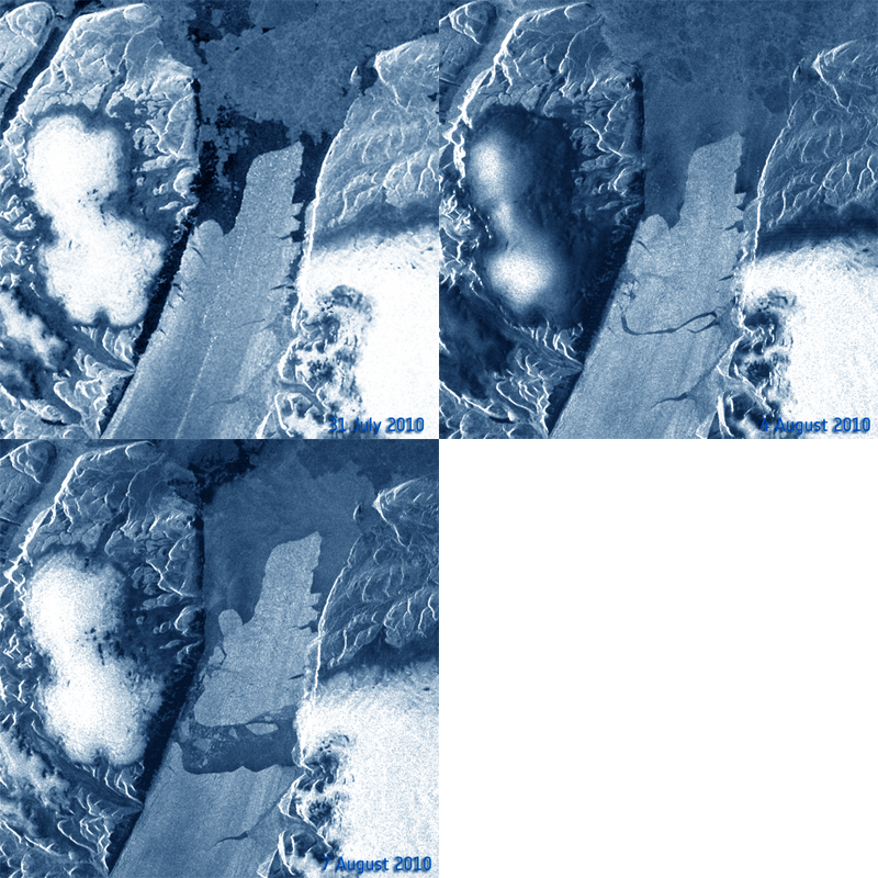
This movie made from another satellite — Envisat from the European Space Agency – shows the giant iceberg breaking off.

Time-series animation based on Envisat Advanced Synthetic Aperture Radar (ASAR) data from 31 July, 4 August, and 7 August 2010 showing the breaking of the Petermann glacier and the movement of the new iceberg towards Nares Strait. Credits: ESA

The animation above was created by combining three Advanced Synthetic Aperture Radar (ASAR) acquisitions (31 July, 4 August and 7 August 2010) taken over the same area. The breaking of the glacier tongue and the movement of the iceberg can be clearly seen in this sequence.

The Petermann glacier is one of the largest glaciers connecting the Greenland inland ice sheet with the Arctic Ocean. Upon reaching the sea, a number of these large outlet glaciers extend into the water with a floating ‘ice tongue’.
The ice tongue of the Petermann glacier was the largest in Greenland. This tide-water glacier regularly advances towards the ocean at about 1 km per year. During the previous months, satellite images revealed that several cracks had appeared on the glacier surface, suggesting to scientists that a break-up event was imminent.

Scientists say it’s hard to tell if global warming caused the event. Records on the glacier and sea water below have only been kept since 2003. The first six months of 2010 have been the hottest globally on record.

Sources: NASA, ESA

2010 Had Warmest Global June on Record

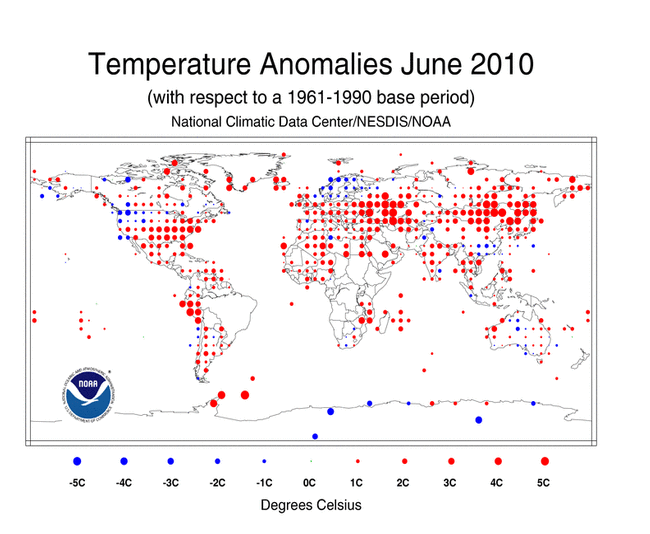
June Land Surface Temperature Anomalies in degrees Celsius. Credit: NOAA

[/caption]

Was last month warm where you live? If so, you weren’t alone. According measurements taken by the National Oceanic and Atmospheric Administration (NOAA) June 2010 was the hottest June on record worldwide. But this is not a new trend, at least for this year. March, April, and May 2010 were also the warmest on record. This was also the 304th consecutive month with a global temperature above the 20th century average. The last month with below-average temperature was February 1985.

Here are some of the numbers:

* The combined global land and ocean average surface temperature for June 2010 was the warmest on record at 16.2°C (61.1°F), which is 0.68°C (1.22°F) above the 20th century average of 15.5°C (59.9°F). The previous record for June was set in 2005.

* The June worldwide averaged land surface temperature was 1.07°C (1.93°F) above the 20th century average of 13.3°C (55.9°F)—the warmest on record.

* It was the warmest April–June (three-month period) on record for the global land and ocean temperature and the land-only temperature. The three-month period was the second warmest for the world’s oceans, behind 1998.

* It was the warmest June and April–June on record for the Northern Hemisphere as a whole and all land areas of the Northern Hemisphere.

* It was the warmest January–June on record for the global land and ocean temperature. The worldwide land on average had its second warmest January–June, behind 2007. The worldwide averaged ocean temperature was the second warmest January–June, behind 1998.

* Sea surface temperature (SST) anomalies in the central and eastern equatorial Pacific Ocean continued to decrease during June 2010. According to NOAA’s Climate Prediction Center, La Niña conditions are likely to develop during the Northern Hemisphere summer 2010.

Some regions on the planet, however, had cool temps for a northern hemisphere summer. Spain had its coolest June temperatures since 1997, and Guizhou in southern China had its coolest June since their records began in 1951.

Still, with those cool temperatures, the planet on the whole was warmer.

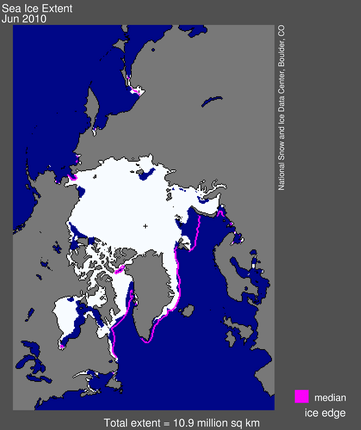
Arctic sea ice extent for June 2010 was 10.87 million square kilometers (4.20 million square miles). Credit: NSIDC

Other satellite data from the US National Snow and Ice Data Center in Colorado shows that the extent of sea ice in the Arctic was at its lowest for any June since satellite records started in 1979. The ice cover on Arctic Ocean grows each winter and shrinks in summer, reaching its annual low point in September. The monthly average for June 2010 was 10.87 km sq. The ice was declining an average of 88,000 sq km per day in June. This rate of decline is the fastest measured for June.

During June, ice extent was below average everywhere except in the East Greenland Sea, where it was near average.

Sources: NOAA, NSIDC

Earth Moved Substantially in April 2010 Earthquake

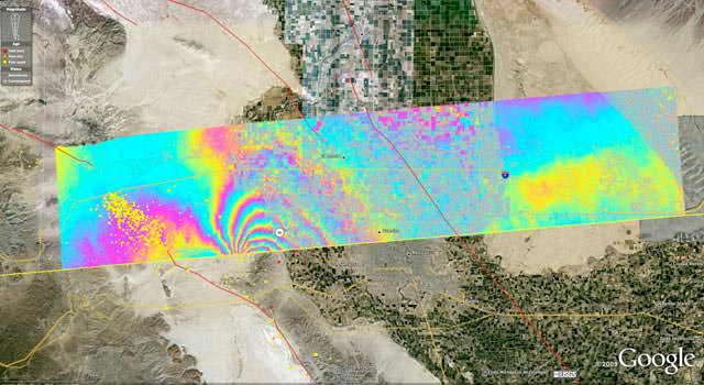
Overview of the UAVSAR interferogram of the magnitude 7.2 Baja California earthquake of April 4, 2010, overlaid atop a Google Earth image of the region. Major fault systems are shown by red lines, while recent aftershocks are denoted by yellow, orange and red dots. Image credit: NASA/JPL/USGS/Google ›

[/caption]


From a JPL press release.

NASA has released the first-ever airborne radar images of the deformation in Earth’s surface caused by a major earth quake — the magnitude 7.2 temblor that rocked Mexico’s state of Baja California and parts of the American Southwest on April 4, 2010. The data reveal that in the area studied, the quake moved the Calexico, Calif., region in a downward and southerly direction up to 80 centimeters (31 inches).

A science team at NASA’s Jet Propulsion Laboratory, Pasadena, Calif., used the JPL-developed Uninhabited Aerial Vehicle Synthetic Aperture Radar (UAVSAR) to measure surface deformation from the quake. The radar flies at an altitude of 12.5 kilometers (41,000 feet) on a Gulfstream-III aircraft from NASA’s Dryden Flight Research Center, Edwards, Calif.

The team used a technique that detects minute changes in the distance between the aircraft and the ground over repeated, GPS-guided flights. The team combined data from flights on Oct. 21, 2009, and April 13, 2010. The resulting maps are called interferograms.

The April 4, 2010, El Mayor-Cucapah earthquake was centered 52 kilometers (32 miles) south-southeast of Calexico, Calif., in northern Baja California. It occurred along a geologically complex segment of the boundary between the North American and Pacific tectonic plates. The quake, the region’s largest in nearly 120 years, was also felt in southern California and parts of Nevada and Arizona. It killed two, injured hundreds and caused substantial damage. There have been thousands of aftershocks, extending from near the northern tip of the Gulf of California to a few miles northwest of the U.S. border. The area northwest of the main rupture, along the trend of California’s Elsinore fault, has been especially active, and was the site of a large, magnitude 5.7 aftershock on June 14.

UAVSAR has mapped California’s San Andreas and other faults along the plate boundary from north of San Francisco to the Mexican border every six months since spring 2009, looking for ground motion and increased strain along faults. “The goal of the ongoing study is to understand the relative hazard of the San Andreas and faults to its west like the Elsinore and San Jacinto faults, and capture ground displacements from larger quakes,” said JPL geophysicist Andrea Donnellan, principal investigator of the UAVSAR project to map and assess seismic hazard in Southern California.

Each UAVSAR flight serves as a baseline for subsequent quake activity. The team estimates displacement for each region, with the goal of determining how strain is partitioned between faults. When quakes do occur during the project, the team will observe their associated ground motions and assess how they may redistribute strain to other nearby faults, potentially priming them to break. Data from the Baja quake are being integrated into JPL’s QuakeSim advanced computer models to better understand the fault systems that ruptured and potential impacts to nearby faults, such as the San Andreas, Elsinore and San Jacinto faults.

One figure (Figure 1) shows a UAVSAR interferogram swath measuring 110 by 20 kilometers (69 by 12.5 miles) overlaid atop a Google Earth image. Each colored contour, or fringe, of the interferogram represents 11.9 centimeters (4.7 inches) of surface displacement. Major fault lines are marked in red, and recent aftershocks are denoted by yellow, orange and red dots.

The quake’s maximum ground displacements of up to 3 meters (10 feet) actually occurred well south of where the UAVSAR measurements stop at the Mexican border. However, these displacements were measured by JPL geophysicist Eric Fielding using synthetic aperture radar interferometry from European and Japanese satellites and other satellite imagery, and by mapping teams on the ground.

Scientists are still working to determine the exact northwest extent of the main fault rupture, but it is clear it came within 10 kilometers (6 miles) of the UAVSAR swath, close to the point where the interferogram fringes converge. “Continued measurements of the region should tell us whether the main fault rupture has moved north over time,” Donnellan said.

An enlargement of the interferogram is shown in another figure (Figure 2), focusing on the area where the largest deformation was measured. The enlargement, which covers an area measuring about 20 by 20 kilometers (12.5 by 12.5 miles), reveals many small “cuts,” or discontinuities, in the fringes. These are caused by ground motions ranging from a centimeter to tens of centimeters (a few inches) on small faults. “Geologists are finding the exquisite details of the many small fault ruptures extremely interesting and valuable for understanding the faults that ruptured in the April 4th quake,” said Fielding. Another figure, (Figure 3) shows a close-up of the region where the magnitude 5.7 aftershock struck.

“UAVSAR’s unprecedented resolution is allowing scientists to see fine details of the Baja earthquake’s fault system activated by the main quake and its aftershocks,” said UAVSAR Principal Investigator Scott Hensley of JPL. “Such details aren’t visible with other sensors.”

UAVSAR is part of NASA’s ongoing effort to apply space-based technologies, ground-based techniques and complex computer models to advance our understanding of quakes and quake processes. The radar flew over Hispaniola earlier this year to study geologic processes following January’s devastating Haiti quake. The data are giving scientists a baseline set of imagery in the event of future quakes. These images can then be combined with post-quake imagery to measure ground deformation, determine how slip on faults is distributed, and learn more about fault zone properties.

UAVSAR is also serving as a flying test bed to evaluate the tools and technologies for future space-based radars, such as those planned for a NASA mission currently in formulation called the Deformation, Ecosystem Structure and Dynamics of Ice, or DESDynI. That mission will study hazards such as earth quakes, volcanoes and landslides, as well as global environmental change.

See all the maps at this webpage.

Latest Satellite Views of Oil Leak, Plus Dramatic Video of Where the Oil May End Up

Satellite view of the oil spill in the Gulf of Mexico on June 12, 2010, from the Aqua satellite. NASA image courtesy the MODIS Rapid Response Team.

[/caption]

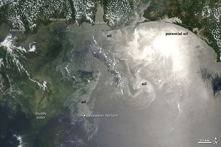
56 days into the the still-leaking Deepwater Horizon oil well spill in the Gulf of Mexico, satellite views are becoming a daily viewing habit. This latest image, taken on June 12, 2010 shows the oil particularly visible across the northern Gulf of Mexico when the Moderate Resolution Imaging Spectroradiometer (MODIS) on NASA’s Aqua satellite captured this image at 1:55 p.m. CDT. Oil appears to have reached beaches and barrier islands in Alabama and the western Panhandle of Florida. The problem for wildlife, and particularly birds, is that from above, the water does not look different. And when they dive in for prey, the get soaked with oil. Estimates are that between 12,000 and 19,000 barrels a day are gushing from the damaged well. On June 3rd, BP lowered a containment cap onto a cut pipe to catch some of the flow. This cap, says the company, is now collecting more than 10,000 barrels of oil a day, ferrying it up to a tanker on the surface. But no one can be absolutely sure of the estimates.

As the oil is coming ashore along the gulf coast, everyone wonders how far the oil will travel. Researchers National Center for Atmospheric Research (NCAR) have completed a detailed computer modeling study that indicates the oil might soon extend along thousands of miles of the Atlantic coast and open ocean as early as this summer. The video of their results, captured in a series of dramatic animations, below, has caused quite a stir.

The results seem fairly dramatic, but Dr. Synte Peacock, an oceanographer at NCAR said in an interview in EarthSky.org on that the simulations used a dye, and not oil. A dye would travel to the Atlantic Ocean, but oil would behave differently.

However, her team still thinks it’s very likely that oil will get into the Atlantic.

If it does, she said, people shouldn’t expect oil to coat Atlantic beaches and wildlife. That’s because, over the months it would take to travel there – if it does travel there – some oil will evaporate, be eaten by microbes, and become diluted in sea water.

Dr. Peacock added that in all the possible scenarios and simulations that were tested, oil from the oil spill traveled outside of the Gulf within 6 months. But she added that it’s still unclear if or how the oil will affect beaches on the Atlantic Coast. That eventual outcome is partially dependent on local weather around the time the oil reaches a beach.

NASA Earth Observatory image created by Jesse Allen, using data provided courtesy of NASA/GSFC/METI/ERSDAC/JAROS, and U.S./Japan ASTER Science Team.

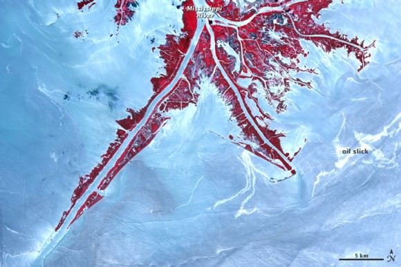
This satellite image from the Advanced Spaceborne Thermal Emission and Reflection Radiometer (ASTER) on NASA’s Terra satellite shows a false color image of on June 10, 2010, where parts of the oil slick are nearing the Mississippi Delta. Vegetation appears red and water appears in shades of blue and white.

Sources: NASA Earth Observatory, EarthSky

Pictures of Australia

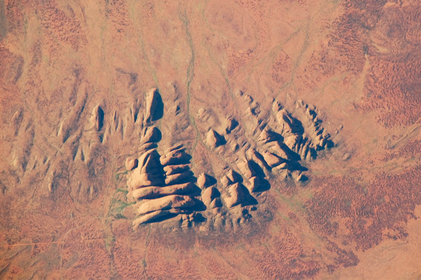
Kata Tjuta (The Olgas), Northern Territory, Australia

Here are some pictures of Australia, taken from space. You can make any of these images into your computer wallpaper. Just click on an image to make it larger, then right-click and choose “Set as Desktop Background”.

[/caption]

This is a photograph of Uluru-Kata Tjuta National Park, an isolated region in Australia’s Northern Territory. It’s famous for these isolated mountains known as inselbergs.

Australia’s Great Barrier Reef

Here’s an image of the Great Barrier Reef from space. This reef extends for 2,000 km along the coast line of Australia.

Spider Crater, Western Australia

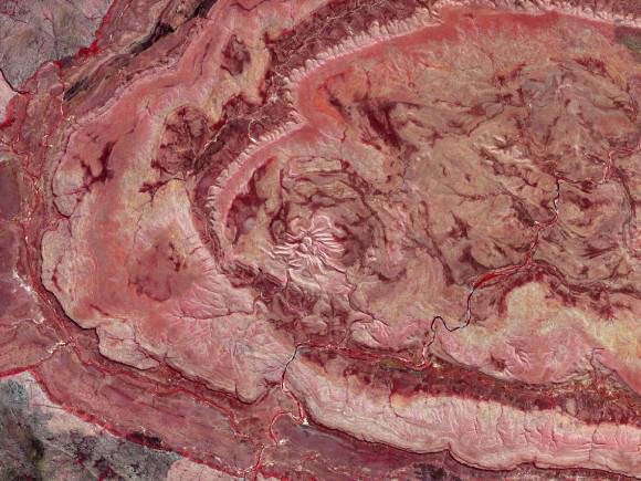
This is an image of Spider Crater, in Western Australia. Geologists believe it was formed between 900 and 600 million years ago, when a large asteroid struck the Earth.

Perth, Australia
Perth, Australia

Here’s a photo of Perth, one of the largest cities in Australia. It’s the capital of Western Australia, and home to about 1.5 million people.

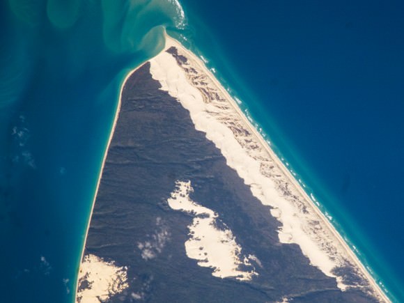
Sandy Cape, Fraser Island, Australia

Here’s an image of Sandy Cape, on Fraser Island; the largest sand island in the world.

We’ve written many articles about Australia for Universe Today. Here’s an article about a huge river of dust above Australia, and here’s an article about Australian bushfires seen from space.

If you’d like more pictures of Australia, check out Visible Earth Homepage. And here’s a link to NASA’s Earth Observatory.

We’ve also recorded an episode of Astronomy Cast all about planet Earth. Listen here, Episode 51: Earth.

A Trilogy of Tremendous Volcanoes

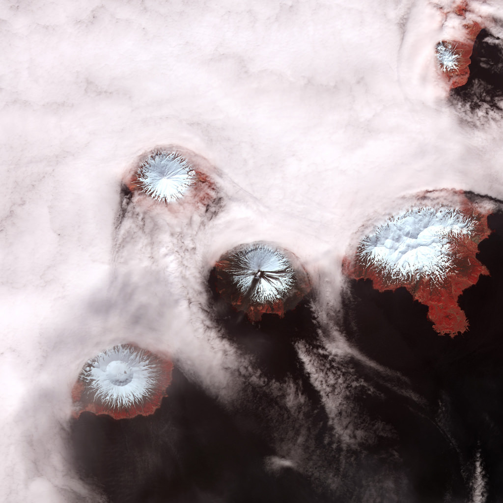
Mt. Cleveland in Alaska. NASA Earth Observatory image by Jesse Allen & Robert Simmon, using data from the NASA/GSFC/METI/ERSDAC/JAROS, and U.S./Japan ASTER Science Team.

[/caption]

You like volcanoes? We’ve got volcanoes! Three recent images from space show some tremendous volcanoes on Earth. This very unusual image shows a small volcanic plume rising above remote Mount Cleveland on June 1, 2010. The snow-covered upper slopes of the Aleutian alaska volcano were also marked by dark debris flow deposits (descending to the east) and ash fall to the south of the summit. This false-color image was acquired by the Advanced Spaceborne Thermal Emission and Reflection Radiometer (ASTER) aboard NASA’s Terra satellite. Snow is white, clouds are pink, vegetation is red, and water is almost black. The Alaska Volcano Observatory reported an ash emission above Mount Cleveland no higher than 16,000 feet (4,900 meters) on May 30th. Mount Cleveland is frequently restless, and the current activity is not unusual, but Ash from Cleveland could threaten flights between Asia and North America. Satellites are the best way to monitor the volcano, which is about 900 miles (1,500 kilometers) from Anchorage.

Next: @Astro_Soichi strikes again:

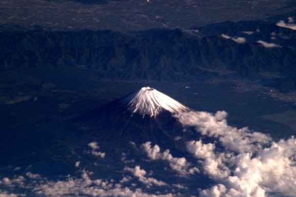
Mt. Fuji in Japan, as seen from the ISS. Credit: NASA/JAXA/Soichi Noguchi

Before he left the International Space Station to return back to Earth, Soichi Noguchi, who shared his experiences in space like no other astronaut via his Twitter feed and pictures, took this image of Mt. Fuji in his home country of Japan.

Iceland, without ash and smoke from the Eyjafjallajokull volcano. Credit: ESA

Ok, this one isn’t specifically of a volcano, but it is one of the first satellite images of Iceland to show smoke- and ash-free skies above Iceland.

This image is from ESA’s Envisat satellite and the Medium Resolution Imaging Spectrometer on May 24, 2010.

The Eyjafjallajokull volcano, which had a series of eruptions in April and May, is visible in the dark area on the southern coast. The Vatnajokull glacier (visible in white northeast of Eyjafjallajokull) is the largest in Iceland and in Europe. The white circular patch in the center of the country is Hofsjokull, the country’s third largest glacier and its largest active volcano. The elongated white area west of Hofsjokull is Langjokull, Iceland’s second largest glacier.

Sources: Goddard Spaceflight Center, @Astro_Soichi, ESA

Time-Lapse Satellite View of Growing Oil Spill

We’ve featured many aerial satellite images of the Deepwater Horizon oil spill, here on Universe Today, but this time-lapse video puts them all together. The video reveals a space-based view beginning on April 12 before the accident, then after the April 20 explosion, with the burning oil rig. Later, the ensuing oil spill is captured through May 24. Two NASA satellites are constantly capturing images Earth, focusing on particular areas of interest, the Terra and Aqua satellites which both have the MODIS instrument (Moderate Resolution Imaging Spectroradiometer.) The oil slick appears grayish-beige in the image and changes due to changing weather, currents, and use of oil dispersing chemicals.

The latest word on the “top kill” effort to stop the gushing oil well is that it has seen initial success.
Continue reading “Time-Lapse Satellite View of Growing Oil Spill”

Satellite Images Show Oil Slick on the Move Towards Florida, Possibly East Coast of US

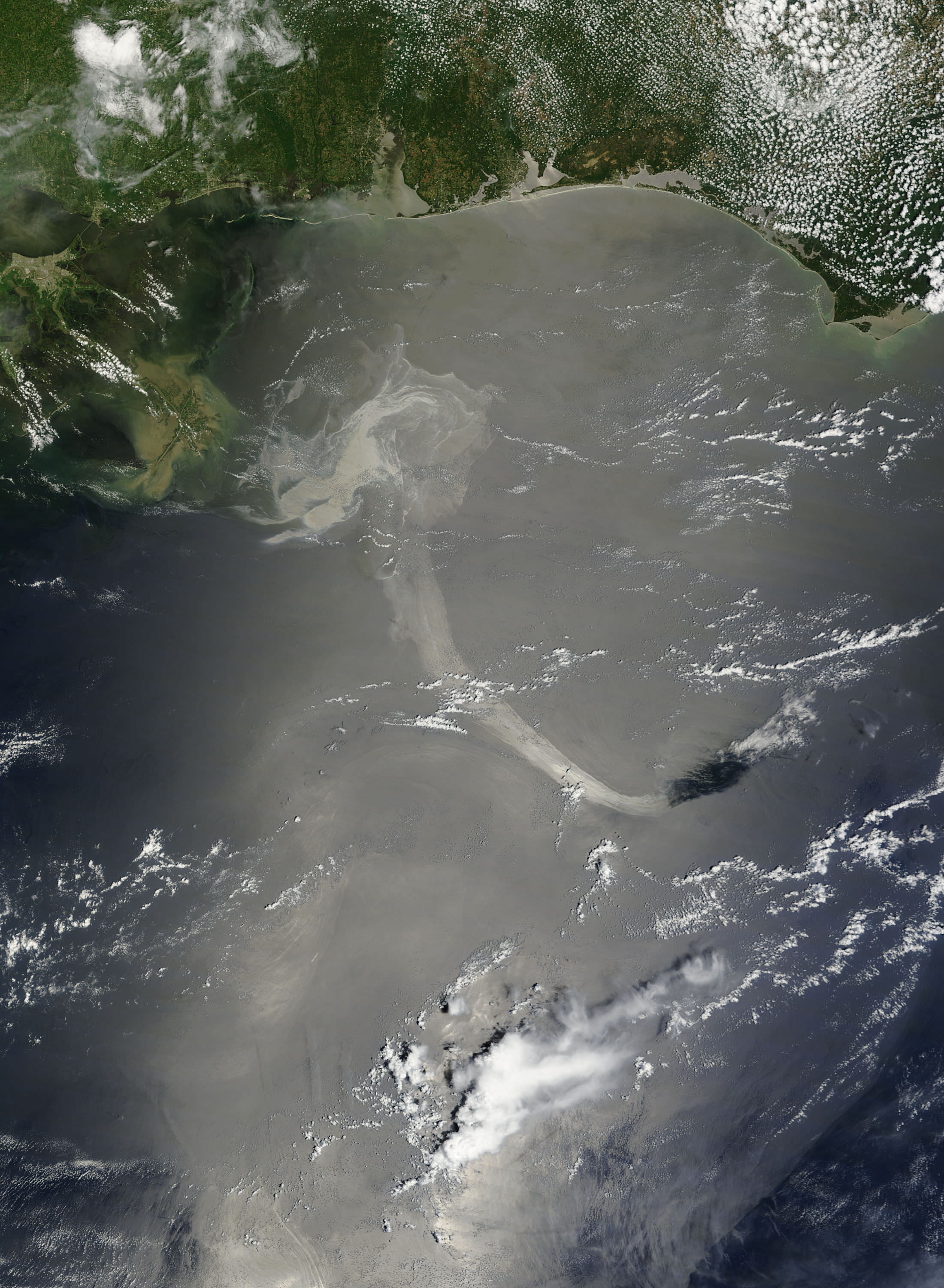
A satellite image from the Moderate Resolution Imaging Spectroradiometer (MODIS) on NASA’s Terra satellite on May 17, 2010, showing a long ribbon of oil stretched far to the southeast. Credit: NASA NASA image by Jeff Schmaltz, MODIS Rapid Response Team.

[/caption]

Confirming some of the worst fears about the Deepwater Horizon oil spill in the Gulf of Mexico, satellite images now show part of the oil slick has entered the Loop Current, a powerful conveyor belt-like current that flows clockwise around the Gulf of Mexico towards Florida. The Loop Current joins the Gulf Stream — the northern hemisphere’s most important ocean-current system — and the oil could enter this system and be carried up to the US East Coast.

Both NASA and ESA satellites have been returning daily satellite images of the oil spill.

“With these images from space, we have visible proof that at least oil from the surface of the water has reached the current,” said Dr Bertrand Chapron of Ifremer, the French Research Institute for Exploitation of the Sea.

During the first weeks following the explosion at the oil rig, oil could be seen drifting from the site of the incident and it usually headed west and northwest to the Mississippi River Delta. But in the third week of May, currents drew some of the oil southeast. According to the National Oceanic and Atmospheric Administration (NOAA), the southward spread increased the chance that the oil would become mixed up with the Loop Current and spread to Florida or even the U.S. East Coast.

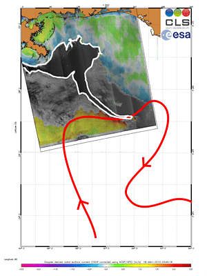
Graphic from Envisat data. Credits: CLS

In this Envisat Advanced Synthetic Aperture Radar (ASAR) image, acquired on 18 May 2010, a long tendril of the oil spill (outlined in white) is visible extending down into the Loop Current (red arrow).

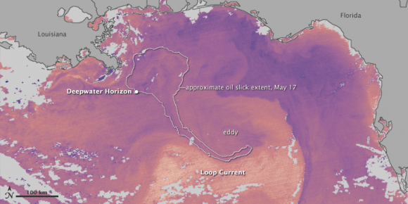
An infrared image from May 18, 2010 from the Moderate Resolution Imaging Spectroradiometer (MODIS) on NASA’s Terra satellite.

The infrared image is annotated with the location of the leaking well and the approximate location of the southern arm of the oil slick on May 17 (based on natural-color MODIS imagery). Oil was very close to the Loop Current, whose warm waters appear in yellow near the bottom of the image. However, there is also an eddy of cooler water (purple) circulating counterclockwise at the top of the Loop Current. According to NOAA, “Some amount of any oil drawn into the Loop Current would likely remain in the eddy, heading to the northeast, and some would enter the main Loop Current, where it might eventually head to the Florida Strait.”

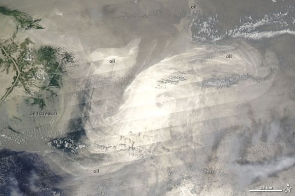
Image from MODIS on Aqua from May 18. NASA image by Jeff Schmaltz, MODIS Rapid Response Team.

This unusual natural color image taken on May 18, 2010 by the Moderate Resolution Imaging Spectroradiometer (MODIS) on NASA’s Aqua satellite shows sun glinting off the oil slick. The diagonal stripes result from the Sun’s reflection on the ocean surface, called sunglint. The sunglint accentuates the left-to-right scans that the satellite sensor makes as it passes over the Earth’s surface, and the stripes are perpendicular to the satellite’s path.

Besides hinting at the sensor’s scans, the sunglint also illuminates oil slicks on the sea surface. Bright oil slicks appear east and southeast of the delta.

NASA’s and ESA’s satellites will keep watch on this oil slick from above.

Sources: NASA Earth Observatory, (this page, and this page, too), ESA