Why People Resist the Notion of Climate Change

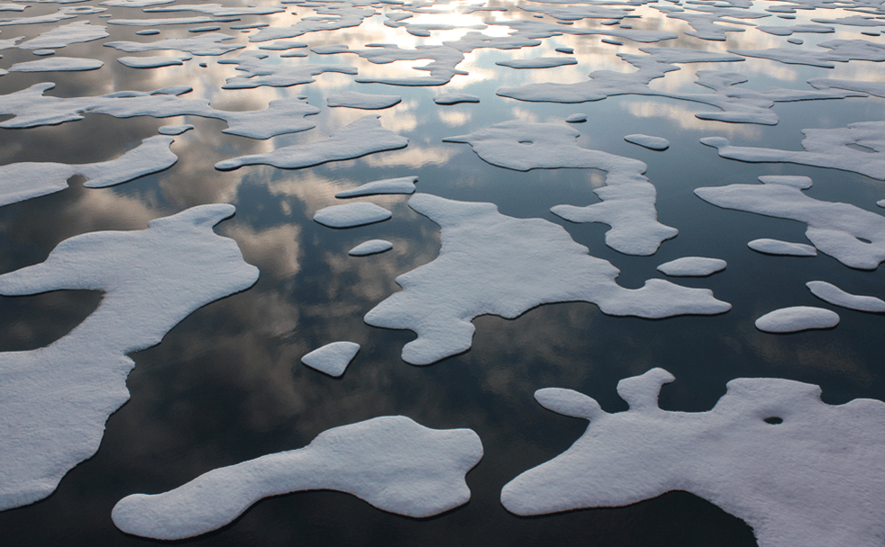
Image Credit: NASA

One of the most striking features of the climate change ‘debate’ is that it’s no longer a debate. Climate scientists around the world agree that climate change is very real — the Earth is warming up and we are the cause.

Yet while there is consensus even among the most reserved climate scientists, a portion of the public persistently disagrees. A recent Pew Research Center — an organization that provides information on demographic trends across the U.S. and the world — survey found that roughly four-in-ten Americans see climate change as a global threat. Climate scientists are racking their brains in an attempt to find out why.

Yale law professor Dan Kahan has done extensive research which reveals how our deep-rooted cultural dispositions might interfere with our perceptions of reality.

Why We Resist Climate Change

In 2010 Kahan led a study, “Cultural Cognition of Scientific Consensus,” which found that individuals tend to weigh evidence and credit experts differently based on cultural considerations. Psychological mechanisms allow individuals to selectively credit or dismiss evidence and experts, depending on whether the views presented match the dominant view of their group.

“There is an interdependence between people’s prior beliefs about risk and their exposure to and understanding of information,” Kahan told Universe Today. “People are motivated to search out information in a biased way. They look more for information that is consistent with their views than for information that is going to refute their views.”

Kahan’s study was administered online to 1,500 U.S. adults. Preliminary analyses wanted to determine if the public thought there was a scientific consensus regarding climate change and if there was a scientific consensus regarding human activity as the cause.

A majority — 55 percent — of the subjects reported their opinion that most scientists agree that global temperatures are rising, 12 percent believed most scientists do not find that global temperatures are rising, and 33 percent believed that scientists are divided on the topic. On whether or not human activity is the cause, 45 percent believed scientists agree that human activity is the cause, 15 percent believed scientists don’t think human activity is the cause, and 40 percent believed scientists are divided on the topic.

The public is generally not in a position to investigate the data for themselves or even read a scientific paper full of unfamiliar acronyms, plots and equations. Instead they turn to experts for assistance. Often times in determining who is credible, individuals will trust those who share similar world views and personal values. They tend to seek information congenial to their cultural predispositions.

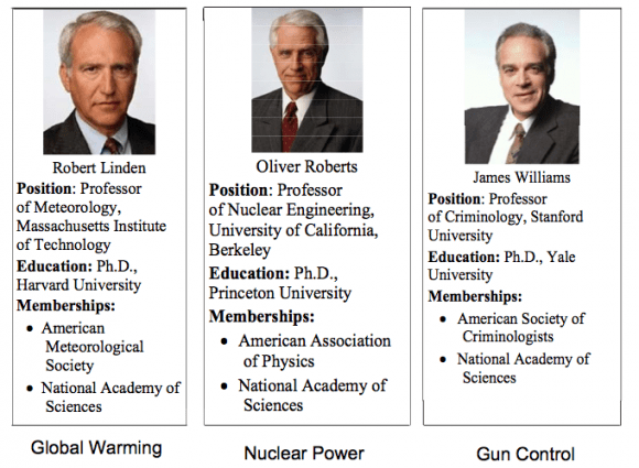
For Kahan’s first experiment, the subjects read the biographical information of an expert scientist. They had to decide whether he was credible, having earned a Ph.D. from an elite university and now serving as a faculty member of another elite university. Those who listed themselves as hierarchical — believing in stratified social roles (generally conservatives) —  were more likely to find the expert scientist credible, while those who listed themselves as communitarian — expecting individuals to secure their own well-being (generally liberals) — were more likely to find the expert scientist not credible.

These fictional individuals were identified as credible or not based on their biographies only.
These fictional individuals were identified as credible or not based on their biographies only. Credit: Kahan et al. 2010

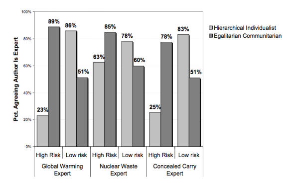
However, a second experiment showed the subjects not only the resume of the expert scientist but his position as well. Half the subjects were shown evidence that the expert believed in climate change, placing us at a high risk, while the other half of the subjects were shown evidence that the expert didn’t believe in climate change, placing us at a low risk.

The position imputed by the expert scientist dramatically affected the responses of the subjects. When the expert scientist supported a high risk position, 23 percent of the hierarchs and 88 percent of the communitarians found him credible. In contrast, when the expert scientist supported a low risk position, 86 percent of the hierarchs and 47 percent of the communitarians found him credible.

Whether the expert scientist was considered credible was highly associated with whether he took the position dominant in the subject’s cultural group. The subjects “have dispositions that are connected to their values that then will affect how they make sense of information,” Kahan said.

Image Credit: Kahan et al. 2010
The percentage of subjects who found the author credible depending on whether he supported a high risk (climate change is real) or low risk (climate change is not real) position. Credit: Kahan et al. 2010

At the end of the day the conclusion is simple: we’re human.  And this leads us to take the path of least resistance: we choose to believe in what those around us believe.

So it’s not that people aren’t sufficiently rational. “They’re too rational,” Kahan said. “They’re too good at extracting from the information you’re giving them, which sends the message that tells them what position they should take given the kind of person they are.”

Moving Forward

Kahan’s study shows that scientific consensus alone will not sway the public. The public will remain polarized despite efforts to increase trust in scientists or simply awareness of scientific research. Instead the key is to use science communication strategies, which reduce the likelihood the public will find climate change threatening.

In a more recent study, published in Nature, Kahan analyzed two techniques of science communication that may help break the connection between cultural predispositions and the evaluation of information.

The first technique is to frame the information in a manner that doesn’t threaten people’s values. In this study, Kahan and his colleagues asked participants to once again assess the credibility of climate change. But before doing so the subjects had to read an article.

One article was a study suggesting that carbon dissipates from the atmosphere much slower than scientists had previously thought. As a result, if we stopped producing carbon today, there would still be catastrophic effects: rising sea level, drought, hurricanes, etc. Another article (shown to a different group) gave information on geo-engineering or nuclear power — potential technological advances that may help reduce the effects of climate change. A final control group read an unrelated article on traffic lights.

Logically all of these articles had nothing to do with whether climate change is valid. But psychologically these articles did determine the meaning that people attached to the evidence of climate change. In all cases the hierarchs were less likely than the communitarians to say climate change is valid. But the gap was 29 percent smaller among the group that was first exposed to geo-engineering than the group that was exposed to regulating carbon.

“The evidence of whether there is a problem doesn’t depend on what you’re going to do about it,” Kahan said. “But psychologically it can make a difference.”

People tend to resist scientific evidence that may lead to restrictions on their personal activities, or evidence that threatens them as individuals  But if they are presented with information in a way that upholds their identities, they react with an open mind.

The second technique is to ensure that climate change is vouched for by a diverse set of experts. If a particular group is able to identify with that expert, then that group will be more open-minded in addressing the study. This will help reduce the initial polarization between hierarchs and communitarians.

Kahan argues that science “needs better marketing.” It needs to combine climate change with meanings that are affirming rather than threatening to people. When groups can identify with the expert, or are presented with possible solutions to climate change, the individuals in that group will stop attaching the issues to identity.

According to Kahan, in order to move forward, science communication needs to change the narrative. It needs to mitigate the connection between climate change and the individual. In order for there to be a public consensus on climate change it has to be presented in a less threatening manner.

This doesn’t mean that science communication has to avoid the nasty truth about climate change in order to finally reach a public consensus. Instead it has to spin climate change in a positive way — a way that is less threatening to the individual.

Science communication has to focus the public’s attention on what so many individuals value: efficiency, not being wasteful, innovation and moving forward. Only then will the public reach a consensus where there is now only polarization.

You are Here! Curiosity’s 1st Photo of Home Planet Earth from Mars

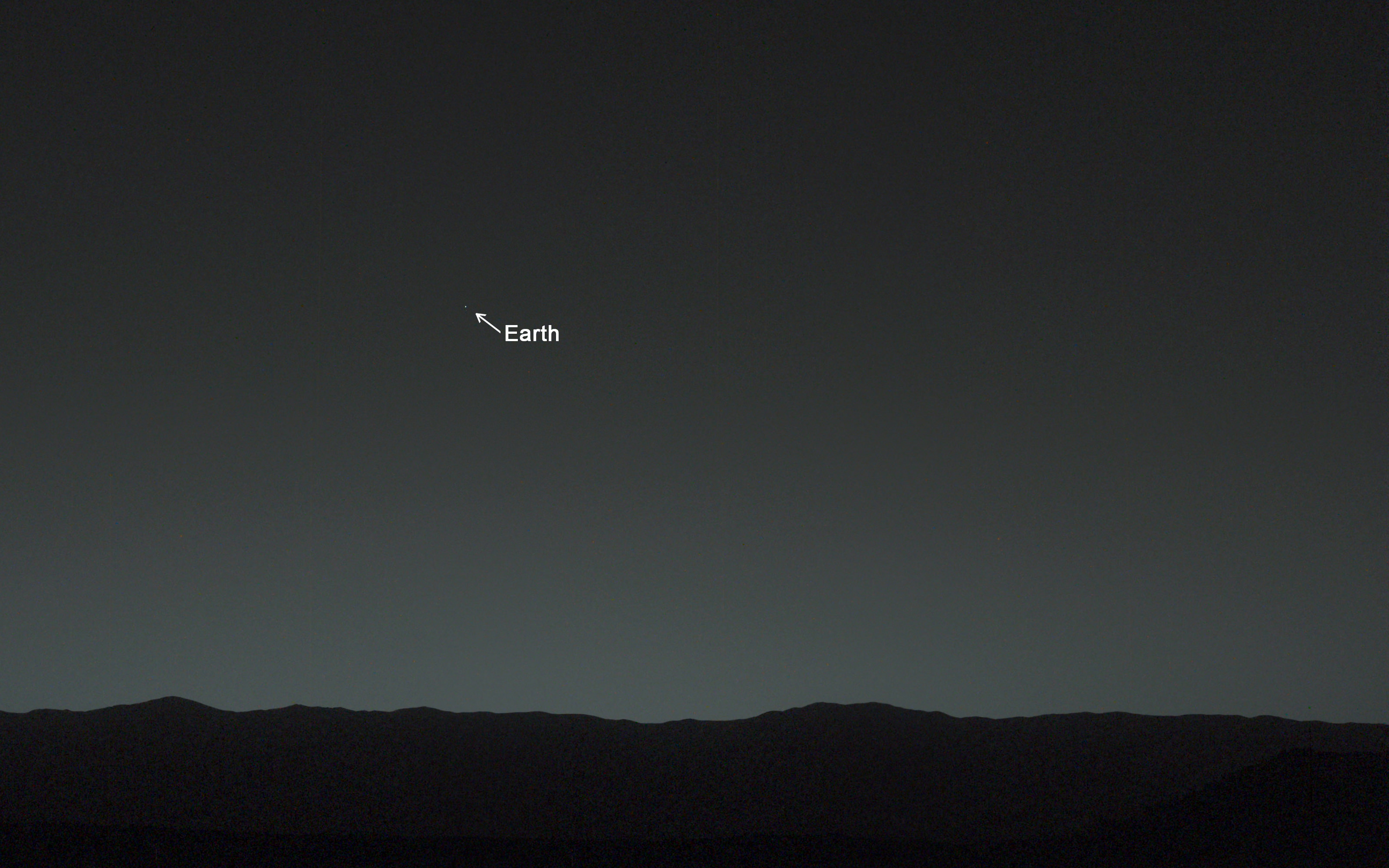
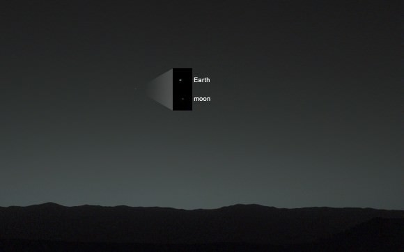
You are here! As an Evening Star in the Martian Sky. This evening-sky view taken by NASA's Mars rover Curiosity shows the Earth and Earth's moon as seen on Jan. 31, 2014, or Sol 529 shortly after sunset at the Dingo Gap inside Gale Crater. Credit: NASA/JPL-Caltech/MSSS/TAMU

You are here! – As an Evening Star in the Martian Sky
This evening-sky view taken by NASA’s Mars rover Curiosity shows the Earth and Earth’s moon as seen on Jan. 31, 2014, or Sol 529 shortly after sunset at the Dingo Gap inside Gale Crater.
Credit: NASA/JPL-Caltech/MSSS/TAMU
See more imagery of the Earth and Moon below!
Story updated[/caption]

18 months into her mission to discover a habitable zone on the Red Planet, NASA’s Curiosity rover has at last looked back to the inhabited zone of all humanity and snapped her 1st image of all 7 Billion Earthlings living on the Home Planet.

“Look Back in Wonder… My first picture of Earth from the surface of Mars,” tweeted Curiosity today.

You are there! See yourselves in the spectacular imagery from the Red Planet’s surface at the ‘Dingo Gap’ inside Gale Crater – above and below.

Car sized Curiosity captured the evocative image of Earth as an evening star in the Martian sky just days ago on Jan. 31, 2014, or Sol 529, some 80 minutes after sunset.

And what’s more is that the evening sky view even includes the Earth’s Moon!

Annotated evening-sky view taken by NASA's Mars rover Curiosity shows the  Earth and Earth's moon - enlarged in inset - as seen on Jan. 31, 2014, or Sol 529 shortly after sunset at the Dingo Gap sand dune.  Credit: NASA/JPL-Caltech/MSSS/TAMU
Annotated evening-sky view taken by NASA’s Mars rover Curiosity shows the Earth and Earth’s moon – enlarged in inset – as seen on Jan. 31, 2014, or Sol 529 shortly after sunset at the Dingo Gap sand dune. Credit: NASA/JPL-Caltech/MSSS/TAMU

Earth shines brilliantly as the brightest beacon in the Martian twilight sky view taken from the 1 ton rovers current location at the edge of a sand dune dubbed the ‘Dingo Gap.’

“A human observer with normal vision, if standing on Mars, could easily see Earth and the moon as two distinct, bright “evening stars,” said NASA in a statement issued today.

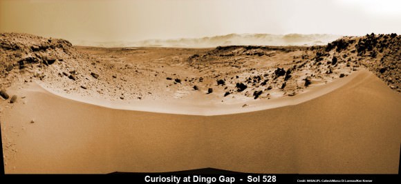
Curiosity’s View Past Tall Dune at edge of ‘Dingo Gap’  This photomosaic from Curiosity’s Navigation Camera (Navcam) taken at the edge of the entrance to the Dingo Gap shows a 3 foot (1 meter) tall dune and valley terrain beyond to the west, all dramatically back dropped by eroded rim of Gale Crater. View from the rover’s current position on Sol 528 (Jan. 30, 2014). The rover team may decide soon whether Curiosity will bridge the dune gap as a smoother path to next science destination. Credit: NASA/JPL-Caltech/Marco Di Lorenzo/Ken Kremer- kenkremer.com
1st Curiosity Snapshot of Earth taken from here –
Curiosity’s View Past Tall Dune at edge of ‘Dingo Gap’ sand dune
This photomosaic from Curiosity’s Navigation Camera (Navcam) taken at the edge of the entrance to the Dingo Gap shows a 3 foot (1 meter) tall dune and valley terrain beyond to the west, all dramatically back dropped by eroded rim of Gale Crater. View from the rover’s current position on Sol 528 (Jan. 30, 2014). The rover team may decide soon whether Curiosity will bridge the dune gap as a smoother path to next science destination.
Credit: NASA/JPL-Caltech/Marco Di Lorenzo/Ken Kremer- kenkremer.com

Curiosity used both of her high resolution mast mounted color cameras to collect a series of Earth/Moon images flittering across the Martian sky.

The Earth and the Moon in this evening-sky view taken by Curiosity’s telephoto Mastcam right -eye camera  on Jan. 31, 2014, or Sol 529 shortly after sunset at the Dingo Gap. Moon’s brightness was enhanced to aid visibility. Credit: NASA/JPL-Caltech/MSSS/TAMU
The Earth and the Moon in this evening-sky view taken by Curiosity’s telephoto Mastcam right -eye camera on Jan. 31, 2014, or Sol 529 shortly after sunset at the Dingo Gap. Moon’s brightness was enhanced to aid visibility. Credit: NASA/JPL-Caltech/MSSS/TAMU

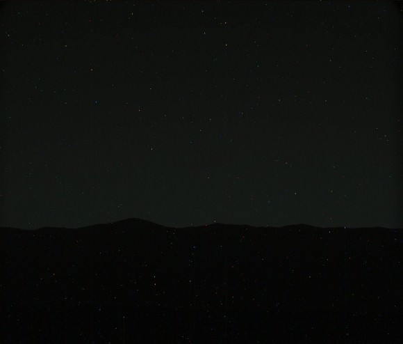
Processing has removed the numerous cosmic ray strikes – see raw image below.

Right now Curiosity’s handlers are pondering whether to climb over the 1 meter tall sand dune and cross into the smooth terrain of the valley beyond the ‘Dingo Gap’ – as an alternate path to minimize damaging encounters with sharp edged Martian rocks that are puncturing holes and ripping tears into the robots six wheels.

To be clear, these are not the first images of the Earth from Mars orbit or Mars surface.

NASA’s Mars Exploration Rover Spirit imaged Earth from the surface in March 2004, soon after landing in Gusev Crater in January 2004.

Two of NASA’s other Red Planet explorers also imaged Earth; Mars Global Surveyor in 2003 and Mars Reconnaissance Orbiter in 2007.

More recently, NASA’s Cassini orbiter at Saturn spied the Earth and Moon during the Wave at Saturn event in July 2013 from a distance of 898 million miles (1.44 billion kilometers).

And still more images of the Earth from NASA’s Mariner 10 and Juno Jupiter orbiter in my recent planetary exploration story – here

The most famous and distant of all is the ‘Pale Blue Dot’ image of Earth taken by NASA’s Voyager 1 probe in 1990 from about 6 billion kilometers (3.7 billion miles) away.

Meanwhile, NASA’s sister rover Opportunity is exploring clay mineral outcrops by the summit of Solander Point on the opposite side of Mars at the start of her 2nd Decade investigating the Red Planet’s mysteries.

Stay tuned here for Ken’s continuing Curiosity, Opportunity, Chang’e-3, SpaceX, Orbital Sciences, LADEE, MAVEN, MOM, Mars and more planetary and human spaceflight news.

Ken Kremer

Curiosity Mastcam raw image showing the Earth in the Martian twilight sky on Jan. 31, 2014 above Gale crater rim amidst numerous cosmic ray strikes. Credit: NASA/JPL-Caltech/MSSS
Curiosity Mastcam raw image showing the Earth in the Martian twilight sky on Jan. 31, 2014 amidst numerous cosmic ray strikes. . Credit: NASA/JPL-Caltech/MSSS
Curiosity photographed You and all of humanity looking from somewhere above the eroded rim of Gale Crater -  a portion of which is seen in this photomosaic taken by the same Mastcam camera  on Feb 1, 2014, Sol 530, at the Dingo Gap sand dune.  Credit: NASA/JPL-Caltech/MSSS/Marco Di Lorenzo/Ken Kremer- kenkremer.com
Curiosity photographed You and all of humanity looking from somewhere above the eroded rim of Gale Crater – a portion of which is seen in this photomosaic taken by the same Mastcam camera on Feb 1, 2014, Sol 530, at the Dingo Gap sand dune. Credit: NASA/JPL-Caltech/MSSS/Marco Di Lorenzo/Ken Kremer- kenkremer.com
Photomosaic shows new holes and tears in several of rover Curiosity’s six wheels caused by recent driving over sharp edged Martian rocks on the months long trek to Mount Sharp. Raw images taken by the MAHLI camera on Curiosity’s arm on Jan. 31, 2014 (Sol 529) were assembled to show some recent damage to several of its six wheels.  Credit: NASA / JPL / MSSS / Marco Di Lorenzo / Ken Kremer- kenkremer.com
Photomosaic shows new holes and tears in several of rover Curiosity’s six wheels caused by recent driving over sharp edged Martian rocks on the months long trek to Mount Sharp. Raw images taken by the MAHLI camera on Curiosity’s arm on Jan. 31, 2014 (Sol 529) were assembled to show some recent damage to several of its six wheels. Credit: NASA / JPL / MSSS / Marco Di Lorenzo / Ken Kremer- kenkremer.com

Heavy-Lift Rocket Launch Seen from Space

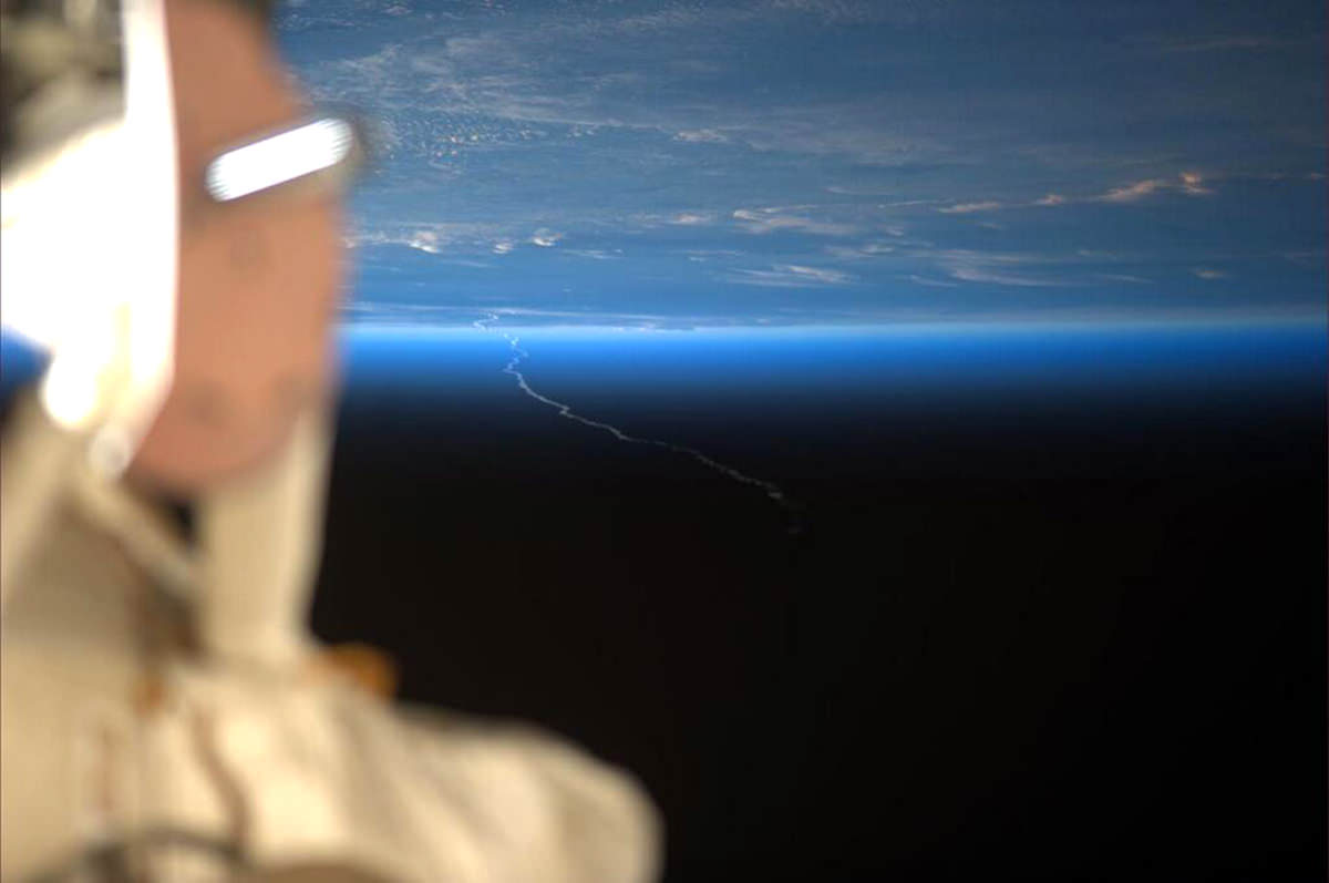
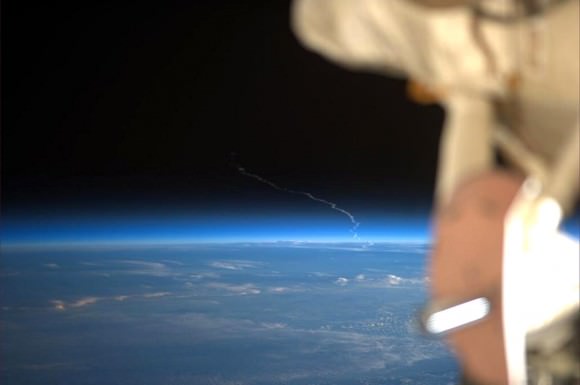
Ariane 5 launch on Feb. 6, 2013 captured on camera by NASA astronaut Rick Mastracchio

We all know what a big rocket launch looks like from the ground, but this is what it looks like from above the ground — 260 miles above the ground! The photo above was captured from the Space Station earlier today by NASA astronaut Rick Mastracchio, and it shows the contrail from a heavy-lift Ariane 5 that had just launched from ESA’s spaceport on the French Guiana coast: flight VA217, Arianespace’s milestone 250th launch carrying the ABS-2 and Athena-Fidus satellites into orbit.

Rick shared his view on Twitter with his nearly 39,000 followers, and now less than an hour later, we’re sharing it here. (Isn’t technology wonderful?)

For a more “natural” look, here it is reversed:

Rick Mastracchio's photo of the Ariane 5 launch, rotated 180 degrees.
Rick Mastracchio’s photo of the Ariane 5 launch, rotated 180 degrees.

The ISS was in the process of passing over Costa Rica when the image was taken. The rocket launched from Kourou, French Guiana — about 2,175 miles (3,500 km) away. What a view!

For this and more great images from orbit follow Rick on Twitter @AstroRM.

Watch a video of the VA217 launch below:

The 250th launch performed by Arianespace lifted off from ESA’s spaceport in French Guiana, delivering a dual-satellite payload into geostationary transfer orbit: ABS-2 for global satellite operator ABS, and Athena-Fidus for the defense/homeland security needs of France and Italy. The flight lasted just over 32 minutes. (Source)

What Is The Future Of Our Sun?

What Is The Future Of Our Sun?

Who knows what the future holds for our Sun? Dr. Mark Morris, a professor of astronomy at UCLA sure knows. Professor Morris sat down with us to let us know what we’re in for over the next few billions years.

“Hi, I’m Professor Mark Morris. I’m teaching at UCLA where I also carry out my research. I work on the center of the galaxy and what’s going on there – in this fabulous arena there, and on dying stars – stars that have reached the end of their lifetime and are putting on a display for us as they do so.”

What is the future of our sun?

“Well, there’s every expectation that in about 5 billion more years, that our sun will swell up to become a red giant. And then, as it gets larger and larger, it will eventually become what’s called an asymptotic giant branch star – a star whose radius is just under the distance between the sun and the Earth – one astronomical unit in size. So the Earth will be literally skimming the surface of the red giant sun when it’s an asymptotic giant branch star.”

“A star that big is also cool because they’re cold – red hot versus blue hot or yellow hot like our sun. Because it’s cold, a red giant star at its surface layers can keep all of its elements in the gas phase. So some of the heavier elements – the metals and the silicates – condense out as small dust grains, and when these elements condense out as solids, then radiation pressure from this very luminous giant star pushes the dust grains out. That may seem like a minor issue, but in fact these dust grains carry the gas with them. And so the star literally expels its atmosphere, and goes from a red giant star to a white dwarf, when finally the core of the star is exposed. Now, as it’s doing this, that hot core of the star is still very luminous and lights up through a fluorescent process, this out-flowing envelope, this atmosphere that was once a star, and that’s what produces these beautiful displays that are called planetary nebulae.”

“Now, planetary nebulae can be these beautiful round, spherical objects, or they can be bipolar, which is one of the mysteries that we’re working here is trying to understand why, at some stage, a star suddenly becomes axisymmetric – in other words, is sending out is’s atmosphere in two diametrically opposed directions predominantly, rather than continuing to lose mass spherically.”

Planetary Nebula
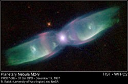
Planetary Nebula M2-9 (Credit: Bruce Balick (University of Washington), Vincent Icke (Leiden University, The Netherlands), Garrelt Mellema (Stockholm University), and NASA)

“We can’t invoke rotation of the star – that would be one way to get a preferred axis, but stars don’t rotate fast enough. If you take the sun and let it expand to become a red giant, then by the conservation of angular momentum, it literally won’t be spinning at all. It’ll be spinning so slowly that it’ll literally have no effect. So we can’t invoke spin, so there must be something going on deep down inside the star, that when you finally expose some rapidly spinning core, it can have an effect.”

“Or, all of the stars that we see as planetary nebula can have binary companions, that could be massive planets or relatively low mass stars that themselves can impose an angular momentum orientation on the system. This is in fact an idea that I’ve been championing for decades now, and it has some traction. There’s a lot of planetary nebula nuclei, the white dwarves, that seem to have companions near them that are suspect for having been responsible for helping strip the atmosphere of the mass-losing red giant star but also providing a preferred axis along which the ejected matter can flow.”

Latest Data Shows Global Climate Continues Warming Trend

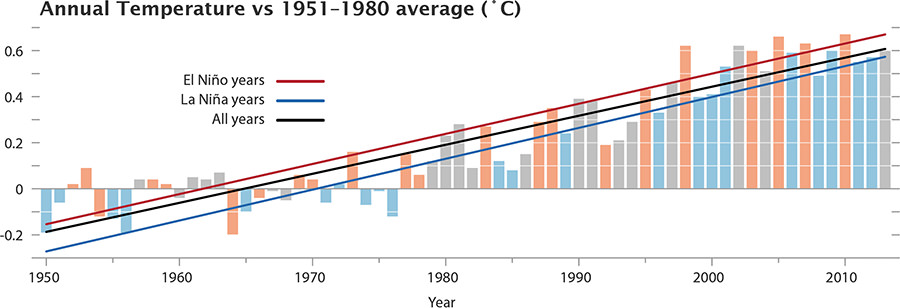
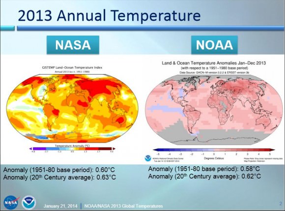
Chart of the temperature anomalies for 1950-2013, also showing the phase of the El Niñ0-La Niña cycle. (Image Credit: NASA/GSFC/Earth Observatory, NASA/GISS)

The latest statistics are in from 2013 and both NASA’s and NOAA’s measurements of global temperatures show Earth continued to experience temperatures warmer than those measured several decades ago.

NASA scientists say 2013 tied with 2009 and 2006 for the seventh warmest year since 1880, continuing a long-term trend of rising global temperatures, while NOAA – which uses a different method of analyzing temperature data – said that 2013 tied with 2003 as 4th-warmest year globally since 1880.

“The long-term trends are very clear, and they’re not going to disappear,” said climatologist Gavin Schmidt from NASA’s Goddard Institute for Space Studies (GISS). “It isn’t an error in our calculations.”

Land and ocean global temperatures in 2013 from both NASA and NOAA. Via NASA.

NASA data shows that since 1950, average temperatures have increased 1.1°F to an average of 58.3° in 2013.

NOAA data shows the average temperature across global land and ocean surfaces was 1.12 degrees above the 20th-century average. This is the 37th consecutive year that the annual temperature was above the long-term average.

This coincides with another recent study that showed the so-called “pause” in global warming is not happening, and that the temperatures over the past 15 years are still on the rise.

Both NASA and NOAA scientists say the increase in greenhouse gas levels continue to drive the temperature increase.

Additionally, with the exception of 1998, the 10 warmest years in the 134-year record all have occurred since 2000, with 2010 and 2005 ranking as the warmest years on record.

NASA says the average temperature in 2013 was 58.3 degrees Fahrenheit (14.6 Celsius), which is 1.1 F (0.6 C) warmer than the mid-20th century baseline. The average global temperature has risen about 1.4 degrees F (0.8 C) since 1880, according to the new analysis. Exact rankings for individual years are sensitive to data inputs and analysis methods.

“Long-term trends in surface temperatures are unusual and 2013 adds to the evidence for ongoing climate change,” GISS climatologist Gavin Schmidt said. “While one year or one season can be affected by random weather events, this analysis shows the necessity for continued, long-term monitoring.”

Scientists emphasize that weather patterns always will cause fluctuations in average temperatures from year to year, but the continued increases in greenhouse gas levels in Earth’s atmosphere are driving a long-term rise in global temperatures. Each successive year will not necessarily be warmer than the year before, but with the current level of greenhouse gas emissions, scientists expect each successive decade to be warmer than the previous.

More from NASA:

Carbon dioxide is a greenhouse gas that traps heat and plays a major role in controlling changes to Earth’s climate. It occurs naturally and also is emitted by the burning of fossil fuels for energy. Driven by increasing man-made emissions, the level of carbon dioxide in Earth’s atmosphere presently is higher than at any time in the last 800,000 years.

The carbon dioxide level in the atmosphere was about 285 parts per million in 1880, the first year in the GISS temperature record. By 1960, the atmospheric carbon dioxide concentration, measured at the National Oceanic and Atmospheric Administration’s (NOAA) Mauna Loa Observatory in Hawaii, was about 315 parts per million. This measurement peaked last year at more than 400 parts per million.

While the world experienced relatively warm temperatures in 2013, the continental United States experienced the 42nd warmest year on record, according to GISS analysis. For some other countries, such as Australia, 2013 was the hottest year on record.

The temperature analysis produced at GISS is compiled from weather data from more than 1,000 meteorological stations around the world, satellite observations of sea-surface temperature, and Antarctic research station measurements, taking into account station history and urban heat island effects. Software is used to calculate the difference between surface temperature in a given month and the average temperature for the same place from 1951 to 1980. This three-decade period functions as a baseline for the analysis. It has been 38 years since the recording of a year of cooler than average temperatures.

The GISS temperature record is one of several global temperature analyses, along with those produced by the Met Office Hadley Centre in the United Kingdom and NOAA’s National Climatic Data Center in Asheville, N.C. These three primary records use slightly different methods, but overall, their trends show close agreement.

You can read NASA’s press release here, and NOAA’s here. Here is a link to a presentation of the data released today from Gavin Schmidt of NASA and Tom Karl, director of NOAA’s Climatic Data Center.

Editor’s note: First quote from Gavin Schmidt is from Jacob Ward on Twitter.

Satellite Image of the “Polar Vortex” Over the US

This image was captured by NOAA's GOES-East satellite on January 6, 2014 at 1601 UTC/11:01 a.m. EST. A frontal system that brought rain to the coast is draped from north to south along the U.S. East Coast. Behind the front lies the clearer skies bitter cold air associated with the Polar Vortex.

If you live in the north and eastern part of the US, you’re probably experiencing some frigid weather. You’re probably also hearing people talk about something called a “polar vortex.”

Just what is a polar vortex and why is it making the temperatures so cold?

This image was captured by NOAA’s GOES-East satellite on Jan. 6, 2014, at 11:01 a.m. EST (1601 UTC). A frontal system that brought rain and snow to the US East coast is seen draped from north to south, and behind the front lies the clearer skies bitter cold air associated with the polar vortex. Also visible in the image is snow on the ground in Minnesota, Wisconsin, Illinois, Indiana, Ohio, Michigan, Iowa and Missouri. The clouds over Texas are associated with a low pressure system centered over western Oklahoma that is part of the cold front connected to the movement of the polar vortex.

NASA explains that the polar vortex is a “whirling and persistent large area of low pressure, found typically over both North and South poles.”

Weather reports say the northern polar vortex was pushing southward over western Wisconsin and eastern Minnesota on Monday, Jan. 6, 2014, and was bringing frigid temperatures to half of the continental United States. It is expected to move northward back over Canada toward the end of the week.

More about the polar vortex:

Both the northern and southern polar vortexes are located in the middle and upper troposphere (lowest level of the atmosphere) and the stratosphere (next level up in the atmosphere). The polar vortex is a winter phenomenon. It develops and strengthens in its respective hemispheres’ winters as the sun sets over the polar region and temperatures cool. They weaken in the summer. In the Northern Hemisphere, they circulate in a counterclockwise direction, so the vortex sitting over western Wisconsin is sweeping in cold Arctic air around it.

Source: NASA

Global Warming Explained in 52 Seconds

Graphic from "How Global Warming Works."

We are awash in the unseen, the unknown and the unexplained. Our Universe is enshrouded in mystery. Even what we do know — the complex physical laws that describe the planets, stars and galaxies — can seem just beyond any normal human being’s grasp. We can’t all be Einsteins, after all.

But excluding string theory, dark energy and quantum field theory most of science is remarkably within our grasp. And in less than a minute, a concept as culturally conflicted and misunderstood as global warming, can be explained. See above.

The motivation behind this video is simple. Research shows that virtually no Americans — roughly 0 percent — can explain the physical mechanisms of global warming at even a basic level. So Berkeley Professor Michael Ranney and colleagues created a total of five videos (with the longest clocking in at 656 words in under five minutes) with the hope of elucidating the basics of global warming.

Their initial study, completed in 2011, surveyed 270 people in San Diego parks in order to assess how well the average American understands global warming. San Diego was chosen because it draws tourists from across the United States, and would thus create a better rounded sample.

“The main concept we were hoping people would tell us, which is at the heart of understanding global warming, is that there is an asymmetry between stuff that’s coming in to our planet and stuff that’s heading out,” Ranney told Universe Today.

This asymmetry explains why sunlight (in the form of visible light) may enter the atmosphere unhindered but is later impeded by greenhouse gases (because it is no longer in the form of visible light — it has been absorbed by the Earth and emitted in the form of infrared light). But not a single person could explain global warming at this basic level.

“We were shocked at how few people knew this” Ranney said. “I thought it was a moral imperative to get the word out as fast as possible.”

So Ranney and his colleagues set out with their work in front of them, creating the videos in order to increase the average American’s understanding of global warming. Their goal is that any one of the five videos will change the lives of seven billion viewers.

“We hope that a video of 400 words or even 35 words will allow people to have a moment in time to which they fix that they knew what the mechanism of climate change was,” Ranney told Universe Today. For that single moment “their knowledge was obvious, valid, understandable and available.”

In order to drive this point home, Ranney used an analogy that began like this: “So a climate change acceptor walks into a bar.” But all jokes aside, if one who accepts anthropogenic global warming tries to convince the man sitting next to him that global warming is real, but cannot explain the physical mechanism behind global warming, then he’s in trouble. He’s likely not only lost his bar mate but encouraged a life-time of global warming denial.

We cannot expect to increase the public’s awareness and acceptance of climate change without a huge increase in scientific literacy. Even if every viewer can’t recall the exact mechanistic details of global warming they can at least say to the man sitting next to them at the bar: “Look, I can’t regurgitate it now but I did understand it then.”

This graph from NOAA shows the annual trend in average global air temperature in degrees Celsius, through December 2012. For each year, the range of uncertainty is indicated by the gray vertical bars. The blue line tracks the changes in the trend over time. Click here or on the image to enlarge. (Image courtesy NOAA's National Climatic Data Center.)
This graph from NOAA shows the annual trend in average global air temperature in degrees Celsius, through December 2012. For each year, the range of uncertainty is indicated by the gray vertical bars. The blue line tracks the changes in the trend over time. Click here or on the image to enlarge. (Image courtesy NOAA’s National Climatic Data Center.)

A second study provided college students with an explanation akin to the one found in the five-minute video.  After reading it, the students not only understood global warming better but they were also more likely to accept global warming as a reality — suggesting these videos have the power to change people’s minds.

“Eventually people come to appreciate salient evidence,” Ranney told Universe Today. “Let’s say you think you’re in a fantastic monogamous relationship. If you come home and find your partner with someone else, it only takes that one moment in time to change your belief.”

Helping people to understand the basic physics behind global warming is a vital tool in convincing them that global warming is as real as it gets. Once someone clicks on the video, the next 52 seconds alone might leave a pretty big impact.

You can view all the videos on howglobalwarmingworks.org.

Ranney emphasized help from graduate student Lee Nevo Lamprey, undergraduate student Kimberly Le and other collaborators (including Dav Clark, Daniel Reinholz, Lloyd Goldwasser, Sarah Cohen and Rachel Ranney).

Three-Meter Asteroid Hits Earth’s Atmosphere… Somewhere

Projected path of 2014 AA south of the Cape Verde islands. (Credit: Asteroid Initiatives, LLC)

This was very likely the last trip around the Sun for the Earth-crossing asteroid 2014 AA, according to calculations by several teams of astronomers and published online earlier today on the IAU’s Minor Planet Center. Discovered just yesterday by the Catalina Sky Survey, the estimated 3-meter-wide Apollo asteroid was supposed to clear Earth today by a razor-thin margin of about 611 km (380 miles)… but it’s now looking like it didn’t quite make it.

The diagram above, via Asteroid Initiatives’ Twitter feed, shows a projected path probability pattern for 2014 AA’s re-entry locations. No eyewitness accounts have yet been reported, and if anyone knows of any surveillance cameras aimed in those directions that might have captured footage of a bolide feel free to share that info below in the comments and/or with @AsteroidEnergy on Twitter.

Other calculations put the entry point anywhere between western Africa and Central America.

According to the MPEC report the asteroid “was unlikely to have survived atmospheric entry intact.”

Watch an animation below showing 2014 AA’s point-of-view as it met Earth. (Video courtesy of Pasquale Tricarico, senior scientist at the Planetary Science Institute in Tucson, AZ.)

2014 AA's approach to Earth on Jan. 1-2, 2014 (Pasquale Tricarico/PSI)
Simulation of 2014 AA’s approach to Earth on Jan. 1-2, 2014 (Credit: Pasquale Tricarico/PSI. Used with permission.)

JPL’s Near-Earth Object program classifies Apollo asteroids as “Earth-crossing NEAs with semi-major axes larger than Earth’s (named after asteroid 1862 Apollo).” And while not an Earth-shattering event (fortunately!) this is just another small reminder of why we need to keep watch on the sometimes-occupied path our planet takes around the Sun!

Read the NASA/JPL news release on 2014 AA here.

h/t to Dr. John Barentine for the heads-up!

UPDATE: Based on infrasound analysis by Peter Brown of the University of Western Ontario, 2014 AA likely impacted the atmosphere over the Atlantic around 0300 UTC at 40° west, 12° north — about 1,900 miles east of Caracas, Venezuela. The impact released the equivalent of 500 to 1,000 tons (0.5 – 1 kiloton) of TNT, but far above a remote and uninhabited area. Read more on Sky & Telescope here.

When Science is Art: a New Map of Wind Patterns

Blah.

A new map of wind patterns is so visually stunning it’s easily mistaken for art.

This interactive visualization of wind patterns — modeled from the U.S. National Weather Service’s Global Forecast System database — provides nearly current weather conditions on the global scale. And it’s beautiful.

In an interactive form, this data set allows the user to move the globe around (simply drag with your mouse) and zoom in and out (use your scroll wheel). After a few seconds the colors appear in snaking lines, depicting wind patterns at varying speeds. Gentle breezes are thin lines of green, strong winds are light streaks of yellow, and the strongest current are thick lines of red and purple.

A screenshot of the Earth's north pole at 5,500 meters.
A screen capture of the Earth’s north pole at 5,500 meters. The thick purple line is the polar jet stream.

Adjustable parameters also allow the user to view the wind patterns at various heights in the atmosphere, from 100 meters (noted as 1000 hPa in the program) to 26,500 meters (10 hPa) above the Earth’s surface. Simply click on the word “earth” in the lower left-hand corner of the web browser.

At the surface the map is a mirage of blue and green — with fairly gentle wind patterns in green. Circling patterns over the oceans are cyclones. They rotate clockwise over the southern Indian ocean and counter-clockwise over the northern Pacific ocean. If you turn your eyes toward land, you can compare the light summer winds across Australia with the swirling gusts off the northeast coast of Japan.

But you can also graze the jet streams, where thick bands of purple and red dance among the less violent green and yellow streaks. The wavy polar jet stream is entering the U.S. near Seattle, dropping southward near the Rocky Mountains, and then turning northward again just beyond the Great Lakes.  It creates a temperature boundary, where south of the jet stream is warm and north of the jet stream is cold.

Users can view seven different altitudes using eight different map projections. This surprising new look at our own world is stunning in its artistic and educative beauty.

Stunning Movie Shows What Earth Looks Like to an Incoming Spacecraft

A mosaic of images of the Earth and Moon taken by the incoming Juno spacecraft as it flew past Earth in October 2013. Credit: NASA/JPL

When NASA’s Juno spacecraft flew past Earth in October of this year, it focused some of its cameras on the Earth-Moon system. Immediately after the flyby, images taken by the Junocam were released, but today, NASA released an amazing video taken by the Advanced Stellar Compass (ASC) camera, a low-light camera that is primarily used as a star tracking a navigation tool. Over the course of three days, it captured the orbital ballet-like dance between the Earth and Moon.

“This is profound, and I think our movie does the same thing as “Pale Blue Dot” image from Voyager, except it’s a movie instead of an image,” said Scott Bolton, Juno principal investigator, speaking during a press briefing from the American Geophysical Union conference today in San Fransisco. “Like Carl Sagan said, everything we know is on this dot. To me this says, ‘we’re all in this together.’”

The Oct. 9 flyby was a gravity assist, accelerating Juno out of the inner solar system and toward Jupiter’s orbit. The probe is expected to arrive at Jupiter on July 4, 2016.

The movie begins at 2:00 UTC on Oct. 6, more than four days before Juno’s closest approach, when the spacecraft was approximately 2.1 million miles (3.3 million kilometers) from Earth. Earth’s moon is seen transiting in front of our planet, and then moves out of frame toward the right as Juno enters the space inside the orbit of our natural satellite. As Juno gets closer to Earth, hints of clouds and continents are visible before the planet’s brightness overwhelms the cameras, which were not designed to image so bright an object. The sequence ends as Earth passes out of view, which corresponds to approximately 17:35 UTC Oct. 9 when Juno was at an altitude of about 47,000 miles (76,000 kilometers) above Earth’s surface.

“From a half-million kilometers out, the Moon is dark as charcoal and but Earth way brighter, as a shiny blue dot,” said John Joergensen, who lead the team that designed the star tracking cameras. “It’s amazing to think that all of humanity being scanned in this movie, and to see how small the Moon is relative to Earth.”

The cameras that took the images for the movie are located near the pointed tip of one of the spacecraft’s three solar-array arms. They are part of Juno’s Magnetic Field Investigation (MAG) and are normally used to determine the orientation of the magnetic sensors. These cameras look away from the sunlit side of the solar array, so as the spacecraft approached, the system’s four cameras pointed toward Earth. Earth and the moon came into view when Juno was about 600,000 miles (966,000 kilometers) away — about three times the Earth-moon separation.

During the flyby, timing was everything. Juno was traveling about twice as fast as a typical satellite, and the spacecraft itself was spinning at 2 rpm. To assemble a movie that wouldn’t make viewers dizzy, the star tracker had to capture a frame each time the camera was facing Earth at exactly the right instant. The frames were sent to Earth, where they were processed into video format.

As Juno is a spinning spacecraft, the images were aligned to remove their apparent rotation. The original ASC images are monochrome; faint coloration has been added by converting the measured grayscale values into false colors matching a true color image of Earth.

JPL press release