Google’s one of those tech companies that makes a big deal about space exploration.
There’s not only the Google Lunar X-Prize, or its maps of the Moon and Mars, or memorable April Fool’s pranks such as the lunar Google Copernicus Hosting Environment and Experiment in Search Engineering (G.C.H.E.E.S.E.)
The Mountain View, Calif.-based search giant often puts space front and center in its periodic “Google Doodles”, which are variations of its logo shown on the site. Google’s been pencilling those since 1998. Over the years the sketches have become more elaborate – and sometimes animated!
After reviewing the space doodles featured on Google’s Doodle site, here are five of the most memorable of them:
May 1-5, 2000 – Google Aliens series

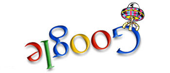
This appears to be the first set of space-themed Google Doodles. The drawings are simple – for the most part, they show a UFO flying past or landing on the Google logo. Still, running them in a series over several days was smart, as it encouraged Internet users to visit the young search engine several days in a row to see what was happening next. More eyes on the page is always good for advertising.
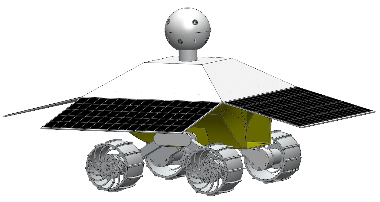
Jan. 15, 2004 – Spirit lands on Mars

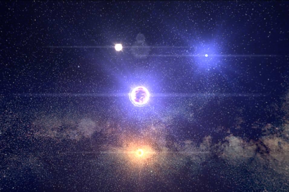
Mars landings are always big media events, and NASA was in the midst of a bonanza of attention in 2004 as both Spirit and Opportunity successfully touched down on the Red Planet. Thousands of Google users would have been searching out the rovers’ latest exploits. Commemorating Spirit’s landing in a doodle, just as that excitement was at a fever pitch, was a great way for Google to highlight the ability for users to seek out information about the rovers on its own site.
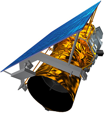
Aug. 9, 2010 – Anniversary of Belka and Stelka spaceflight

The best Google Doodles are those that show you what you don’t know before. In this case, few outside the space community are likely aware of who Belka and Stelka were, and where their spaceflight fits in history. (They were among a series of animal flights flown in the 1960s to determine the risks of space travel to humans.) From Google’s perspective, running a doodle one needs to learn more about encourages users to click on it, generating more page views.
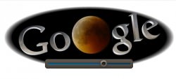
June 15, 2011 – Total lunar eclipse, featuring Slooh

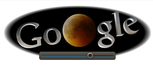
This is a brilliant example of cross-promotion. Astronomy geeks are well-aware of Slooh, a site that turns telescopes to celestial events such as the recent Venus transit of the sun. Google brought the site to the masses through promoting Slooh’s June 15, 2011 lunar eclipse feed right on the home page; the colour of the moon in the logo changed as the eclipse progressed. Google also showed the eclipse on its YouTube channel and on Google Earth, and promoted the Slooh Android app (also hosted by Google.) Slooh mentioned Google’s participation on its own website, too.
Nov. 8, 2011 – Edmond Halley’s birthday

Commemorating Edmond Halley’s birthday is not unique in itself, as Google has singled out other astronomers for the honour – see Ruby Payne-Scott and Johann Gottfried Galle, for example. What makes this sketch memorable is you can barely see the “Google” logo in the doodle. This is a company that is so confident in its brand that it is willing to let its readers fill in the blanks by imagination. (Astute readers will notice Scott’s doodle follows the same principle, but Halley’s doodle did run first.)
What other doodles should Universe Today readers check out? Share your thoughts in the comments.
All images are from Google’s Doodle website.
Elizabeth Howell (M.Sc. Space Studies ’12) is a contributing editor for SpaceRef and award-winning space freelance journalist living in Ottawa, Canada. Her work has appeared in publications such as SPACE.com, Air & Space Smithsonian, Physics Today, the Globe and Mail, the Canadian Broadcasting Corp., CTV and the Ottawa Business Journal.

