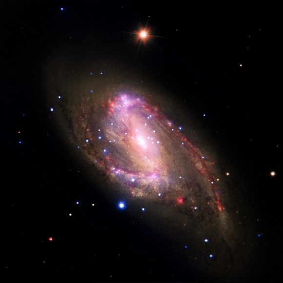
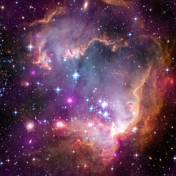
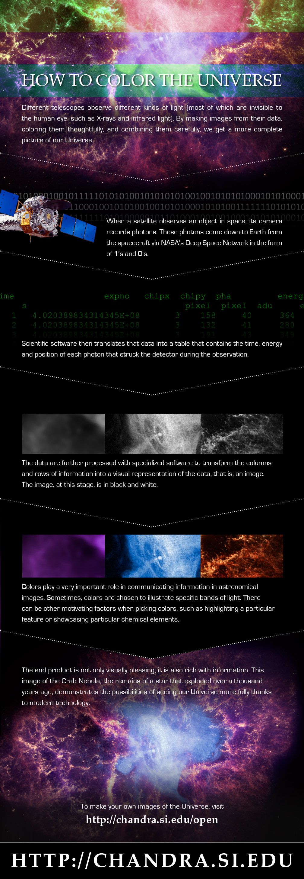
For your daily space zing, check out an infographic recently highlighted on the Chandra X-ray Observatory’s Google+ page. Called “How to Color the Universe” (see it below), it explains why the colors we see from space telescope pictures are added in after the data is gathered.
In a nutshell, the information is recorded by the telescope in photons, which is sent down to Earth in binary code (1s and 0s). Software renders these numbers into images, then astronomers pick the colors to highlight what to show in the data.
“Colors play a very important role in communication information in astronomical images,” the infographic states. “Sometimes, colors are chosen to illustrate specific bands of light. There can be other motivating factors when picking colors, such as highlighting a particular feature or showcasing particular chemical elements.”

It’s natural right now to think that astronomers are adding data where none exist, but Chandra’s public affairs employees (Kim Arcand and Megan Watzke) wrote a Huffington Post piece in September addressing this, too.
“Often, scientists choose colors to represent certain scientific phenomena such as structures that appear in one wavelength and not another. This might be why the planet is pink or the galaxy green. Or they might want to show where different elements like iron or magnesium are found in an object, and they can demonstrate this by assigning the sliver of light for each in different colors,” they wrote.
“In other instances, colors are picked to make an image the most pleasing or beautiful. In some of these instances, cries of the images being faked can erupt. But they are not fake, no matter what colors are used. We can’t see these data without scientific tools and processing. The color in these images enhances the data but does not alter them.”
If you have a high level of comfort manipulating images, Chandra offers a website to create images from raw data yourself, complete with a tutorial showing you how to do it.


