If the Moon Were Only One Pixel: a Scale Model of the Solar System

Josh Worth's HTML scale model of the Solar System

One of my favorite pet peeves is the inability of conventional models to accurately convey the gigantic scale of the Solar System. Most of us grew up with models of the planets made of wood or plastic or spray painted styrofoam balls impaled on bent wire hangers (don’t tell Mommy), or, more commonly, illustrations on posters and in textbooks. While these can be fun to look at and even show the correct relative sizes of the planets (although usually not as compared to the Sun) there’s one thing that they simply cannot relate to the viewer: space is really, really, really big.

Now there are some more human-scale models out there that do show how far the planets are from each other, but many of them require some walking, driving, or even flying to traverse their full distances. Alternatively, thanks to the magic of web pages which can be any size you like limited only by the imagination of the creator (and the patience of the viewer), accurate models can be easily presented showing the average (read: mind-blowingly enormous) distances between the planets… and no traveling or wire hangers required.

This is one of those models.* Enjoy.
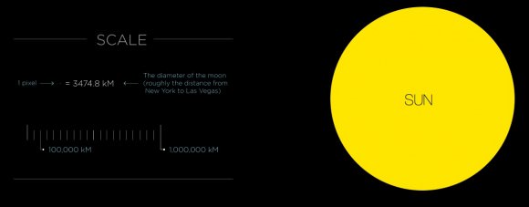
Despite their similar apparent sizes in our sky, the Moon and Sun are (obviously) quite different in actual size. Which is a good thing for us. (Credit: Josh Worth)

Created by designer Josh Worth, “If the Moon Were Only 1 Pixel: A Tediously Accurate Scale Model of the Solar System” uses a horizontally-sliding HTML page to show how far it is from one planet to another, as well as their relative sizes, based on our Moon being just a single pixel in diameter (and everything lined up neatly in a row, which it never is.) You can use the scroll bar at the bottom of the page or arrow keys to travel the distances or, if you want to feel like you’re at least getting some exercise, scroll with your mouse or computer’s swipe pad (where applicable.) You can also use the astronomical symbols at the top of the page to “warp” to each planet.

Just try not to miss anything — it’s a surprisingly big place out there.

“You may think it’s a long way down the road to the chemist’s, but that’s just peanuts to space.”

– Douglas Adams

See more of Josh Worth’s work here. (HT to Alan Stern.)

*And this is another one.

OMG Space

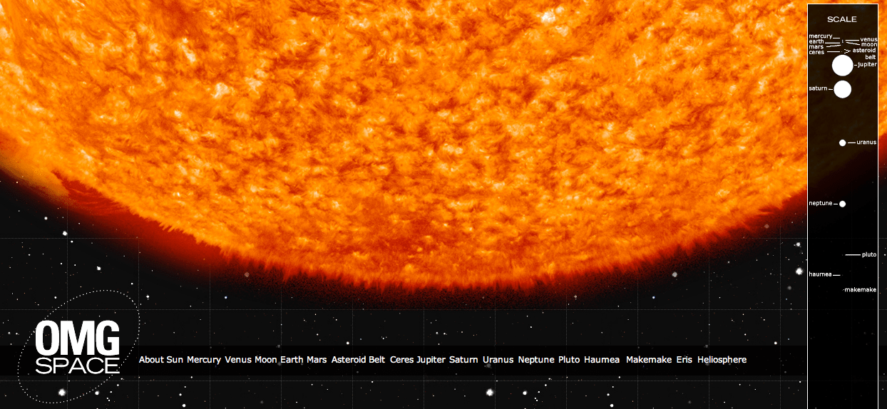
OMG Space attempts to portray the scale sizes and distances in the Solar System

[/caption]

“You may think it’s a long way down the road to the chemist’s, but that’s just peanuts to space.” – Douglas Adams

Standard classroom models and textbook illustrations of the Solar System, regardless of how pretty they are, all share one thing in common: they’re wrong. Ok, maybe not wrong, but definitely inaccurate… especially in regards to scale. And understandably so, as it’s nearly impossible to portray in a convenient manner the sheer amount of space there is between the planets and their relative sizes. Even if a model manages to show one or the other in a straightforward, linear fashion, it usually doesn’t show both.

This one does.

OMG Space is a web page made by Margot Trudell as graphic design thesis project at Toronto’s OCAD University. Displayed on the Visual.ly portfolio site, Margot’s expansive infographic shows the Sun, planets and some minor bodies to scale, both in terms of relative size and distance. By clicking on a planet’s name at the bottom of the page you’ll be whisked away toward it, giving a sense of how very far it really is between the many worlds that make up our own little Solar System.

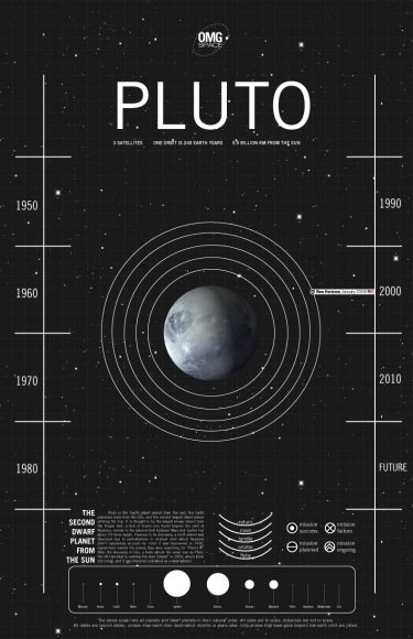
And if that’s not enough, Margot has included a descriptive chart for each world that gives basic information on distance from the Sun, orbital period and moon count as well as details on visiting exploration missions — past, present and planned. These can be accessed by clicking on the respective worlds once you arrive.

Each planet has an infographic associated with it, showing physical characteristics and exploration timelines. (M. Trudell)

“I created the infographics first and as I worked on them decided they needed more context, and the idea of creating a to scale version of our solar system came to mind,” Margot told Universe Today. “The project was initially intended to be all print, but knowing the real scale of our solar system I eventually came up with the idea of using the infiniteness of the web to my advantage.”

If you watch the scroll bar on the right side of the page (and I do suggest resizing the page to fill your screen as much as possible) you’ll also get a sense of how much space you’re traversing as you zip between worlds. And that’s just taking into consideration the average distances between each planet at opposition. In reality, they’re never lined up in a row like that!

If you’re so inclined you can also scroll up and down manually… if only to see how long it takes you to not get anywhere.

“My favourite thing to do on OMG Space’s website is go to Earth and then click on the link to the Moon,” Margot said. “The small distance you move yet the big gap you see… it gives you a whole new perspective on how far people traveled to get to the moon and back, and it shows how far the moon really is from Earth (I feel that it’s always portrayed as being almost right beside us) and makes you consider how powerful those rockets must have been to get us that far.

“It gives you a bit of that ‘OMG’ feeling that the project is named for.”

Yes, OMG indeed.

Infographics by Margot Trudell. See more of Margot’s work here.